3. Display Content Clearly on the Page
Introduction
Writing easy-to-read web content is only the first step. If you want
people to understand the content, it needs to look easy to read—both
on desktop and on mobile.
Even health content written in plain language can look overwhelming if
there’s too much text in a paragraph or not enough space on the
page.7,24,35,49
And if your site doesn’t display or function well on mobile, users on
mobile devices may give up before they even get to your content.
Web design and content go hand in hand. Use white space, layout, font,
and color to help users understand the content on your website.
Try this
When developing your health content, imagine you’re
writing for a mobile screen. This will naturally force you to take into
account many of the best practices outlined in this section. By writing
for a mobile display, your content will be simpler and easier to
understand across all screen sizes.
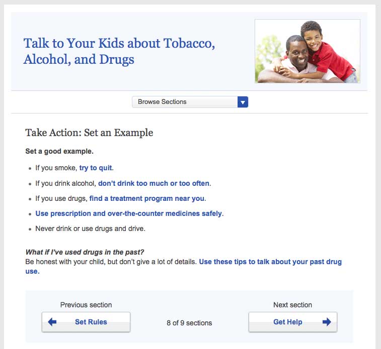
3.1 Limit paragraph size. Use bullets and short lists.
It’s very important not to overwhelm your users with content regardless
of screen size. These principles apply not only to mobile devices, but
to desktops and laptops as well. All of the following can trigger web
users with limited literacy skills to skip over content:
- Dense “walls” of text
- Long sentences
- Paragraphs with multiple numbers in the text
- Long words
- Paragraphs with more than 3 lines7,24,28
The takeaway here is that users will skip information that looks
difficult to read regardless of how simply it’s written or how important
it is.
Additionally, write for users’ limited working memory. Breaking up
content into manageable “chunks” or bulleted or numbered lists can help.
For example:
- Use clear, stand-alone sections or “chunks” of text with
headings.24,30,53
- Make sure each chunk of text has only 1 theme or
idea.54
- Turn sentences into lists when possible.24,30
- If your list has more than 7 items, break it up into several
sub-lists.54
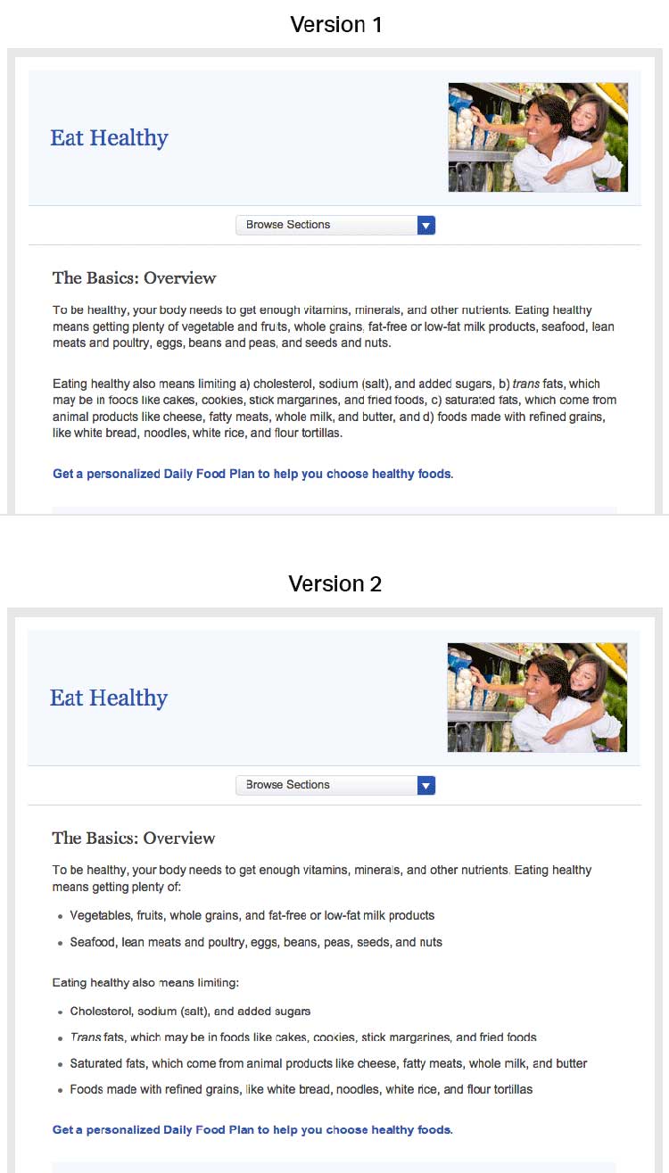
Figure 3.1
Compare these webpages from healthfinder.gov. Users are less
likely to read content presented in long paragraphs of text, as in
version 1. Version 2 is easier to read because it uses bulleted lists
and smaller “chunks” of text.
3.2 Use meaningful headings.
When users scan webpages, they often only read the headings to figure
out if the content is relevant to them. It’s important to make your
headings as specific as possible24,30—try to include keywords to help
users find the information they need.
Including keywords in headings also makes it more likely that search
engines will show your content in search results. Search engines show
sites where keywords appear in the web address, title, page headings,
and links before they show websites with keywords that only appear in
content.
Try this
Start headings with verbs when you can. This helps set you
up to write actionable content.
Use subheadings.
Adding a subheading, or “teaser” text, underneath each heading can give
the user additional clues about what to expect from your content.
Suggestion
Main heading: Get Active
Subheading: Aim for 2 hours and 30 minutes of activity a week.
Consider question headings.
When appropriate, try using questions as headings.24 Use “I” and “me”
to reflect the voice of the user.
For example, when discussing mammograms, common questions include:
- How will this benefit me?
- How much does it cost?
- What happens if the doctor finds something wrong?
- How often do I need to get tested?
- Does it hurt?
- Are there any risks associated with the test?
- What if I don’t have time?
Place headings properly.
Make sure your headings don’t “float” on the page (floating happens when
there’s too much white space above and below the heading). Make it clear
which chunk of text the heading corresponds to—leave more space above a
heading than between the heading and the text that comes after it.24
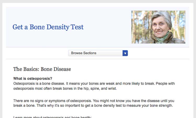
Figure 3.2
On this healthfinder.gov webpage, information about
osteoporosis is organized using questions as headings. There’s more
space before the heading than after, creating clear “chunks” of text.
3.3 Use a readable font that’s at least 16 pixels.
The font you choose is important because it affects your site’s
readability. Below, we list the most important elements that contribute
to making a font readable.
Size
Choose a font that’s at least 16 pixels, or 12 points. If many of your
users are older adults, consider using an even larger font size—19
pixels or 14 points.6,24 A small font size is more
difficult to read, especially for users with limited literacy skills and
older adults.
 Quote
Quote
“I like when I can read the words without my
reading glasses.”
Set up your site so that users can adjust the size of the text on the
page.24 Web designers can make this possible by using what’s called
relative type size. However, it’s still important to test out your
website with different font sizes to make sure it’s still easy to read
and navigate. Always check how your content looks on a mobile device, as
well—newer, high-resolution screens that render more pixels per inch can
make text look smaller.
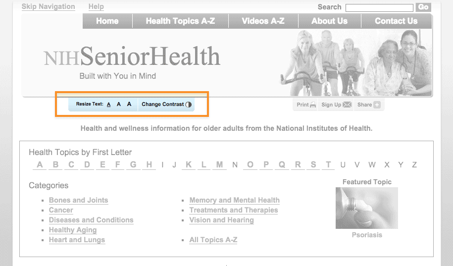
Figure 3.3
NIH SeniorHealth includes a toolbar on every page that allows
users to change text size and adjust color contrast (colored text on a
black background).
Simplicity
Unusual fonts with unnecessary flourishes can be hard to read. Choose a
mainstream font that will feel familiar to your users.30
It’s easier to read text printed in simple, familiar fonts like
Verdana.
Example
Lucida Handwriting
“Regular physical activity is good for your health. Get tips to help you
get more active.”
Verdana
“Regular physical activity is good for your health. Get tips to help you
get more active.”
Also, while you can use a different font for headings and body content, don’t use more than 3 fonts on a page. Use fewer, simpler fonts to make your page look more cohesive.55
Serif or sans serif?
There’s been a lot of debate about which type of font is easier to read
online—and overall, the research is inconclusive.30,56
However, some evidence suggests that serif fonts may make reading on the
web more difficult for users with reading
disorders.56,57
The bottom line: Choosing sans serif fonts is best practice when writing
for the web.24,57,58 Use a familiar sans serif font like
Verdana, Lato, Open Sans, Proxima Nova, or Source Sans.
Line height
Line height (also called leading) is the vertical distance between lines
of text. Common line heights in word processing include:
- “Single spaced” (line height of 100%, equal to the font size)
- 1.5 lines (line height of 150%, equal to 1.5 times the font size)
- “Double spaced” (line height of 200%, twice the font size)
Some word processors—and many web design programs—will give you even
more options.
To maximize readability, use a line height that is 130% to 150% larger
than the font size.56 This helps keep users with limited literacy
skills from losing their place in the text as they start reading a new
line—and makes it easier for them to use their fingers to help keep
their place.
Example
It’s best to specify leading of about 140% (the middle option
below).59
100% Leading
“Making small changes to your eating habits can make a big difference
for your health. Here are some tips and tools you can use to get
started.”
140% Leading
“Making small changes to your eating habits can make a big difference
for your health. Here are some tips and tools you can use to get
started.”
200% Leading
“Making small changes to your eating habits can make a big difference
for your health. Here are some tips and tools you can use to get
started.”
Line height is also an important consideration for mobile users. When
paragraphs or bulleted lists include multiple links, extra height
between lines helps ensure that users have enough room to tap the item
they want.60
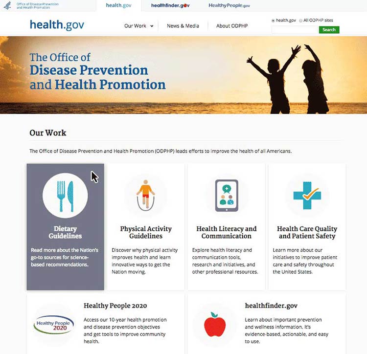
3.4 Use white space and avoid clutter.
Clean, uncluttered webpages are easier to read24,30—they’re less
distracting and less overwhelming for everyone, especially people with
limited literacy skills and very busy users.
Use white space in your content to break information into chunks. Leave
space between sections of text and around images and buttons.
Figure 3.4
The CDC.gov homepage includes space around the logo and search
box, and under the banner image, which helps the site look clean and
uncluttered.
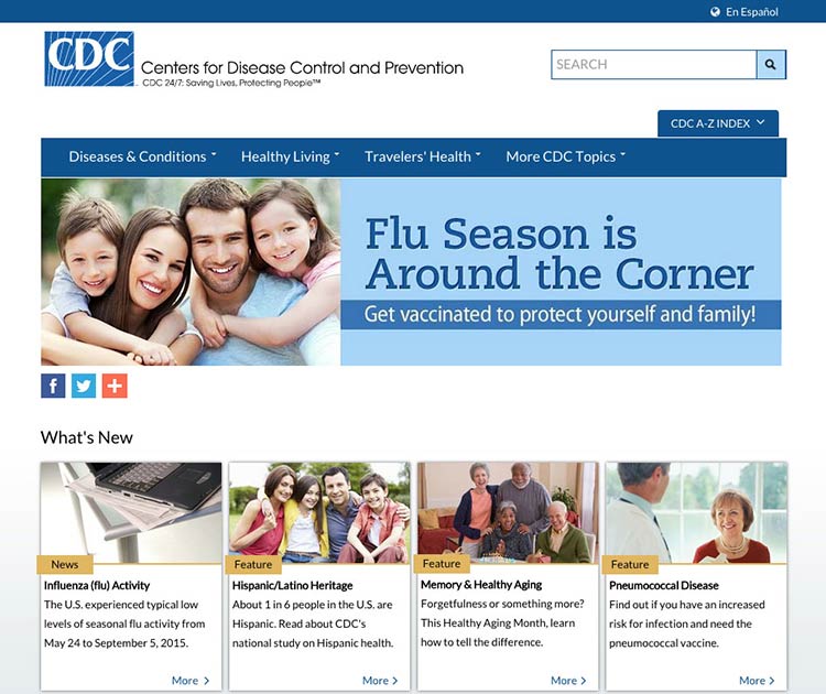
Figure 3.5
The health.gov homepage also has a very clean look with lots of
white space.
White space around site features also helps mobile users interact with
buttons and links without accidentally tapping the wrong place.
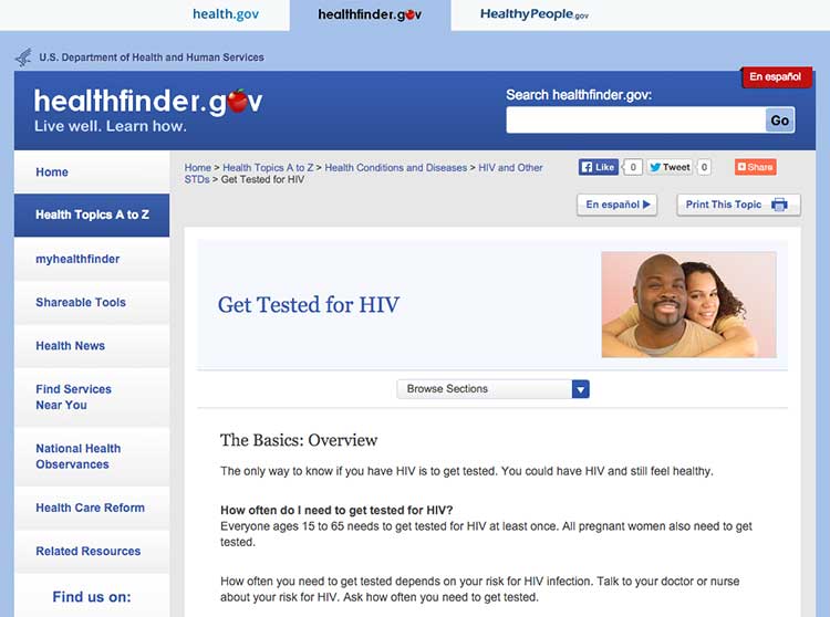
3.5 Keep the most important content above the fold—even on mobile.24,30,61
Users spend the most time looking at content they see
first,62 so make sure the most important and compelling
content appears above the fold. Users also judge the content they can
see to decide whether it’s worth scrolling down to see more.62
Figure 3.6
The most important content in this topic about getting tested
for HIV is visible above the fold.
Keep in mind that low literacy readers may have trouble with
scrolling—eye-tracking data shows that the need to scroll makes it more
likely that they’ll skip content as they try to find their place again
to continue reading. That’s why it’s important to minimize scrolling
when you can.63
If your content continues below the fold, the best cue to let users know
they need to scroll down is a paragraph of text that crosses the scroll
line.64 However, it’s very challenging to ensure that
this will display consistently on different screen sizes—so you may want
to consider using a scroll arrow or scroll bar
instead.65
Try this
View your website using different monitors, browsers, and
devices to see how your content displays on the screen.
Finally, be aware that users may mistake horizontal lines or large
sections of white space at the bottom of their screen for the end of a
webpage. That’s a good reason to look at your site on many devices and
screen sizes. If you find either of these at the bottom of a page,
consider making some changes—“false bottoms” might stop people from
seeing all of your content.24
3.6 Use links effectively.
The ability to link to related content is a major benefit of writing for the web. Below, we list some strategies for using links effectively in your online health content.
Limit the number of links on a page.
Users with limited literacy skills sometimes click on links instead of reading content on a page.7 Limiting how many links you have on a page can help prevent too much “link hopping”.
Think about links as exit points—include them only in places where you really want your users to exit.
Link directly to tools and resources that support your
content.28,40
Include links that allow
users to “drill down” for more detailed
information8,28,40—avoid linking to pages with
redundant content.
Here are 3 rules to follow when writing links on a webpage:30
1. Make links long enough to “grab” easily.24,50 If
your link is too short, it may be hard for users to tap or click on the
right part of the screen to select the link.
2. Use descriptive link labels so there are no surprises.24,30
Descriptive link labels tell your user what to expect from a link. Users
should never be surprised by what they find when they click on your
link. They can also help users find the right content—and improve search
engine rankings.
3. Use action verbs in link labels.8,24 Choose actionable link
labels, like “Check out these tips for getting active,” “Find out how to
eat healthy during pregnancy,” or “Read more about diabetes.” Action
verbs help users engage with your content.
Suggestion
- Before:
- Insurance Plan Locator
- After:
- Find the right insurance plan for you
Figure 3.7
Links on this healthfinder.gov webpage follow all 3 rules for
link labeling. Readers know what to expect when they click on each link.
Never use general link labels—they don’t help people know what to
expect. For example, avoid the following link labels:
- Click here
- Print
- Learn more
3.7 Use color or underline to identify links.
Display links so users will easily recognize them as clickable—and stay
consistent with presentation throughout your site.66
To follow established guidelines for displaying links:
- Use blue for unvisited links and purple for visited links unless you
have a reason to choose different colors.
- Test your color choice to make sure it stands out from the body text—and
that it’s visible to people who are color blind.50
- Underline links in main content areas—users still recognize underlined
content as a hyperlink indicator (especially users with low vision or
other accessibility issues).67
- Don’t underline items like navigation menus if their location makes it
clear that they’re links.50
Figure 3.8
NIH Senior Health uses standard link guidelines—blue and
underlined for unvisited links, and purple for visited links.
3.8 Use images that help people learn.
Including simple visuals to support written text can help users with
limited literacy skills find, understand, communicate, and use health
information.30,38,65,68,69
Choose images that support your text.
Think of graphics as a way to enhance and explain your content, not as
decorations. Also look out for visuals that might actually diminish your
content—busy, bright, or animated graphics are distracting and often
mistaken for advertisements.41
Choose realistic images.
Use realistic pictures to illustrate health behaviors and clarify
medical concepts. Users prefer photographs of “real” people rather than
illustrations or people who look like models.49 It’s also important to
show people of diverse racial and ethnic backgrounds. That way, more
people will be able to find “themselves” on your site—and more easily
relate to your content.
Keep in mind that people react strongly to images, so be sure to test
your site with images included. Pay attention to users’ reactions to the
images—they may surprise you.
Try this
When illustrating an anatomical or medical concept,
consider a simple line drawing—they’re often most effective.67
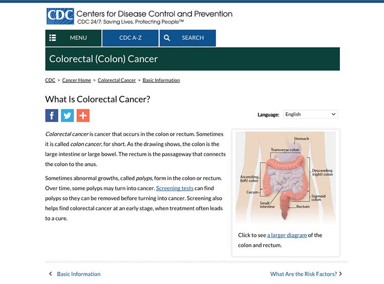
Figure 3.9
This simple line drawing and labels from CDC.gov explain the
location of the colon and rectum.
Make sure the meaning of your image is clear to all users.
Always include a descriptive caption that explains the picture.67 Use
alternative text (called an “alt tag” or “alt text”) to describe
graphics for people using screen readers.
3.9 Use appropriate contrast.
Dark text on a white or very light background is the easiest to
read.24,30 Use reversed-out text (dark backgrounds with light text)
sparingly. It’s also important to keep the background clear, so avoid
patterns and images.
Example
- Good contrast:
- Arteries are the tubes that carry blood away from your heart. Every time your heart beats, it pumps blood through your arteries to the rest of your body.
- Bad contrast:
- Arteries are the tubes that carry blood away from your heart. Every time your heart beats, it pumps blood through your arteries to the rest of your body.
3.10 Make web content printer friendly.
Many web users with limited literacy skills prefer to print pages from a
website rather than read text on a computer screen.28,30,60,65 They may
also want to share health information with family members or friends who
don’t have access to a computer or post it on their refrigerator. That’s
why it’s important to make sure your content is ready to print.
Figure 3.10
When a user clicks the “Print” button, a printer-friendly page appears. The printer-friendly version has clear headings and doesn’t include page numbers.
 Quote
Quote
“I would like to print this page and show it to
family members who need this information.”
Use print links for pages designed specifically for printing.
For pages meant to be printed (like a list of questions to bring to the
doctor’s office), prompt users with a print link. Make the print link or
icon clearly visible on each page. If possible, give users the option to
print a single page, a complete section, or just a portion of the text.
Make printed content user-friendly.
Follow these design guidelines:
- Use a lot of white space, good color contrast, and clear headings on
each page.
- Specify a print style sheet that will only be used when the user
clicks to print the page.
- Design your site with fluid, percentage-based widths that allow for
printing from a range of devices.
- If your site has page numbers, make sure that printing will override
them—or give users a “view all pages”
option.71,72
3.11 Make your site accessible to people with disabilities.
All Federal Government websites must be accessible to people with
disabilities. This is often called Section 508 compliance (referring to
Section 508 of the Rehabilitation
Act).73
The guidance in Section 508 helps us design websites that work for
everyone.
Here are a few of the important considerations addressed under Section
508:
- Make sure screen readers and other assistive technologies can read
your site. That way, users with physical impairments will still be
able to access your content. Usually, this involves confirming a
logical reading order of your page, making sure important content is
near the top of what the screen reader will “see” first, and making
sure that images have appropriate alt text. You can find other
criteria in the Web Content Accessibility Guidelines (WCAG)
2.0.
- Mark up page titles and section headings consistently. This will
ensure that users with and without a screen reader can easily
identify the major content sections on the page.
- Check that users can navigate your site using only a keyboard.
That way, your site will still be accessible for users who have
mobility or vision impairments and aren’t comfortable using a mouse
or touch screen.
- Choose strong color contrast, especially for buttons. Many users
with vision impairments are not actually blind, but rather have low
vision or color blindness. For these users, it’s very difficult to
tell the difference between similar colors—low-contrast text
may disappear.
- Test content that requires the use of plug-ins or dedicated
software for accessibility.30 There are additional accessibility
requirements for other plug-ins that take a user out of a
web browser. It’s important to test non-HTML elements in their
application to make sure they are still accessible to all users.
Get more information about web accessibility
from the Web Accessibility Initiative.
3.12 Make websites responsive.
Today’s users expect websites to work well on every screen they
touch—whether it’s a phone, a tablet, a desktop computer, or whatever
else we haven’t thought of yet. More and more, users are accessing the
web from mobile devices. And for some—especially low-literacy
users—mobile devices may be their only means of web
access.17
With this shift in how we’re accessing web content, web designers have a
variety of options for serving content to mobile users, including native
mobile apps, web apps, and mobile
websites.74,75
For most health websites, responsive design is the best choice.
Responsive design websites show users content in a format that’s
tailored to the screen size, platform, and orientation of the user’s
device.72,73
Figure 3.11
AIDS.gov’s responsive design delivers content in different
formats based on the user’s screen width.
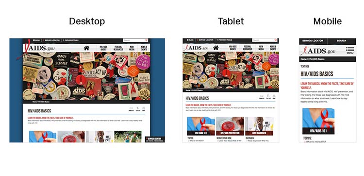
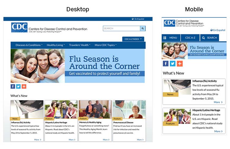
Figure 3.12
CDC’s responsive design template offers a good experience for
users on mobile. The site is reprioritized so that users don’t need to
“pinch” or zoom into content when they land on the page.
A main advantage of responsive design is that a single website can
deliver content optimized to appear on a wide variety of devices and
screen sizes. But keep in mind that responsive design is limited in that
only format—not content—can be tailored based on a user’s device. That’s
why it’s so important to develop content for the smallest screen size.
By doing so, content developers must make tough choices and create a
thoughtful, logical content hierarchy and cut (or link to) superfluous
information.
Most of the time, users won’t think about how your site was built—they
just want a seamless experience across devices.72
3.13 Design mobile content to meet mobile users’ needs.
Many of the core design principles in this guide apply to mobile design
as well as desktop, but there are some additional things to consider
when designing on mobile.
Limit the number of elements on each screen.76
Keeping your design uncluttered is especially important for mobile users
who are viewing content on a small screen. Simple screens enable users
to find what they’re looking for more efficiently.
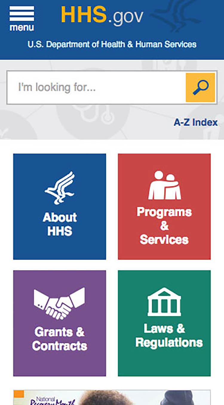
Figure 3.13
On mobile devices, the HHS.gov homepage features a simple
search bar and 4 buttons, each linked to a secondary page.
Prioritize content and features at the top of the page.
Users spend the most time looking at content near the top of the
page.77 Give limited space to elements users interact
with at the top of the page—like buttons, menus, and links—so there’s
room for content.78
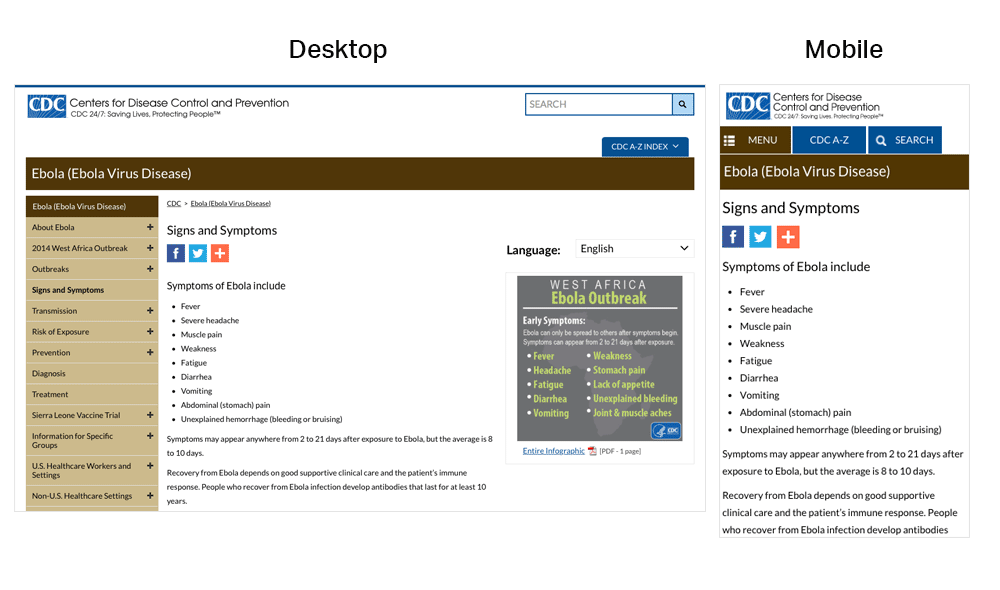
Figure 3.14
On mobile devices, the CDC website prioritizes important
content at the top of the page—images and additional settings (like
language preference) are at the bottom of the page.
Make interaction easy.
Mobile devices have smaller screens, so selecting a button or typing may
be more challenging than on a desktop computer. Additionally, mobile
interfaces can be challenging for users with physical conditions that
affect their fine motor control (how precisely they can click or touch
things).
With this in mind:
- Limit the amount of text your users need to type.20
- Use large buttons and tappable areas so that people using small devices
can easily select them. Also be sure to include enough space around
them.11,17
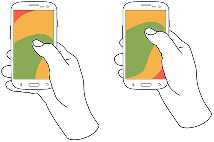
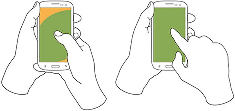
- Place frequently used buttons where they’re easy to reach. The easiest
places to reach depend on the size of the device and how the user is
holding it. In most cases, the center and bottom of the screen are
easier to reach than the top.17,79
Figure 3.15
Users hold their phones in various ways, but the center and
bottom of the screen are usually easiest to reach.
- Try radio buttons. Limited-literacy users find large radio buttons the
easiest way to make selections on a mobile device. Use them instead of
checkboxes or interactive icons.
Figure 3.16
HealthCare.gov uses radio buttons for the answers to the
question, “What do you want to do first?”
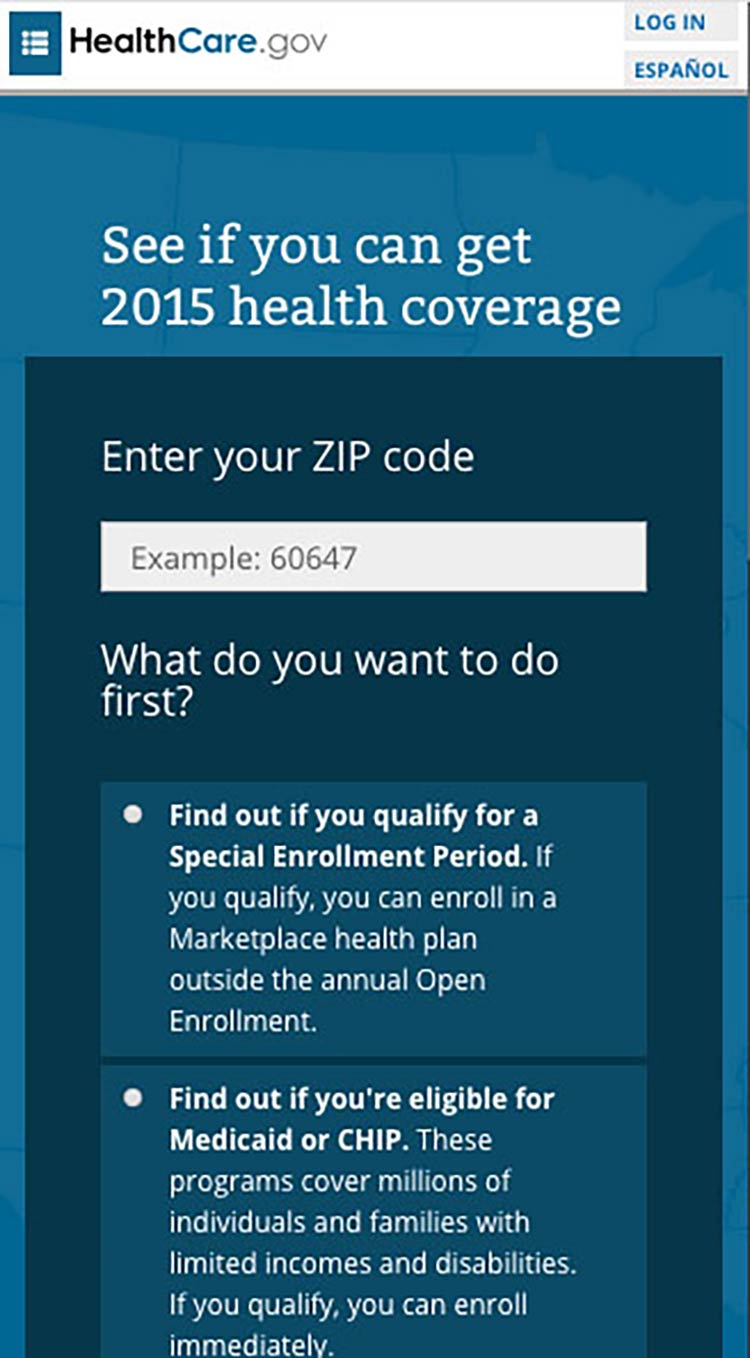
Try this
To improve “tappability,” be sure the label is associated
with the radio button. That way, the label will be tappable, too—so
users have a bigger area to tap.
Summary
To be successful, web content doesn’t just need to be well written—it
needs
to look
easy to read. Thoughtful design and layout can help your readers focus
on your content without feeling overwhelmed, confused, or distracted by
how the information is presented.
Remember to think about all your users—including those on mobile and
those with accessibility needs—when you’re designing your site. Make
sure your content is accessible and easy to navigate, regardless of how
it’s accessed.
In the next section, we discuss content organization and navigation—that
is, making sure your users can easily get to the right page on your site
to find the information they’re looking
for.