3.12 Make websites responsive.
Today’s users expect websites to work well on every screen they touch—whether it’s a phone, a tablet, a desktop computer, or whatever else we haven’t thought of yet. More and more, users are accessing the web from mobile devices. And for some—especially low-literacy users—mobile devices may be their only means of web access.17
With this shift in how we’re accessing web content, web designers have a variety of options for serving content to mobile users, including native mobile apps, web apps, and mobile websites.74,75
For most health websites, responsive design is the best choice.
Responsive design websites show users content in a format that’s tailored to the screen size, platform, and orientation of the user’s device.72,73
AIDS.gov’s responsive design delivers content in different formats based on the user’s screen width.
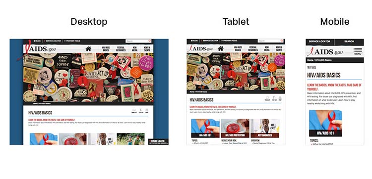
Source: https://www.aids.gov/hiv-aids-basics/ at several screen widths
CDC’s responsive design template offers a good experience for users on mobile. The site is reprioritized so that users don’t need to “pinch” or zoom into content when they land on the page.
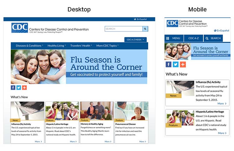
Source: https://www.cdc.gov/
A main advantage of responsive design is that a single website can deliver content optimized to appear on a wide variety of devices and screen sizes. But keep in mind that responsive design is limited in that only format—not content—can be tailored based on a user’s device. That’s why it’s so important to develop content for the smallest screen size. By doing so, content developers must make tough choices and create a thoughtful, logical content hierarchy and cut (or link to) superfluous information.
Most of the time, users won’t think about how your site was built—they just want a seamless experience across devices.72