3.3 Use a readable font that’s at least 16 pixels.
The font you choose is important because it affects your site’s readability. Below, we list the most important elements that contribute to making a font readable.
Size
Choose a font that’s at least 16 pixels, or 12 points. If many of your users are older adults, consider using an even larger font size—19 pixels or 14 points.6,24 A small font size is more difficult to read, especially for users with limited literacy skills and older adults.
 Quote
Quote
“I like when I can read the words without my reading glasses.”
Set up your site so that users can adjust the size of the text on the page.24 Web designers can make this possible by using what’s called relative type size. However, it’s still important to test out your website with different font sizes to make sure it’s still easy to read and navigate. Always check how your content looks on a mobile device, as well—newer, high-resolution screens that render more pixels per inch can make text look smaller.
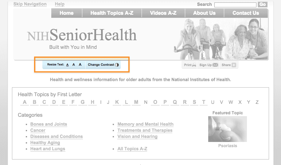
NIH SeniorHealth includes a toolbar on every page that allows users to change text size and adjust color contrast (colored text on a black background).

Source: http://nihseniorhealth.gov/ homepage
Simplicity
Unusual fonts with unnecessary flourishes can be hard to read. Choose a mainstream font that will feel familiar to your users.30
It’s easier to read text printed in simple, familiar fonts like Verdana.
Lucida Handwriting
“Regular physical activity is good for your health. Get tips to help you
get more active.”
Verdana
“Regular physical activity is good for your health. Get tips to help you
get more active.”
Also, while you can use a different font for headings and body content, don’t use more than 3 fonts on a page. Use fewer, simpler fonts to make your page look more cohesive.55
Serif or sans serif?
There’s been a lot of debate about which type of font is easier to read online—and overall, the research is inconclusive.30,56 However, some evidence suggests that serif fonts may make reading on the web more difficult for users with reading disorders.56,57
The bottom line: Choosing sans serif fonts is best practice when writing for the web.24,57,58 Use a familiar sans serif font like Verdana, Lato, Open Sans, Proxima Nova, or Source Sans.
Line height
Line height (also called leading) is the vertical distance between lines of text. Common line heights in word processing include:
- “Single spaced” (line height of 100%, equal to the font size)
- 1.5 lines (line height of 150%, equal to 1.5 times the font size)
- “Double spaced” (line height of 200%, twice the font size)
Some word processors—and many web design programs—will give you even more options.
To maximize readability, use a line height that is 130% to 150% larger than the font size.56 This helps keep users with limited literacy skills from losing their place in the text as they start reading a new line—and makes it easier for them to use their fingers to help keep their place.
It’s best to specify leading of about 140% (the middle option below).59
100% Leading
“Making small changes to your eating habits can make a big difference
for your health. Here are some tips and tools you can use to get
started.”
140% Leading
“Making small changes to your eating habits can make a big difference
for your health. Here are some tips and tools you can use to get
started.”
200% Leading
“Making small changes to your eating habits can make a big difference
for your health. Here are some tips and tools you can use to get
started.”
Line height is also an important consideration for mobile users. When paragraphs or bulleted lists include multiple links, extra height between lines helps ensure that users have enough room to tap the item they want.60