4.1 Create a simple and engaging homepage.
Research tells us that web users with limited literacy skills have a hard time processing more than 1 concept at a time,7,34,50 so make sure your homepage is a simple, focused entry point to the content on your site. This is also valuable when designing for mobile—or even better, responsive—websites.
Keep your homepage as simple as possible.
Limit the amount of text on the homepage.30
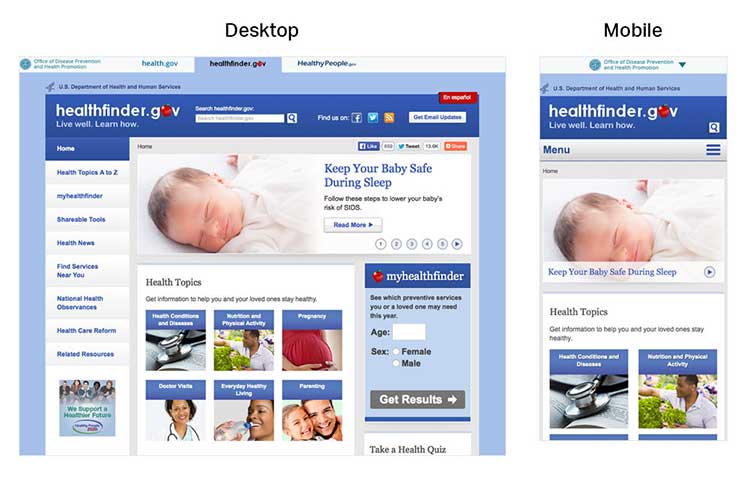
In usability testing, limited-literacy users were more successful using healthfinder.gov’s mobile-optimized homepage because it had fewer distractions than the desktop version.
A useful homepage is mostly links and short descriptions.24,30 Well-designed homepages include lots of white space and large buttons.
The smokefree.gov website is simple—it doesn’t have too much text, it’s made up of mostly buttons to get users to more content, and it has a large search feature.
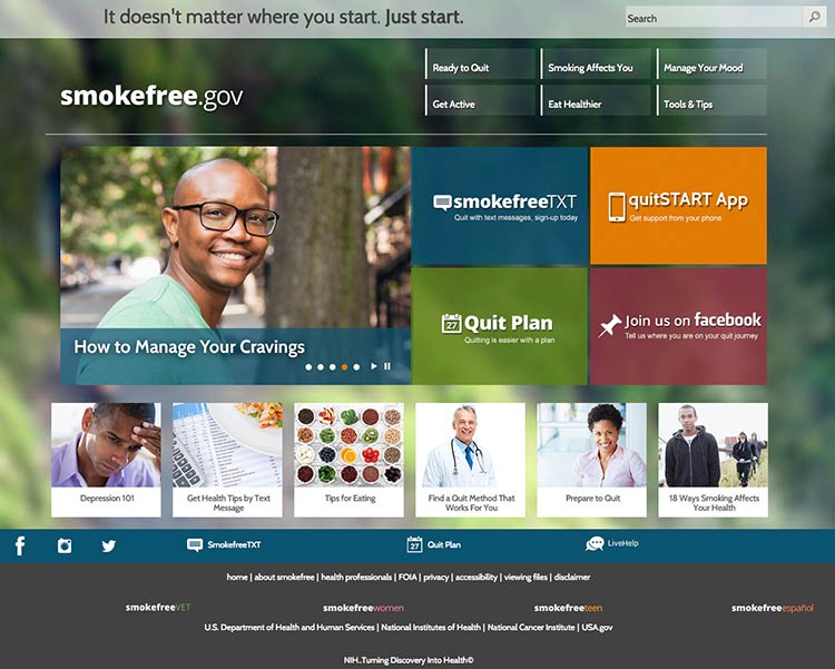
Source: https://smokefree.gov/
If you include information in more than 1 language, link to the non-English sections directly from the homepage. It’s also important to link to non-English sections from a universal menu bar—that way, if users find your content using a search engine, they’ll be able to find additional non-English content.