5. Engage Users
Introduction
Section 2 introduced the idea of user engagement. Engagement is the
process of involving users in health content in a way that motivates
them to take action.31
Using multimedia like video, audio, graphics, and
interactivity32,82,83
is an effective way to engage users. For example, you might offer users
the opportunity to:
- Watch video testimonials of people like them
- Customize graphics to reflect variables they care about
- Enter personal data such as age or weight to get tailored
information
Remember, formatting and layout can dramatically improve the user
experience. Make interacting with multimedia content easy for users by
designing user-friendly forms, quizzes, buttons, links, and mobile apps.
It’s also important to make it convenient for users to access and share
web content from anywhere. You can enable users to share content with
their online networks by adding social media buttons to your website.
5.1 Share information through multimedia.
Whenever possible, provide health information in multiple formats—for
example, audio, video, interactive graphics, quizzes, or slideshows.
Multimedia can improve both learning and engagement, particularly for
users with limited literacy skills.82,83
Choose media that support your content.
Before you decide on which formats to use, think about the information
you’re trying to communicate. Each type of media fosters learning in its
own way.
For example, consider:
- Visuals to show spatial information (like maps)
- Text to communicate information you want users to remember in the long
term
- Sound to convey information you want users to remember in the short
term82
Make sure each piece of media you use supports the text—using media only
as decoration will distract your users.83
Make media accessible.
When using audio or video, be sure to include a text alternative or
transcript, so the content is accessible to all
users.84,85,86
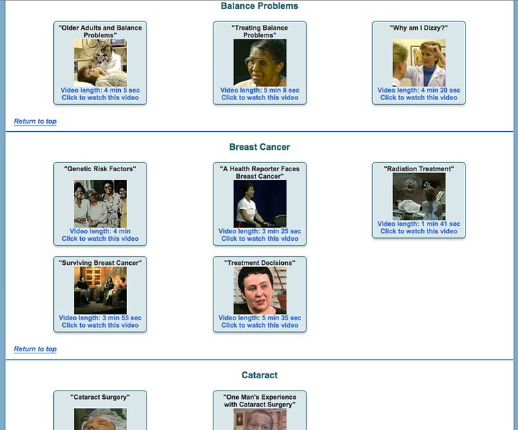
Figure 5.1
NIH SeniorHealth offers short video clips on popular health
topics. Each video includes a transcript and a help tool.
If you’re posting videos on a dedicated YouTube channel, use the closed
captioning options available. You can find details in these
instructions from
YouTube.
Consider quizzes.
Use quizzes to encourage active learning. Limited-literacy users like
quizzes and tend to complete them. After each question, give users
helpful feedback.82
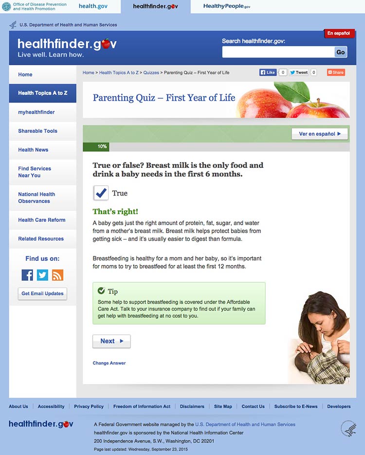
Figure 5.2
In healthfinder.gov usability testing, many participants with
limited literacy skills completed a parenting quiz on the website and
reported liking it. After answering each question, users get information
explaining why their response was right or wrong.
Try this
Look through your website’s content and ask yourself if
any of it can be repurposed as a quiz. Quizzes are especially popular
with limited-literacy users.
5.2 Design intuitive interactive graphics and tools.
Interactive graphics and tools allow users to make choices and see
results that reflect their choices.87 Many types of
graphics and tools—including decision aids, infographics, images,
charts, and maps—can be interactive.
Present choices one at a time.
Avoid asking users to make more than 1 choice at a time. This will help
keep users from getting overwhelmed.87
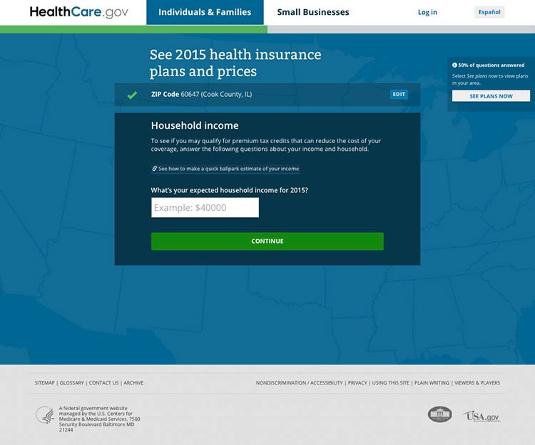
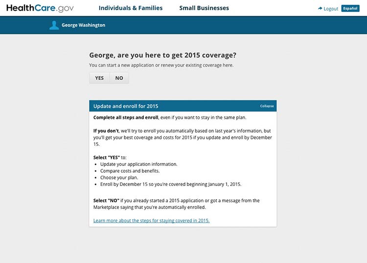
Figure 5.3
Healthcare.gov asks users questions 1 at a time before they can
see information about health care costs in their area.
Show that the graphic or tool has changed with visual
cues.88
If users can’t see changes, they’ll assume the graphic or tool isn’t
working.87 Use visual cues to indicate change—the more obvious, the
better.88
Include intuitive controls.
Users interact with a graphic or tool using controls. Include commonly
used controls that will be familiar to users—for example, radio buttons,
drop-down selections, and autocomplete fields.87
Make it easy to start over.
Allow users to easily clear their choices and start from the beginning.87
You may want to include a “Start Over” button for forms or tools that
have multiple pages.
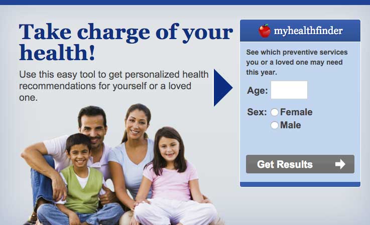
5.3 Provide tailored information.
Invite your users to customize content to their personal interests or
characteristics. This will help encourage them to interact with your
content.
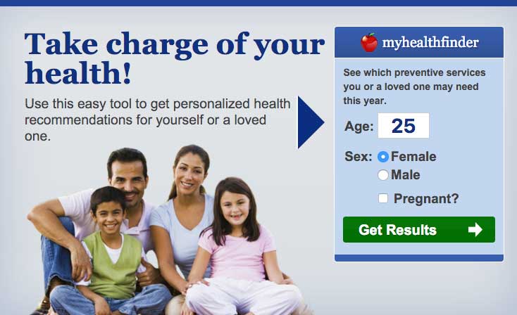
Figure 5.4
The myhealthfinder tool on healthfinder.gov prompts users to
enter their age, sex, and pregnancy status to get personalized
recommendations.
Avoid asking for too much information.
We know that users want personalized health information, but they don’t
want to enter a lot of personal
details.27,39,49
Consider interactive content that only requires users to enter a few
pieces of information about themselves.
Figure 5.5
To use the myhealthfinder tool, users only need to enter their
sex and age.
Create a link between the information you asked for and users’
personalized results.49
In other words, make sure users understand why you asked them to enter
a particular piece of information. This will help compensate for users’
limited working memory.
 Quote
Quote
“I’m very comfortable [entering my age]. That way, I get exact
information for me, not different age groups.”
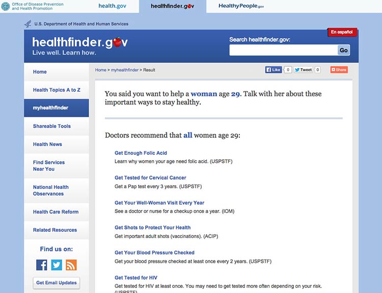
Figure 5.6
The myhealthfinder results page from healthfinder.gov includes
a summary of the user’s personal information entered on the previous
screen.
5.4 Create user-friendly forms and quizzes.
It’s important that forms and quizzes are intuitive and easy to use.
Make instructions clearly visible on the page.
Avoid asking users to click on a button or link to see the instructions
they need to fill in a form or complete a quiz.13
To follow limited-literacy users’ typical reading path, display fields
in a vertical
list23,89,90 and
put instructions above each field. If instructions appear at the
beginning of a section or to the right of a field, users may skip over
them.13
Figure 5.7
Users can easily follow instructions on the myhealthfinder
form.

Suggestion
The best-case scenario is that your quiz or form is so intuitive that it
doesn’t require many instructions in the first place.
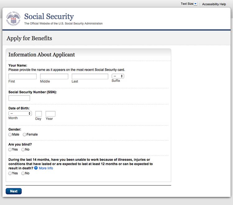
Chunk information on forms into meaningful categories.
Grouping information in ways that make sense to users will help them
easily follow along.91
Figure 5.8
When applying for Medicare benefits, the form is chunked into
manageable pages like “Information About Applicant.”
When designing a long form or quiz, use 1 of 2 layout options:13
- Show users 1 field at a time
- Allow users to scroll down to see all fields
Figure 5.9
This healthfinder.gov parenting quiz displays each question on
a new page.
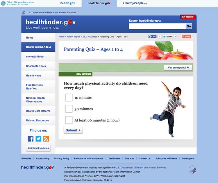
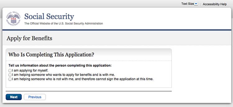
Figure 5.10
This initial page in the Social Security application asks users
for details about who they’re filling out the form for.
Keep required information on forms to a minimum.
The less information your users have to enter, the better. Also try to
avoid asking users to register. If you need to have a registration page,
ask for as little information as possible. Be sure to:
- Distinguish between logging in and registering
- Make the username an email address
- Keep registration to no more than 3 screens and provide cues (for
example, “Page 1 of 3”)
- Include a final results page with questions and responses
- Display fields that need corrections on a new page and include
instructions for correcting information23,89,90
Figure 5.11
If a user is already logged in to Healthcare.gov, forms
auto-populate with his or her name.
Design forms for mobile.
Online forms can be especially challenging for mobile users when
important information or elements of the form run off-screen. Make sure
users can see the information they need to complete the form and the
related fields in the same view. When they can’t, we rely on users to
remember and interpret content—and low literacy users may already be
struggling to read and understand what they’re supposed to
do.4,10,93
5.5 Consider social media sharing options.
In today’s digital era, people aren’t just online and on mobile—they’re
also on social media. In fact, 3 out of 4 online adults use social
media92 platforms like Facebook, Twitter, Instagram,
Pinterest, and LinkedIn. That’s why it can be important to give users
the opportunity to share your content on social media.
Keep in mind that many people access social media on their phones.92
Make it fast and easy to share.
Embed social media buttons on your website. You can also add fixed
social media buttons to your site header or footer so that users can
easily follow or “like” your social media pages.
Put social media buttons below written content—that way users can read
the information before they decide whether or not to share
it.93 To avoid cluttering your site, beware of
overusing social media buttons—only include them on pages you expect
users will want to share.93
Figure 5.12
healthfinder.gov features fixed social media buttons in the bottom-left hand corner of the site.
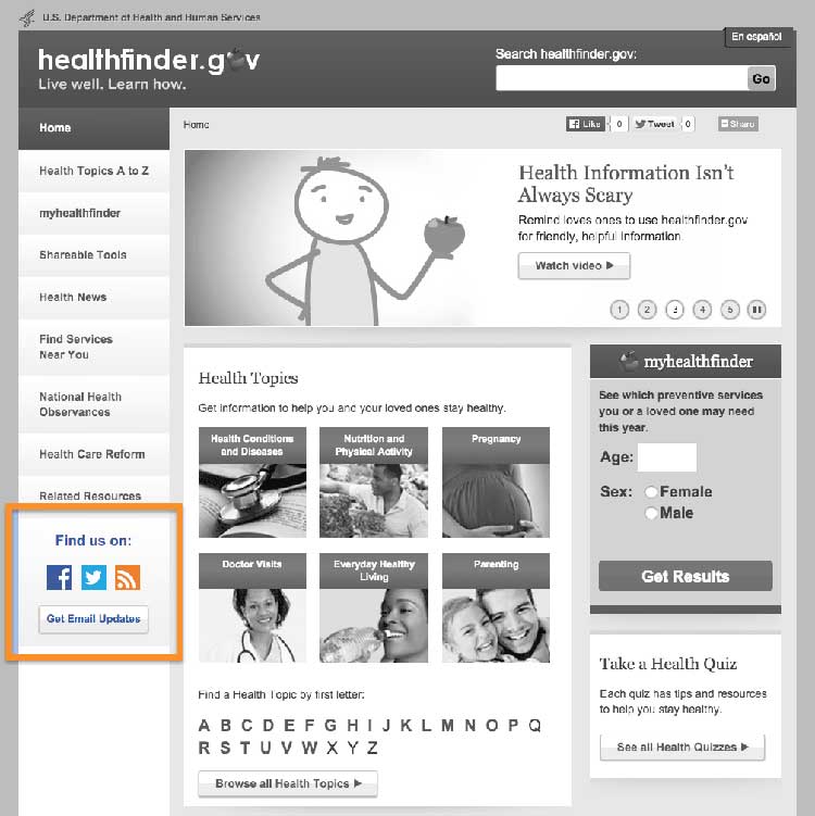
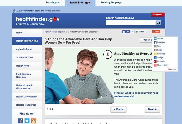
Figure 5.13
Users can click on the video’s sharing icon and choose how
they’ll share it on social media.
Summary
Interactive and multimedia elements—like video, audio, graphics, and
tailored information based on personal data—can help users actively
engage with your content.
Design an easy and intuitive interface for forms, quizzes, graphics, and
other multimedia content, and make it convenient for users to print your
content or share it on social media. When your users feel connected to
your content, they’re more likely to take action and change their
behavior.
Always test interactive features with users to make sure they’re
intuitive. In the next section, we’ll discuss best practices for
including users with limited literacy skills in research and testing
activities.