3.1 Limit paragraph size. Use bullets and short lists.
It’s very important not to overwhelm your users with content regardless of screen size. These principles apply not only to mobile devices, but to desktops and laptops as well. All of the following can trigger web users with limited literacy skills to skip over content:
- Dense “walls” of text
- Long sentences
- Paragraphs with multiple numbers in the text
- Long words
- Paragraphs with more than 3 lines7,24,28
The takeaway here is that users will skip information that looks difficult to read regardless of how simply it’s written or how important it is.
Additionally, write for users’ limited working memory. Breaking up content into manageable “chunks” or bulleted or numbered lists can help. For example:
- Use clear, stand-alone sections or “chunks” of text with headings.24,30,53
- Make sure each chunk of text has only 1 theme or idea.54
- Turn sentences into lists when possible.24,30
- If your list has more than 7 items, break it up into several sub-lists.54
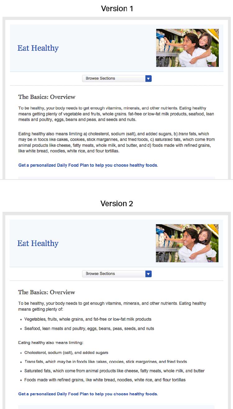
Compare these webpages from healthfinder.gov. Users are less likely to read content presented in long paragraphs of text, as in version 1. Version 2 is easier to read because it uses bulleted lists and smaller “chunks” of text.
Source: https://health.gov/myhealthfinder/topics/health-conditions/diabetes/eat-healthy