4.5 Make clickable elements recognizable.
Users get frustrated when clickable elements—like buttons and links—are difficult to spot.
Design buttons that are easy to find.
Make them:
- Large
- Bright
- A contrasting color from the surrounding text and background
- Obviously clickable30,35,36,50
Buttons that are obviously clickable have borders and shadows. If you’re using a site design that doesn’t include borders and shadows, give buttons a rectangular shape and rounded corners.66
Make button labels easy to understand.
Use a label such as “go” or “get started.” Some users with limited literacy skills don’t understand the term “submit.”
Make buttons look distinct from other elements.
Users get confused when non-clickable elements look like buttons, so avoid giving headings a background color or including lots of colorful boxes on a page.66
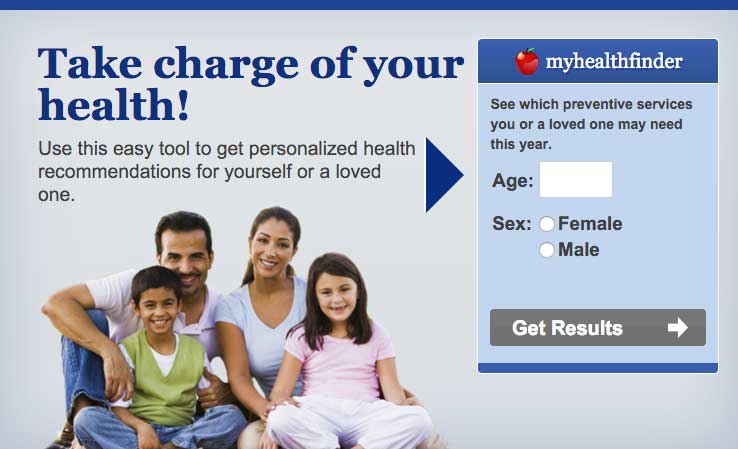
The myhealthfinder “Get Results” button clearly tells users to click to start finding the preventive services they need. Clickable buttons and icons have a unique style that’s distinct from other elements on the page.
Apply clear visual cues to links.
Make it clear that links are clickable—avoid making users mouse over text to see if it’s clickable. For example, make links blue or another color that stands out from the body text.66 (See section 3 for more information on making links look clickable.)
Links on CDC’s Healthy Weight Success Stories page are blue and underlined, which sets them apart from the surrounding text.
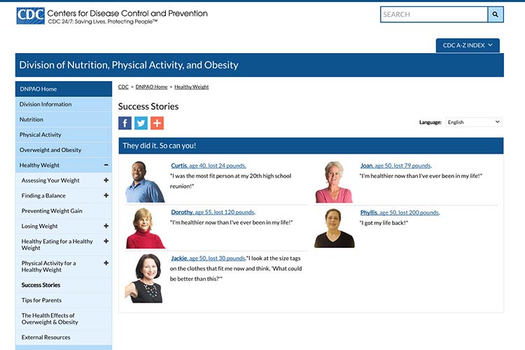
Source: https://www.cdc.gov/healthyweight/success/index.html
Make all link elements clickable.
Make all elements—for example, a picture, icon, and text—that are related to each other clickable. Users find it easier to click on a large target area.66 If you’re using an icon for a link, combine it with another visual cue, like a text label.66
Users can click the button, the icon, or anywhere in the box to get answers to tax questions.
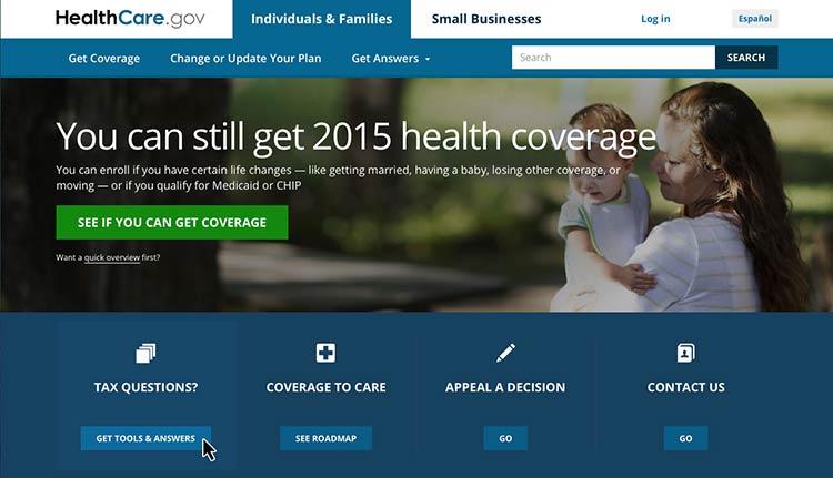
Source: https://www.healthcare.gov/
Be consistent.
Whatever button or link style you choose, apply it consistently across your website.66