5.4 Create user-friendly forms and quizzes.
It’s important that forms and quizzes are intuitive and easy to use.
Make instructions clearly visible on the page.
Avoid asking users to click on a button or link to see the instructions they need to fill in a form or complete a quiz.13
To follow limited-literacy users’ typical reading path, display fields in a vertical list23,89,90 and put instructions above each field. If instructions appear at the beginning of a section or to the right of a field, users may skip over them.13
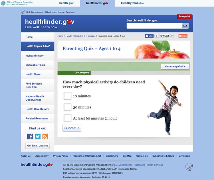
Users can easily follow instructions on the myhealthfinder form.

The best-case scenario is that your quiz or form is so intuitive that it doesn’t require many instructions in the first place.
Chunk information on forms into meaningful categories.
Grouping information in ways that make sense to users will help them easily follow along.91
When applying for Medicare benefits, the form is chunked into manageable pages like “Information About Applicant.”
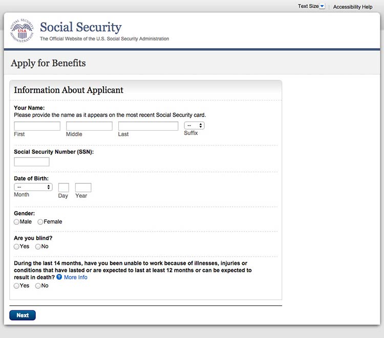
Source: Medicare.gov Apply for Benefits
When designing a long form or quiz, use 1 of 2 layout options:13
- Show users 1 field at a time
- Allow users to scroll down to see all fields
This healthfinder.gov parenting quiz displays each question on a new page.
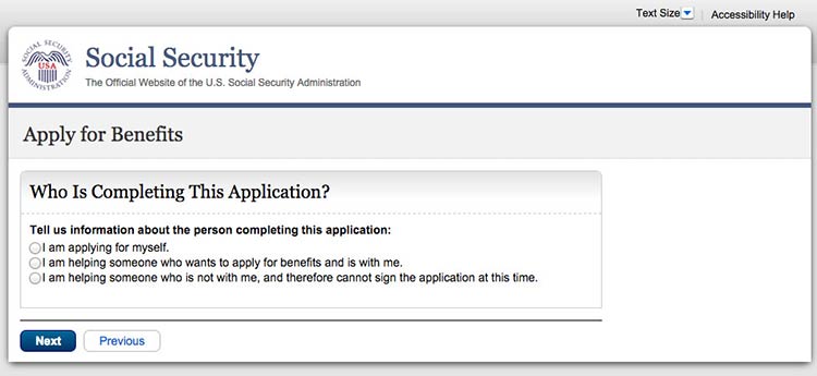
This initial page in the Social Security application asks users for details about who they’re filling out the form for.
Keep required information on forms to a minimum.
The less information your users have to enter, the better. Also try to avoid asking users to register. If you need to have a registration page, ask for as little information as possible. Be sure to:
- Distinguish between logging in and registering
- Make the username an email address
- Keep registration to no more than 3 screens and provide cues (for example, “Page 1 of 3”)
- Include a final results page with questions and responses
- Display fields that need corrections on a new page and include instructions for correcting information23,89,90
If a user is already logged in to Healthcare.gov, forms auto-populate with his or her name.
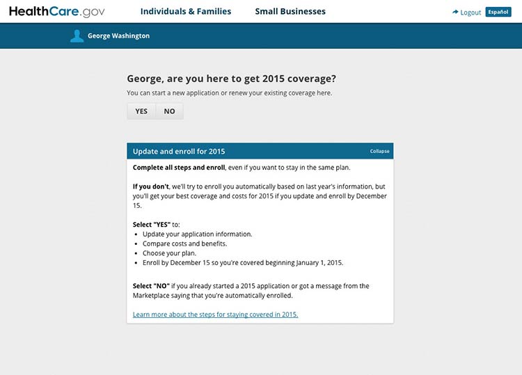
Source: https://healthcare.gov
Design forms for mobile.
Online forms can be especially challenging for mobile users when important information or elements of the form run off-screen. Make sure users can see the information they need to complete the form and the related fields in the same view. When they can’t, we rely on users to remember and interpret content—and low literacy users may already be struggling to read and understand what they’re supposed to do.4,10,93