The Basics
This section discusses two important concepts:
Content Organization (also called
Information Architecture)—Information architecture is the way information
is categorized on a Web site. It typically involves a category structure
(taxonomy) and labels. For example, think of browsing through a bookstore.
Clearly labeled sections (Mystery, Nonfiction, Teen, Business) help you find
what you're looking for. Good content organization helps users find information
quickly.
Navigation—Navigation refers to how
users move through the pages of your Web site. Elements of navigation include
menus, tabs, headings, breadcrumbs, site maps, and "back" or "next"
buttons.
Keep content organization and navigation simple and
consistent. Users are typically topic-focused.7,13 Organize and
label your content according to your users' needs, and use terms that are
familiar to them.
Back to top
Actions
4.1. Create a simple and engaging home
page.
The home page should be an easy entry point to the content
on your Web site. Research indicates that Web users with limited literacy
skills have difficulty processing multiple concepts at the same time.3–5 Include as few elements as possible on
the home page.
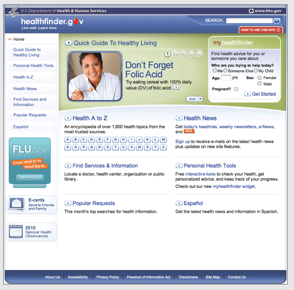
White space and short links
create a clean home page on healthfinder.gov.
- A useful home page is mostly links and
short descriptions.7,13 Use white space and large buttons.
- Limit the amount of text on the home
page.13
- If you include information in more than
one language, link to the non-English sections right from the home page.
Back to top
4.2. Use labels that reflect words your
users know.
Use the words of your Web users, rather than technical or
"catchy" terms.7 This enables users to
find content more quickly.
People have different mental models (methods) for grouping
health information.20,34 To help different users find what they need,
repeat topics under multiple categories. For example, based on card sorting,
content on mammograms appears under three categories on healthfinder.gov:
Cancer, Women, and Screening.
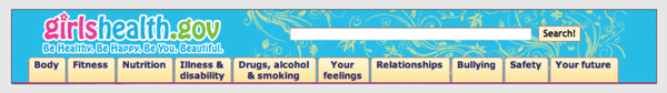
This Web page from the Office
on Women's Health includes a navigation bar with audience-appropriate category
labels (the site is for girls aged 10 to 16). For example, the mental health
section is labeled "your feelings."
Back to top
4.3. Enable easy access to home and menu
pages.
Include large buttons that take users back to the home
page or the main menu pages on the site.13,18,19 Web users
with limited literacy skills typically don't use breadcrumbs.13,18
- Avoid drop-down menus, especially those
that require internal scrolling.
- Use a clear lefthand navigation menu.
Indicate where users are in relation to the rest of the site.13,18-20
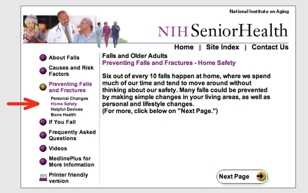
NIH SeniorHealth uses a strong
lefthand navigation menu. The current section is highlighted with a different
color in the navigation bar so users can easily see where they are in the
site.
Back to top
4.4. Make sure the "Back" button
works.
Web users with limited literacy skills often depend on the
"Back" button to navigate a Web site.21
Make sure this button works predictably and consistently.
- If users are entering data into a
registration page or form, ensure that the information does not get deleted
when users select the "Back" button.
Back to top
4.5. Use linear information paths.
Using linear navigation (numbered pages) helps Web users
with limited literacy skills move through the content on your Web site.12,16,17 Linear navigation can be combined with tabs
(typically running horizontally across the top of the page) to organize content
and simplify navigation.
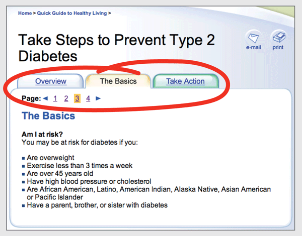
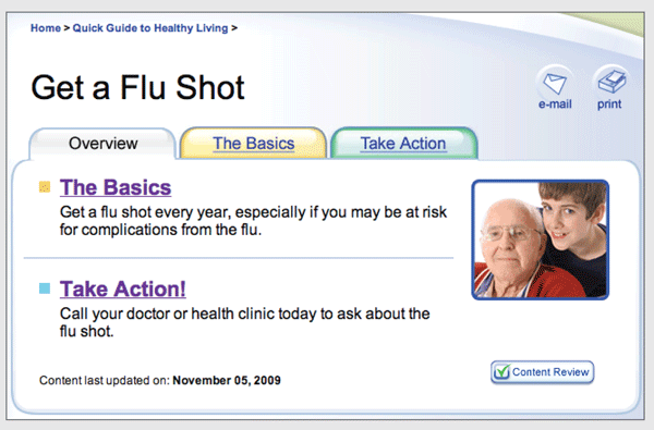
The healthfinder.gov Quick
Guide to Healthy Living uses tabs to organize content (Overview, The Basics,
Take Action). Within each tabbed section, pages are numbered so users can move
easily through the content.
Linear information paths move users through a topic using
a series of pages or screens. Each topic on the site has its own linear path.
The content progresses from general to more specific.

Allow users to move easily from page to page by providing
"Next" and "Back" buttons as well as clickable page numbers at the top or
bottom of each screen.3,13,15,16,18,20
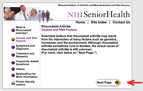
On this Web page from NIH
SeniorHealth, the "Next Page" button is large and clearly labeled.
On the first page of each topic, give the user a short
overview of the content. Provide a link to each subsection for users who wish
to skip directly to a specific section.
The Overview tab on this
healthfinder.gov Web page gives a brief summary of the content and links users
directly to the section that interests them.
Back to top
4.6. Include simple search and browse
options.
Many users with limited literacy skills will browse
through categories of content rather than use a search box.4,5,16,19 This may be
because these users:
- Don't see the search box (many users with limited
experience on the Web don't know where to look for a search box)
- Are worried about spelling mistakes
- Are overwhelmed by search results
- Include multiple ways to browse for
topics (for example, by topic category and using an A to Z list).
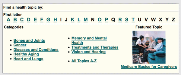
The NIH SeniorHealth Web site
allows users to search for health information by topic categories or an A to Z
list. Note that some letters (in black) aren't linked to anything; they are
still included so that users see a familiar alphabet.
During usability testing, some users with limited literacy
skills clicked a "search" button without entering any terms in the search
box.15 Consider using the "search"
label together with a "get started" or "go" button. This will help signal to
users that they must first enter a term(s) and then submit or "go."
- When designing a search function, use a
large text box with obvious buttons.
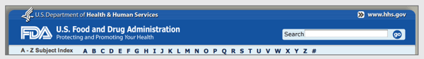
The Food and Drug
Administration (FDA) Web site's Search box is clearly labeled and has an
obvious "go" button to submit the search request.
Here are three rules to follow when designing a search
function:
- Allow for common misspellings.4,13
- When displaying search results, limit the number of
results displayed on a page. Use numbered pages to avoid scrolling.4,13 Use white space and a large font.
- Use clear page titles and include a brief
plain-language description of each result.4,13 Avoid using long URLs in search results, if
possible.
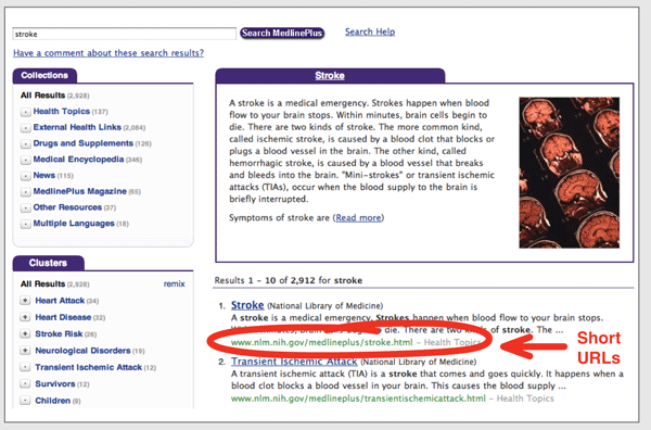
This search results Web page
from MedlinePlus displays clear titles and short URLs for the linked results. A
brief description written in plain language appears above the top results. Only
10 results show per page.
Back to top
Iterative Design Methods and
Tips
Methods
- Card sorting
- Prototypes
- Usability testing
Tips for designing and testing your Web site with users
- Use card sorting to group the content
on your Web site into categories. Once you have initial categories established
(sometimes called a "seed structure"), conduct another round of user testing to
confirm the structure. Have participants suggest labels for the categories.
- If resources are tight, build a limited
prototype of the home page and a few secondary navigation pages. This should be
enough to test with users to determine whether the content is organized
well.