The Basics
Writing easy-to-read Web content is only the first step.
If you want people to understand the content, the next step is to make it
look easy to read.
Even health content written in plain language can look
overwhelming if too much text is together in one paragraph or if there is not
enough space on the page.4,7,15,18
Web design and content go hand in hand. Use white space
(also called active or blank space), layout, font, and color to help users
understand the content on your Web site.
Back to top
Actions
3.1. Limit paragraph size. Use bullets
and short lists.
All of the following triggered Web users with limited
literacy skills to skip over content:
- Dense "walls" of text
- Long sentences
- Paragraphs with multiple numbers in the text
- Long words
- Paragraphs with more than three lines4,7,11
Write for users' limited working memory. Use clear,
stand-alone sections or "chunks" of text.
- Use small chunks of text with lots of
headings.7,13
- Turn sentences into lists.7,13
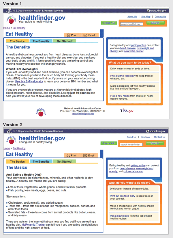
Compare these two Web pages from
healthfinder.gov. Testing showed that users did not read Version 1, where
information was presented in paragraphs of text. However, Web users did read
Version 2, where information was presented in bulleted lists and smaller
"chunks" of text.
Back to top
3.2. Use meaningful headings.
As people scan your Web page, they often will read only
the headings to determine whether the health content is relevant to them. It is
important to make your headings as specific as possible.7,13
- Create a subheading, or "teaser" text,
underneath each heading to give the user additional clues.
In the example above, both the heading and the subheading
start with verbs. This is a good practice to follow when you are writing
actionable content.
 |
When appropriate, try using questions as
headings.7 Use "I" and "me" to reflect
the voice of the user. |
For example, when discussing mammograms, common questions
include:
- How will this benefit me?
- How much does it cost?
- What happens if the doctor finds something wrong?
- How often do I need to get tested?
- Does it hurt?
- Are there any risks associated with the test?
- What if I don't have time?
Make sure your headings don't "float" on the page. There
should be more space above a heading than between the heading and the text that
follows.7 The goal is to create discrete
chunks of content that comprise a heading and related text or bullets.
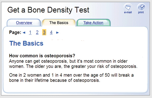
On this healthfinder.gov Web
page, information about osteoporosis is organized using questions as headings.
There is more space before the heading than after, creating clear "chunks" of
text.
Back to top
3.3. Use a familiar font in at least
12-point type.
There are two categories of fonts: serif (with "arms and
feet") and sans serif (without "arms and feet").


Example
- Arial is a sans serif
font.
- Times New Roman is a
serif font.


There has been much debate about whether serif or sans
serif fonts are easier to read online. Most usability and literacy experts
recommend using sans serif fonts such as Arial or Tahoma.3,7 Because sans
serif fonts are commonly used on the Web, they are more familiar to users.
Pay attention to font size. A small font size is more
difficult to read, especially for users with limited literacy skills and older
adults.
- Use at least a 12-point font. If many
of your users are older adults, consider using a 14-point font.3,7,8

- Let users adjust the size of the text
on the page.7 Web designers can enable
this feature by using relative type size. However, it's important to test out
your Web page with different font sizes to make sure it's still easy to read
and navigate.
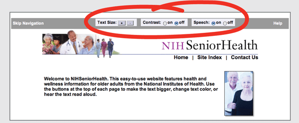
NIH SeniorHealth includes a
toolbar on every page that lets users change the text size, adjust color
contrast (colored text on a black background), and activate a screen reader
that reads aloud the text on the page.
Back to top
3.4. Use white space and avoid
clutter.
Clean, crisp Web pages are easier to read.7,13 They are also
less distracting and less overwhelming for people with limited literacy skills.
- Use white space inside your main
content area to break pieces of information into chunks. Leave space between
sections of text and around images and buttons.
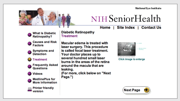
This page from NIH SeniorHealth
includes space around the image and "Next Page" button, which helps the site
look clean and uncluttered.
Back to top
3.5. Keep content in the center of the
screen and above the fold.6,7,13
Many users with limited literacy skills don't scroll. This
means they are only seeing the content in the center of their screen.4,5,15,18,20
- Make an effort to keep text above the
fold. "Above the fold" means that the text can be read without scrolling down.
If you need to continue text below the fold, provide strong visual cues to
prompt users to scroll down the page for more information.
|
View your Web site using different monitors and
browsers to see how your content displays on the screen. |
Caution: Horizontal lines or large sections of
white space at the bottom of the screen are sometimes mistaken for "false
bottoms" and stop people from reading further.7
Back to top
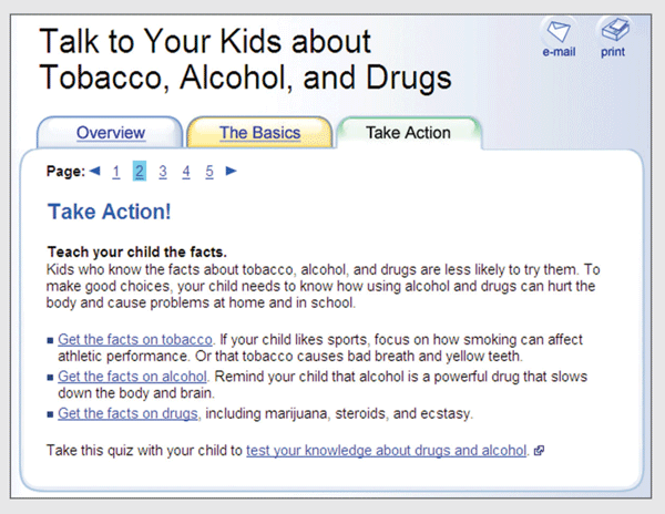
3.6. Label links clearly.
Users with limited literacy skills tend to click on links
rather than read the content on a page; this is sometimes called "link
hopping."4
Link directly to tools and resources that supplement and
support your text.16,34 Avoid linking to pages with redundant
content. Instead, allow users to "drill down" for more detailed
information.12,16,34
- Limit the number of links on a page.
Here are four rules to follow when including links on a
Web page:
- Make links obvious by underlining them.3,13
- Make links long enough to "grab" easily.3,7
- Use descriptive link labels so there are no
surprises.7,13
- Use action verbs in link titles.3,7
Links on this healthfinder.gov
Web page follow all four rules for link labeling. For each link, readers have a
good idea of what to expect. Avoid these link labels:
- Click here
- Print
- Learn more
Back to top
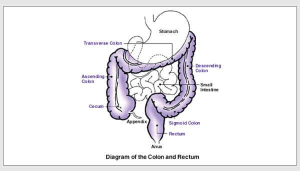
3.7. Use images that facilitate
learning.
Including pictures along with written text can help users
with limited literacy skills find, understand, communicate, and use health
information. 16,17,42–44
This simple line drawing and
caption from CDC.gov explain the location of the colon and rectum.
- Use simple, realistic pictures to
illustrate health behaviors and medical concepts.
Web users prefer photographs of "real" people rather than
illustrations or people who look like models.15 However, when illustrating an anatomical or
medical concept, simple line drawings are often most effective.42
- Include a descriptive caption that
explains the picture.42
Be sure your graphics support your text rather than
detract from it. Busy, bright, or animated graphics are distracting and often
mistaken for advertisements.21
- Use alternative text (called an "alt
tag" or "alt text") to describe graphics for people using screen readers.
Back to top
3.8. Use bold colors with contrast.
Avoid dark backgrounds.
Black text on a white or very light background is the
easiest to read.7,13 Keep the background clear (avoid patterns
and images).
Back to top
3.9. Make your site accessible to people
with disabilities.
All Federal Government Web sites must be accessible to
people with disabilities. This is often called Section 508 compliance
(referring to Section 508 of the Rehabilitation Act).45
Design a Web site that works for everyone. Here are a few
of the important considerations addressed under Section 508:
- Make sure screen readers and other
software can read your site.
- Choose strong color contrast,
especially for buttons.
- Test plug-ins and other software for
accessibility.13
To learn more about accessibility, visit
www.w3.org/WAI
 or www.section508.gov/.
Back to top
Iterative Design Methods and
Tips
Methods
- Prototypes
- Usability testing
Tips for designing and testing your Web site with users
- Conduct user testing with paper or
clickable prototypes. If you build a clickable prototype, gauge how much
content can fit on a screen. Experiment with heading sizes, space, and color
contrast.
- If you are using a clickable prototype
or developmental Web site for usability testing, be on the lookout for dense
chunks of text that trigger skipping.
 |
Refer to Research-Based
Web Design & Usability Guidelines (PDF, 20.64 MB) sections:
3:1; 3:5; 6:1; 6:3; 6:5; 6:10; 6:11; 9:1; 9:2; 9:3;
9:4; 10:1; 10:3; 10:6; 10:9; 10:14; 11:1–8; 11:10; 11:11; 12:4; 14:8;
14:15; 14:16; 15:6; 16:2; 16:4; 16:6 |