4. Organize Content and Simplify Navigation
Introduction
This section discusses 2 important concepts related to the structure of
a website on devices of every size.
Content Organization (also called Information Architecture) is the
way information is categorized on a website. It typically involves a
category structure (taxonomy) and labels. Think about browsing through a
bookstore—clearly labeled sections (like Mystery, Nonfiction, and so
forth) help you find what you’re looking for. Good content organization
helps users find information quickly.
Navigation refers to how users move through the pages of your
website. Elements of navigation include menus, tabs, headers,
breadcrumbs, sitemaps, and “Back” or “Next” buttons.
It’s important to keep content organization and navigation simple and
consistent. Users are typically topic
focused.24,30 Organize and label your
content according to your users’ needs, and make sure you use terms that
are familiar to them.
4.1 Create a simple and engaging homepage.
Research tells us that web users with limited literacy skills have a
hard time processing more than 1 concept at a
time,7,34,50 so
make sure your homepage is a simple, focused entry point to the content
on your site. This is also valuable when designing for mobile—or even
better, responsive—websites.
Keep your homepage as simple as possible.
Limit the amount of text on the homepage.30
Figure 4.1
In usability testing, limited-literacy users were more
successful using healthfinder.gov’s mobile-optimized homepage because it
had fewer distractions than the desktop version.
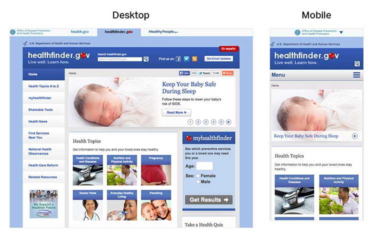
A useful homepage is mostly links and short descriptions.24,30
Well-designed homepages include lots of white space and large buttons.
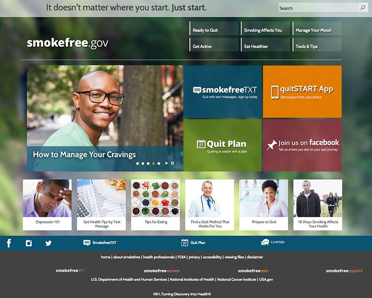
Figure 4.2
The smokefree.gov website is simple—it doesn’t have too much
text, it’s made up of mostly buttons to get users to more content, and
it has a large search feature.
If you include information in more than 1 language, link to the
non-English sections directly from the homepage. It’s also important to
link to non-English sections from a universal menu bar—that way, if
users find your content using a search engine, they’ll be able to find
additional non-English content.
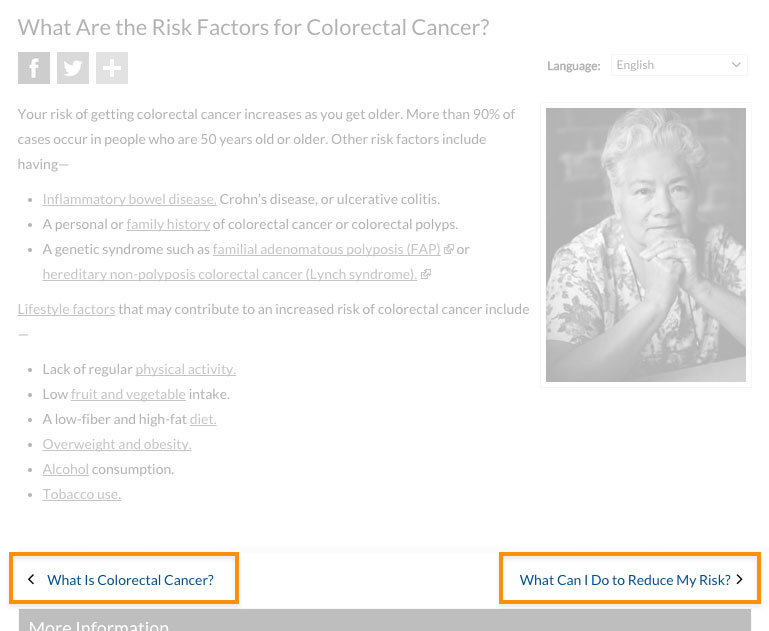
4.2 Label and organize content with your users in mind.
Use words your users know instead of technical or “catchy” terms.24
Remember, your goal is to help users find what they need as quickly as
possible.
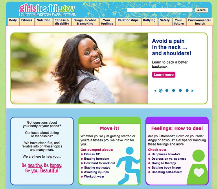
Figure 4.3
This page from the Office on Women’s Health includes a
navigation bar with audience-appropriate category labels (the site is
for girls ages 10 to 16). For example, the mental health section is
labeled “your feelings,” rather than a technical term.
People have different mental models (methods) for grouping health
information.36,40 To help different
users find what they need, repeat topics under multiple categories. For
example, based on card sorting, content on mammograms appears under 3
categories on healthfinder.gov: Cancer, Women, and Doctor Visits.
Try this
Next time you need to prioritize, rank, or organize types
of content on your site, try card sorting with your users.
Card sorting is a user-centered design technique used to organize
content intuitively. Start by creating an index card for each page of
your website. Then ask people to sort the cards into groups. This will
tell you how users expect to see content organized and labeled on your
site.
Alternately, you can have participants rank cards in order of importance
or interest. In card sorting exercises conducted by ODPHP, users with
limited literacy skills prioritized the following types of health
information as most useful:
- Basics I need to know (Understanding)
- I would like to learn more (Assessment)
- I can do this (Overcoming barriers)
- How will this help me? (Motivators)
- Ways I can take action (Strategies)
- Where can I go for help? (Community resources)
Learn more about card sorting on
usability.gov.
4.3 Create linear information paths.
Linear information paths can help web users with limited literacy skills
learn, understand, and move through content on your
website.8,28,38,80
Each topic or section of a site has its own linear path. This path
guides users through the section using a series of pages or screens. On
the first page, give the user a short overview of the content. On each
page in a section, include a button or link that takes users to the next
page. That way, users can move easily along the linear information
path.28,30,35,36,49,50
Figure 4.4
CDC uses links to help users navigate linearly through content.
If you can’t split content into logical chunks, keep it on a single
page.81 It’s better for web users to scroll than to
click through a series of pages without any clear logic.81 Be sure to
put the most important information at the top of the page.
Figure 4.5
healthfinder.gov content is split into short, meaningful chunks
so that users can move through the content without getting overwhelmed.
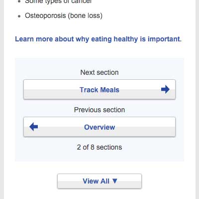
4.4 Give buttons meaningful labels.
Include buttons or links with labels that tell users where they will go.
Web users will click through if you give them reason to believe the
click will lead them toward their goal.81
Skip page numbers or generic labels, like “Next” or “Back.”81 Instead,
use specific labels, like “What is cholesterol?” or “Back to the
homepage.”
Figure 4.6
In a study of healthfinder.gov mobile usability, users missed
the clickable page numbers. Instead of page numbers, healthfinder now
uses buttons with more meaningful labels.
4.5 Make clickable elements recognizable.
Users get frustrated when clickable elements—like buttons and links—are
difficult to spot.
Design buttons that are easy to find.
Make them:
- Large
- Bright
- A contrasting color from the surrounding text and background
- Obviously clickable30,35,36,50
Buttons that are obviously clickable have borders and shadows. If you’re
using a site design that doesn’t include borders and shadows, give
buttons a rectangular shape and rounded corners.66
Figure 4.7
The buttons on CDC’s homepage look clickable because of their
shape.
Make button labels easy to understand.
Use a label such as “go” or “get started.” Some users with limited
literacy skills don’t understand the term “submit.”
Make buttons look distinct from other elements.
Users get confused when non-clickable elements look like buttons, so
avoid giving headings a background color or including lots of colorful
boxes on a page.66
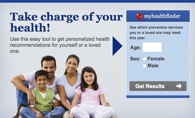
Figure 4.8
The myhealthfinder “Get Results” button clearly tells users to
click to start finding the preventive services they need. Clickable
buttons and icons have a unique style that’s distinct from other
elements on the page.
Apply clear visual cues to links.
Make it clear that links are clickable—avoid making users mouse over
text to see if it’s clickable. For example, make links blue or another
color that stands out from the body text.66 (See section 3 for more
information on making links look clickable.)
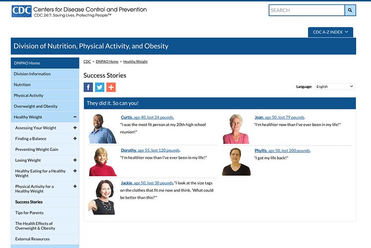
Figure 4.9
Links on CDC’s Healthy Weight Success Stories page are blue and
underlined, which sets them apart from the surrounding text.
Make all link elements clickable.
Make all elements—for example, a picture, icon, and text—that are
related to each other clickable. Users find it easier to click on a
large target area.66 If you’re using an icon for a link, combine it with
another visual cue, like a text label.66
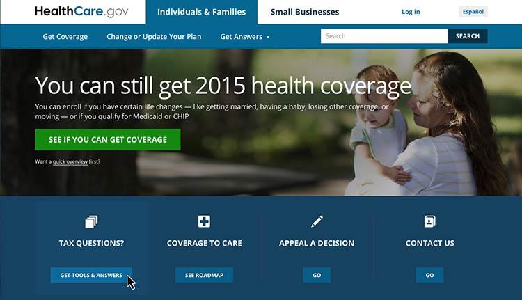
Figure 4.10
Users can click the button, the icon, or anywhere in the box to
get answers to tax questions.
Be consistent.
Whatever button or link style you choose, apply it consistently across
your website.66
4.6 Make sure the browser “Back” button works.
Web users with limited literacy skills often depend on the “Back” button
to navigate a website,41 so it’s very important that
this button works predictably and consistently.
For example, when users enter data into a registration page or form,
make sure that the information isn’t deleted if users click the “Back”
button.
4.7 Provide easy access to home and menu pages.
Web users want the option to start over or jump between pages.11
However, we know that users with limited literacy skills typically don’t
use breadcrumbs.30,35 In ODPHP usability testing, users with limited
literacy skills were also unlikely to click on a logo in the site header
to get to the homepage.
With this in mind, include large buttons that take users back to the
homepage or the main menu pages on the site.30,35,39
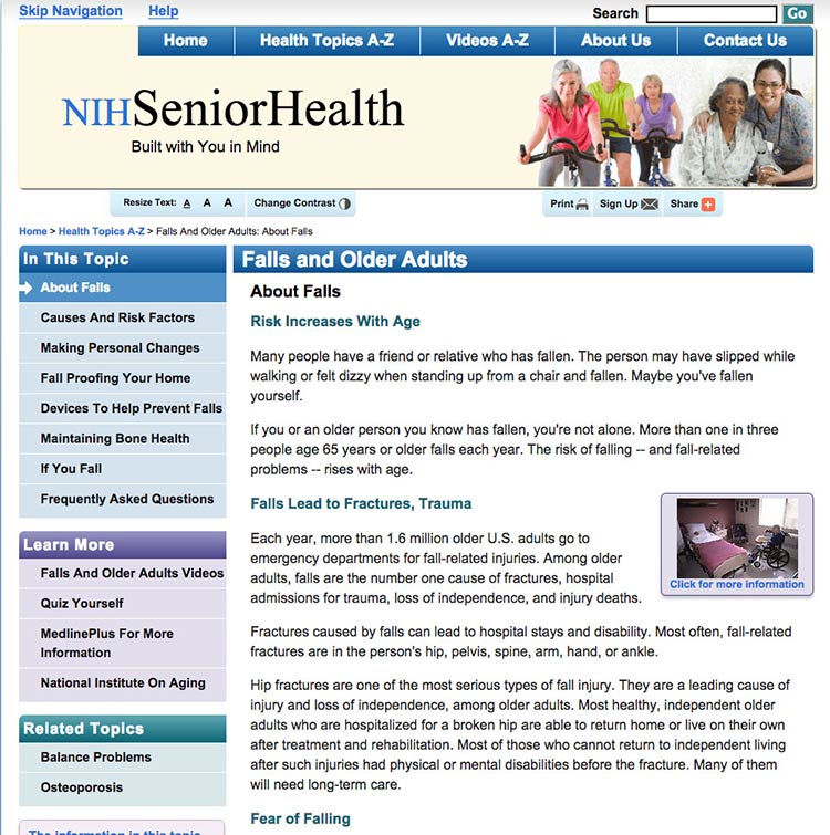
Figure 4.11
NIH SeniorHealth uses a strong left-hand navigation menu. The
current section is highlighted with a different color in the navigation
bar so users can easily see where they are in the site.
Use a menu button for mobile.
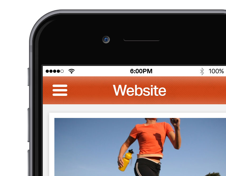
Mobile devices have limited space. Instead of using a left-hand
navigation menu on mobile, add a menu button that opens a custom,
mobile-optimized menu. That way, users can expand the menu as needed.
Allow mobile users to go back to the homepage by including a home button
or a home option in the menu.
Users appreciate when they don't have to retrace their steps but can instead start fresh on the homepage.
 Quote
Quote
“I like the “Home” button because it lets me correct mistakes
more easily.”11
Don’t rely on the “hamburger button” as a navigation cue—research
suggests that users don’t find it intuitive.81
Instead, try using the word “menu.”
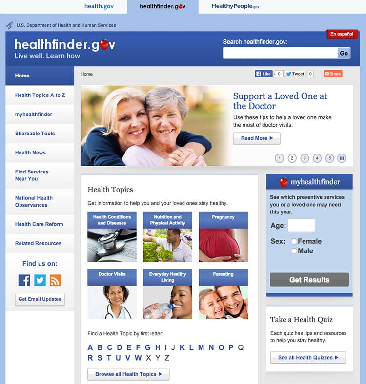
4.8 Give users options to browse.
Many users with limited literacy skills will browse through categories
of content instead of using a search box.8,28,34,39 This may be because
they:
- Don’t see the search box (many users with limited web experience don’t
know where to look for a search box)
- Are worried about spelling mistakes
- Are overwhelmed by search results
- Don’t understand placeholder text in search boxes
Include multiple ways to browse for topics (for example, by topic
categories in an A to Z list).
Figure 4.12
The healthfinder website allows users to search for health
information by topic categories, A to Z list, or search box, or by using
the left menu navigation.
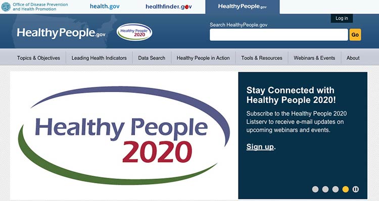
4.9 Include a simple search function.
Web users with limited literacy skills are more likely to use a search
function that’s simple and user-friendly.
Make your search function easy to locate and use.
Use a large text box with obvious buttons.15
Use a “get started” or “go” button next to your search box.
During usability testing conducted by ODPHP, some users with limited
literacy skills clicked a “search” button without entering any terms in
the search box.49 A clearly labeled button will signal users that they need to enter a term(s) first.
Figure 4.13
The Healthy People website has a large search box and prompts
users to submit their search request with a “go” button.
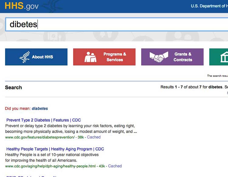
Allow for common misspellings.8,30
Spelling is difficult for limited-literacy
users,3,10,15 so make sure your
search engine will still work if users make a spelling mistake. Help
users search by providing spelling and autocomplete
assistance.3,10,15
Figure 4.14
HHS.gov uses autocomplete to help users with spelling, and if a
search term is misspelled, the results recommend a word using “Did you
mean...”
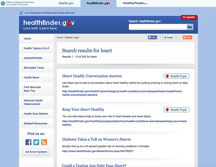
4.10 Display search results clearly.
To streamline users’ search experience, display the most relevant
results first.15
Figure 4.15
The health.gov search function lists relevant health
topic results before related news results. Users usually find the most
helpful information in health topics.
When displaying search results:30
- Limit the number of results displayed on a page (unlike content-heavy
pages, use numbered pages to avoid scrolling)8,30
- Use clear page titles and include a brief plain language description of
each result8,15,30
- Avoid using long URLs if you can
- Use keywords in URLs when possible to help users scan
- Include lots of white space between results
- Use a large, easy-to-read font
- Highlight search terms in the results15
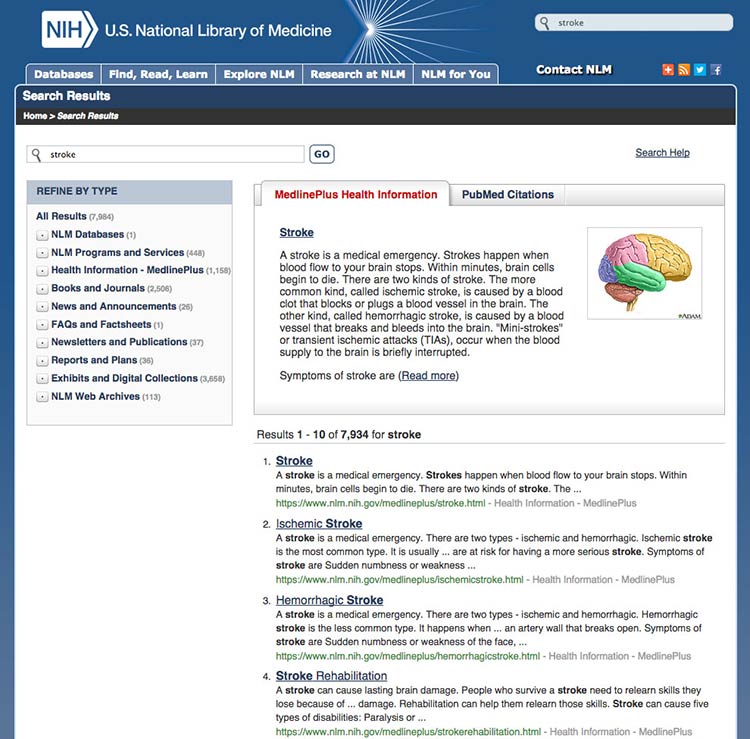
Figure 4.16
This search results webpage from MedlinePlus displays clear
titles and short URLs for the linked results. A brief description
written in plain language appears above the top results. Only 10 results
show per page.
Summary
Before users can read your web content, they need to find it. Construct
simple and consistent navigation that uses familiar terms, and organize
your content in a way that makes sense to your users. Give your users
options, like search- and topic-based browsing, so they can navigate
your site on any device in the way that’s easiest for them.
When your site is organized well, users can quickly and easily find the
information they’re looking for—and they’re less likely to get
frustrated and give up altogether.
In the next section, we discuss strategies for engaging your users with
multimedia and interactive content.