Foreword by Dr. Karen B. DeSalvo, MD, MPH, MSc
As content writers and developers of consumer digital health information tools, you are faced with the difficult task of imagining what your end users will find understandable and actionable. There are a number of strategies that can help (e.g., use cases, personas, and user requirements) to make your tools more user friendly. But these strategies cannot always close the experience gap that exists between writers and developers and their end users. That is why user research is so important. It can provide insights into how users interact with and understand digital health information. This guide provides actionable steps for creating more accessible consumer-centric digital tools that have the potential to ease the burden of navigating complex digital health information.
The Office of Disease Prevention and Health Promotion (ODPHP) within the U.S. Department of Health and Human Services (HHS) has developed this 2nd edition of Health Literacy Online: A Guide to Simplifying the User Experience, an updated version of the 2010 guide, to help bridge this gap. Derived from extensive research with more than 800 users, this updated guide offers practical insights into a full range of users’ navigation experiences, particularly those who struggle with reading and health literacy, and can be used to help create intuitive, easy-to-use digital health information tools.
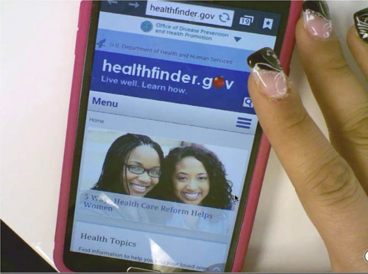
This 2nd edition of Health Literacy Online is aligned with the President’s Digital Government Strategy, which calls for new and better ways to deliver digital information and services anytime, anywhere, and on any device. Since its conception, Health Literacy Online has informed the responsively designed healthfinder.gov, an award-winning website developed by ODPHP that reflects the commitment of HHS to improving health literacy and democratizing access to health information technology. The recommendations in Health Literacy Online serve as a roadmap for achieving the Healthy People 2020 objectives to increase the proportion of quality health-related websites (Objective HC/HIT-8).
We cannot know for sure the level of health literacy of those who will visit our websites, in what context they will access them, or what device they will be using. We can, however, be ready for them. We do this by designing digital health information tools that are broadly accessible and available to all Americans because they have been designed with them in mind.
Thankfully, we have practical guidance like Health Literacy Online to help us in this mission.
Karen B. DeSalvo, MD, MPH, MSc
Acting Assistant Secretary for Health
U.S. Department of Health and Human Services
About
About Health Literacy Online: 2nd Edition
Health Literacy Online is about broadening access to user-friendly
health information and services on the web. This research-based guide
discusses why and how to design health websites and other digital
health information tools for all users, including the millions of
Americans who don’t have strong reading or health literacy skills—as
well as those who don’t have a lot of time to find, process, and use
complex health information.
It’s written for anyone involved in creating online health content, from
start to finish—writers and editors, content managers, digital
strategists, user experience strategists, web designers, developers, and
others. The strategies and tips can also be applied widely across
disciplines.
Why This Guide
Many web users struggle with even the most basic tasks—for example,
using a search function, navigating from a drop-down menu, and scanning
a webpage for relevant information. This may not matter too much in the
context of an online news article or confusing eCommerce site. But the
stakes are raised considerably when a person is trying to sign up for
health insurance, learn about a new medical diagnosis, or look up how to
correctly install a child safety seat. And today, these activities are
more likely to occur online than off.
How easily users can accomplish health-related tasks online depends
largely on the quality of the websites we create. This guide represents
more than a collection of recommendations; it reflects an approach to
responsible digital design and development that:
- Prioritizes the information needs and preferences of consumers
- Involves end users as co-creators of web products
- Responds to small and large screens—and all sizes in between
- Recognizes that designing for limited-literacy users is designing
for all users
A Note on the Research
The first edition of Health Literacy Online (2010) synthesized lessons
learned from ODPHP’s original research with more than 700 web users and
the small but growing body of literature on the web experiences of users
with limited literacy skills.
In this second edition, we’ve updated the recommendations to reflect
findings from a more robust body of literature related to the cognitive
processing and online behavior of adults with limited literacy skills
(see section 1), as well as additional original ODPHP research conducted
during the past 5 years. As with the first edition, we build on the
principles of web usability described in the Research-Based Web Design
and Usability
Guidelines
developed by HHS in partnership with the General Services
Administration.
In addition, we’ve included new considerations for mobile devices. A
growing subset of Americans only access the web via a phone or mobile
device, and many of these users are likely to have limited literacy
skills. Like the rest of the recommendations in the guide, the
guidelines for mobile are based on best practices in the literature and
original testing conducted by ODPHP. Fortunately, many of the strategies
employed to improve the online experience for users with limited
literacy skills—such as putting the most important information first and
simplifying navigation—are the same best practices for mobile devices.
In section 6, we offer specific tips for involving web users with
limited literacy skills in the design and testing of health websites.
Throughout the guide, we incorporate quotes from web users with limited
literacy skills who participated in our usability studies. These quotes
speak to the valuable role web users play in writing and designing
effective websites.
Health Literacy Online: Key points
- As many as half of U.S. adults have limited literacy skills. Even
more Americans—up to 9 in 10—have limited health literacy skills.
- Literacy skills affect how people find, understand, and use
information on the web. Users may get distracted easily, give up
quickly, and struggle with dense text and complex navigation. This
is true across devices.
- The simple strategies described in this guide—like increasing font
size and using bulleted lists—can break down literacy-related
barriers and increase a user’s odds of success.
- Designing with limited-literacy users in mind results in health
websites that are easier to use for everyone.
1. What We Know About Users with Limited Literacy Skills
Introduction
There’s a growing body of literature related to the cognitive processing
and online behavior of adults with limited literacy skills. In this
section, we outline what we know about how literacy can affect a user’s
ability to read, process information on a screen of any size, and
interact with technology.
The bottom line: Literacy skills can impact virtually every aspect of
using the web.
1.1 Reading and cognitive processing challenges
Cognitively speaking, reading is a lot of work—it involves both decoding
and understanding text. First, a user has to “decode” the text by
assigning meaning to the words. Next, a user has to comprehend the text
by stringing the words together to understand what the author is trying
to communicate in a particular sentence or
paragraph.1,2,3
Users with limited literacy skills have more problems with short-term
and working memory than users with higher literacy
skills.4 They may struggle to decode challenging words
and remember their meanings.3 If a webpage has a large
amount of content, users may not be able to remember it all.
Furthermore, what they do remember may not be the most important
information.
Users with limited literacy skills often describe themselves as reading
well or very well.3,5 However, data from
eye-tracking and usability studies paint a different picture.
According to these studies, users with limited literacy skills generally
read more slowly, and reread words, sections, or elements on a website
(like buttons or menus) in order to understand them.3
And depending on the situation, limited-literacy users may:
- Skip words or sections, or start reading in the middle of a
paragraph3,7,8,9
- Try to read every word because they can’t effectively scan and draw
meaning from
content3,7,10—this is
more common when users are reading something very important and they
feel the stakes are high
These strategies used by users with limited literacy skills reinforce
the importance of creating simple content that won’t overwhelm readers
with too many words. Dense “walls of words” can trigger limited-literacy
readers to skip content altogether—or they may try to read every word on
the page while struggling to understand what they’re reading.
Additionally, online forms present a unique set of challenges for
limited-literacy users. Users need to read the instructions and the form
field labels, and then either spell the answers to questions or read and
select from multiple-choice answers.3 This is a lot to
ask from users with limited literacy skills.
Figure 1.1
Gaze path of a reader who does not have limited literacy skills skimming a page.
Figure 1.2
Gaze path of a user who has limited literacy skills reading (and re-reading) every word.
Figure 1.3
Gaze path of a user with limited literacy skills reading only the text that looks easy to read.
1.2 Understanding navigation
When navigating a website, users with limited literacy skills tend to:
- Get distracted by extra words and elements of a website (like links
and icons)3,11
- Navigate in a linear fashion and backtrack
frequently4,10
- Choose the first answer they find, without checking if it’s
correct—and have a hard time telling the difference between high-
and low-quality
information3,10,12
- Have trouble recovering from mistakes10
When reading, users with limited literacy skills focus on the center of
the screen. Once they shift their focus from the navigation to the
center of the screen, they’re unlikely to look back to the navigation to
solve a problem or change course if the content isn’t meeting their
needs.10,13
1.3 Using search
Using a website search function can be challenging for people with
limited literacy skills. Typing in a search term requires (somewhat)
accurate spelling—and some search engines help with spelling better than
others. Reading and comparing search results to identify the best option
is a cognitively challenging task.
As a result, compared with users with advanced literacy skills, users
with limited literacy skills:
- Spend more time on information search
tasks3,10
- Are more likely to give up if they can’t find information
quickly10
- Have a hard time thinking of search terms14
- Tend to only click 1 or 2 links in the search
result14
- Add terms to refine a search instead of changing their search
strategy15
The ways people with limited literacy skills tried to find information
differ from user to user.10
Example
In previous healthfinder.gov usability testing, the team observed 5
users while they searched for information in 5 completely different
ways. Some used the left navigation menu, while others used the homepage
buttons or the search bar.
1.4 Mobile considerations
Users with limited literacy skills are likely to access the web on
mobile devices—more than 90% own a mobile phone.16 We
also know that users with lower incomes, users with less education, and
minority users are especially likely to access the internet primarily
from their mobile phones.17
Research shows that people with limited literacy skills find it easier
to learn how to use mobile devices than desktop
computers.18
Figure 1.4
When we tested healthfinder.gov on mobile in March 2015, users navigated through health topics much more easily on their mobile devices than on a desktop computer.
Additionally, mobile screens can make reading easier for users with
reading disabilities. For this population, both speed and comprehension
may improve when reading on a mobile screen. Studies suggest this may be
because of line length—lines on mobile devices are inherently
short.19
All of the best practices set forth in this guide enhance mobile
usability. However, there are some specific considerations to take into
account when designing online health information for mobile devices.
Challenges of mobile display
Because we know that so many users with limited literacy skills are
accessing information on mobile devices, it’s very important to consider
the challenges presented by mobile display.
In spite of the fact that many users with limited literacy skills may
ultimately find mobile easier to use than desktop computers, they still
struggle with elements of navigation on mobile devices, like:
- Following hierarchical navigation
- Knowing where to look for information
- Using scroll bars within menus
- Using a single button (like the iPhone menu button) for a variety of
different purposes depending on context
- Using a small keyboard to enter text20
In general, mobile content can be twice as difficult for all users to
digest.21 Part of this is because it’s harder to
understand complicated information when you’re reading on a tiny screen,
like an iPhone.21
Additionally, mobile device users are constantly scrolling because they
can’t see all the information on the page at once. That means users are
moving around the page to refer to other parts of the content instead of
simply glancing at it as they might on a desktop screen. This can
negatively affect users’ understanding.22 The constant
need for scrolling:
- Takes more time
- Diverts users’ attention
- Introduces the problem of reorienting position on the
page22
Summary
It’s critical that we understand and anticipate the online behavior of
users with limited literacy skills—including what kind of devices
they’re using to view web content. Even users with high literacy skills
may find reading and using the web more difficult when they are sick,
stressed, or tired. Designing websites with these behaviors in mind will
make the web a better place for all of us.23
On the journey to better user experience, simplifying content is a
logical place to start.
In the next section, we cover the basics of writing actionable, engaging
plain language content for the web.
2. Write Actionable Content
Introduction
Writing for the web is different than writing for print. Most web
users—including those with limited literacy skills—are looking for
specific information or an answer to a question.24 They
typically don’t stay very long on a page. In fact, the average time
spent on a page is usually 15 seconds or
less.24,25,26
When it comes to health information, web users want to quickly and
easily do 2 things:
- Understand the health problem or behavior
- Find out how to take action—in other words, what they can do to change
their behavior or address the
problem27,28,29
Content is the most important element of your
website.24,30 No matter what the literacy
level of your audience is, always aim for health content that is:
- Brief and to the point
- Actionable and engaging
When you write actionable content, it means that you’re focusing on
health behavior: tell users what you want them to do and give them steps
to do it.
Engaging users means presenting content in a way that motivates them to
take action. Examples of engaging content include:
- Interactive tools
- Checklists
- Conversation tools
High levels of engagement with online health information can lead to
health behavior change.31
Remember, plain language alone is not enough. If you want users to
adopt healthy behaviors, you also need to write actionable health
content.
2.1 Identify user motivations and goals. Why are they here?
Motivation drives the search for health information and influences
users’ performance on a website.32,33
Understanding users’ motivations will help you write actionable,
targeted health content to meet your audience’s information needs and
expectations.
Users want the answer to a question.
Keep in mind that most web users have a specific goal in mind. Usually,
they’re trying to answer a
question.7,8, 24 Conduct
research with your users to find out what that question is—ask them what
they want to know. Then decide on the best way to give them that
information.
You can get basic information about your users online.
The best way to understand users’ motivations is to talk to them, but
you may be able to find some of the basics about an audience—like
demographic information—online. (Learn more about how to conduct
research with users with limited literacy skills in section 6.)
For example, ODPHP’s research identified several common motivations for
users who seek online health information. From this research, we know
that many users go to the web to:
- Learn about a health problem affecting them or someone they know
- Find out whether they have a health problem or reason to be concerned
- Learn how to prevent health problems32,33
Expect users’ motivations to change.
Studies have also found that what’s driving your users tends to
shift—often frequently.24 With that in mind, make sure your content meets
the different goals users may have for seeking health information.
The formula below was developed based on the motivations of users with
limited literacy skills. It’s designed to move users from “I want some
information about a topic” to “I want to do something about it.”
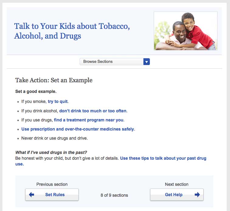
Follow this proven formula for presenting health promotion information:
- Describe the health behavior
- Describe the benefits of taking action
- Provide specific action steps
 Quote
Quote
“Get my attention. Then get to the point.”
2.2 Put the most important information first.30
Many users with limited literacy skills read only the first few words on
a page or paragraph. If they think the content will be easy to get
through, they may keep reading. If they’re overwhelmed and think it
might be too difficult, they’ll skip to a different spot on the
page.7,27,28,34,35,36,37
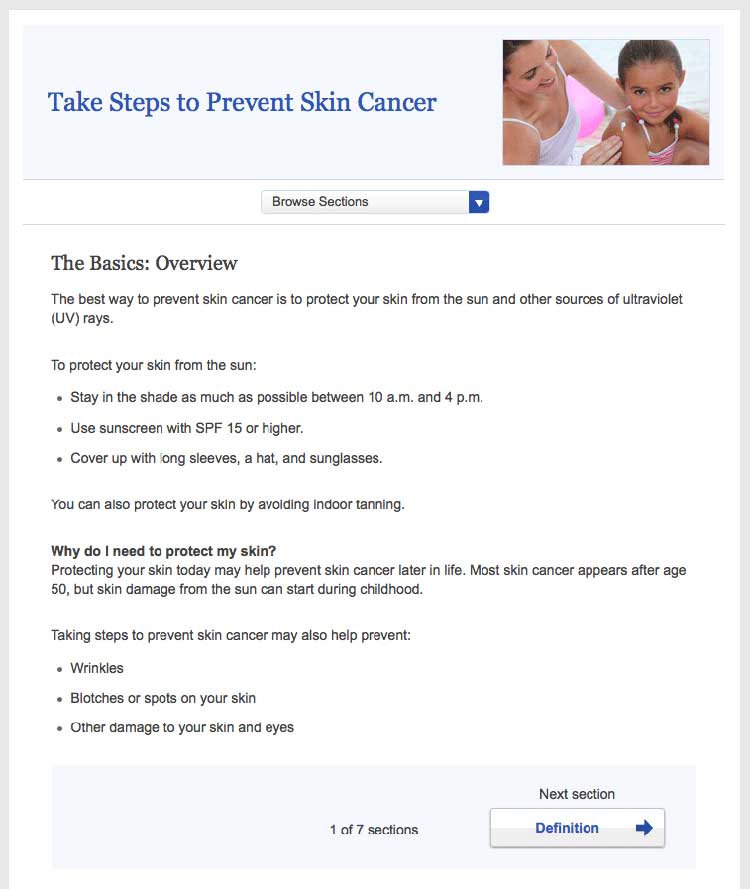
Figure 2.1
This healthfinder.gov topic puts the most important information about preventing skin cancer first. Additional information comes after the basics.
By putting the most important information first, you’re also structuring
your content for mobile users—and for busy users no matter their
literacy level or the device they’re using. Eye-tracking data shows us
that all users tend to read content at the top of a webpage and lose
interest quickly if the information doesn’t seem relevant to them.25
2.3 Describe the health behavior—just the basics.
Start by introducing the behavioral objective. Users want actionable and
specific behavioral
guidance.28,38,39,40 In
other words, tell users both what to do and how to do it. Focus on
behavior rather than background information and statistics. Remember,
it’s important not to overwhelm your users.
Think “need to know” vs. “nice to know.”
Health information doesn’t need to be comprehensive. Instead, usability
research has shown that many users prefer to learn “just the basics”
about a health topic.30 What do your users need to know to take
action? Keep your information direct and to the point. People who are
motivated to find more information will dig further.26
 Quote
Quote
“Just tell me what I need to know.”
Example
- Before:
- Blood pressure is the force of blood against the walls of
your arteries. Blood pressure should be checked often.
- After:
- Check your blood pressure every 2 years, especially if you
are age 40 or older.
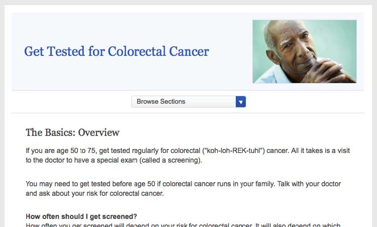
Figure 2.2
The first sentence on this page from healthfinder.gov
includes the behavioral recommendation (regular screenings for people
ages 50 to 75).
 Quote
Quote
“I like this website because it gives you the
information you want right away. It gives you the basics, not too much
to read.”
2.4 Stay positive. Include the benefits of taking action.
Users overwhelmingly prefer a positive tone, so make your case without
being too negative. During card-sorting exercises, users prioritized
information on motivators and overcoming barriers to behavior change —
not information about the risks and barriers
themselves.8,27,29,39,41,42,43,44
Give users motivation to make a change.
Users want to know what they can gain from changing their behavior.
Example
Physical activity can improve your heart health—not to mention help you
feel better in your daily life!
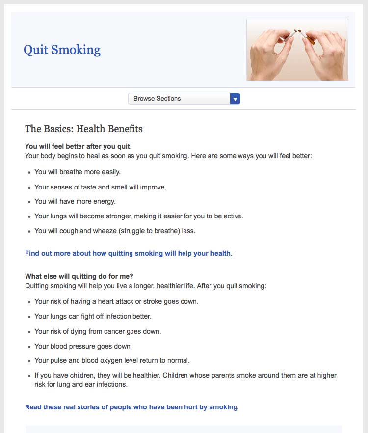
Figure 2.3
This healthfinder.gov page clearly lists the benefits of
quitting smoking instead of focusing on the risks of continuing to
smoke.
Be positive.
Instead of telling people what not to do, give users positive reasons
to change their behavior.
Example
- Before:
- Never ride a bike without a helmet.
- After:
- Wear a helmet every time you ride a bike.
Try this
When choosing language, limit the use of “don’t.” This
automatically sets up negative framing. Additionally, try not to use
“should”—it can sound “preachy” or condescending.
Focus on tips and tools for overcoming barriers—not on the barriers
themselves.
Users need to overcome many perceived and actual barriers on the road to
health behavior change. Be realistic—it’s important to acknowledge these
barriers and continue to offer encouragement and
motivation.45
Example
Quitting smoking is hard, but millions of people have done it
successfully. In fact, more than half of Americans who have ever smoked
have quit. You could be one of them!
2.5 Provide specific action steps.
Give users the tools they need to get started. Users are looking for
action steps, especially things they can do immediately.28,38,39,40,41
It’s not enough to tell users what to do. You also need to tell them
how to do it.
Break behavior into small steps.
Breaking behaviors into small, manageable steps gives users choices
about which steps feel realistic and doable. When possible, lead with
steps users can take right away.
Figure 2.4
This healthfinder.gov page has specific action steps—they’re
concrete and manageable.
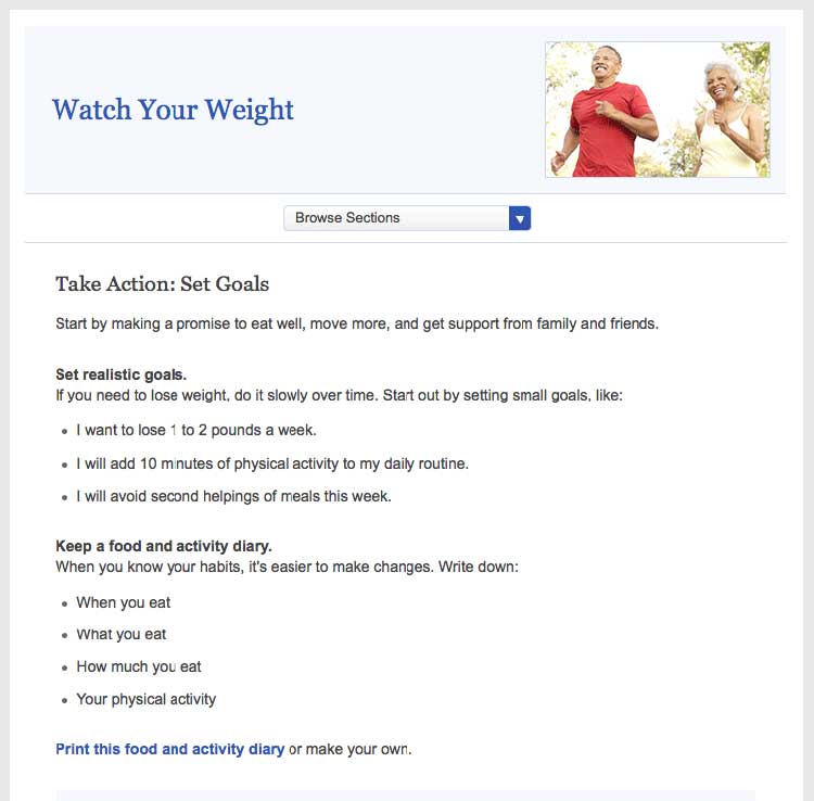
Breaking behaviors into small steps improves users’
self-efficacy.28,38,39,40,41
Try this
Next time you’re creating messages, incorporate personal
stories of people who have made a healthy behavior change to strengthen
your messaging. Storytelling can go a lot further than statistics when
it comes to improving your reader’s self-efficacy. Even adding a single
quotation from someone your reader can relate to can make a big
difference.
Create interactive content.
As part of your action steps, engage users with interactive content like
menu planners, printable checklists, and questions to ask a doctor
(learn more in section 5).
 Quote
Quote
“This is good information because a lot of
times, I take information to the doctor and ask questions about diet
issues, what to avoid, and medications.”
Explain the “why” of the action step.
Tell users the reason behind what you’re asking them to do. This will
help them understand why it’s important that they take the step.
Example
Keep a food diary. Knowing what you eat now will help you figure out
what you want to change.
2.6 Write in plain language.
Developing website content in plain language means that your users will
be able to understand what you’re trying to say the first time they read
it.47
Keep paragraphs and sentences short and simple.47
Try to keep sentences to 20 words and under.30 Try to keep paragraphs
to 3 lines or less.7,24,48
Always use language that is familiar to your
users.7,8,24,27,30,35,49
Avoid jargon terms when you can. Choose language that your users can
relate to.
Use the active voice.
Write in the active voice.47 Writing in the active voice means that
the subject of your sentence performs the action. Active sentences:
- Are more actionable and direct
- Are easier to understand
- Generally require fewer words24,30,37,50
Example
- Passive:
- Tests may be needed to find out what’s wrong.
- Active:
- You may need a test to find out what’s wrong.
Define complex terms.
When introducing a medical term, clearly define the term the first time
you use it. Define the word in context rather than using a glossary or
scroll-over definition.
Example
Your primary doctor may refer you to a neurologist. A neurologist is a
doctor who treats problems related to the brain and nervous system.
Think about whether it benefits the user to learn a jargon term—or if it
makes sense to work around it. For example, a person with epilepsy needs
to know the term “neurologist,” while in a different context it may be
enough to say “specialist.”
If the most accurate word is an unfamiliar medical term, incorporate a
plain language definition into the text the first time you use
it.51 Consider making the definition part of the
sentence or placing it between em dashes.8
Example
The medicine can cause vomiting—throwing up—if you take it on an empty
stomach.
Use everyday examples to explain medical or technical concepts.47
Always choose words and images that your users can relate to.
Example
When you get a mammogram, the nurse will place your breasts between 2
plastic plates and take a picture of each breast.
Write in a friendly, conversational tone.
Formal language can make health content feel less accessible to your
user,37 so write how you speak. Use contractions.52
Use second-person pronouns when you can to speak directly to your
reader.47
 Quote
Quote
“I like [this website] because it’s easy for
everyday people like me to read. No big words or medical terms.”
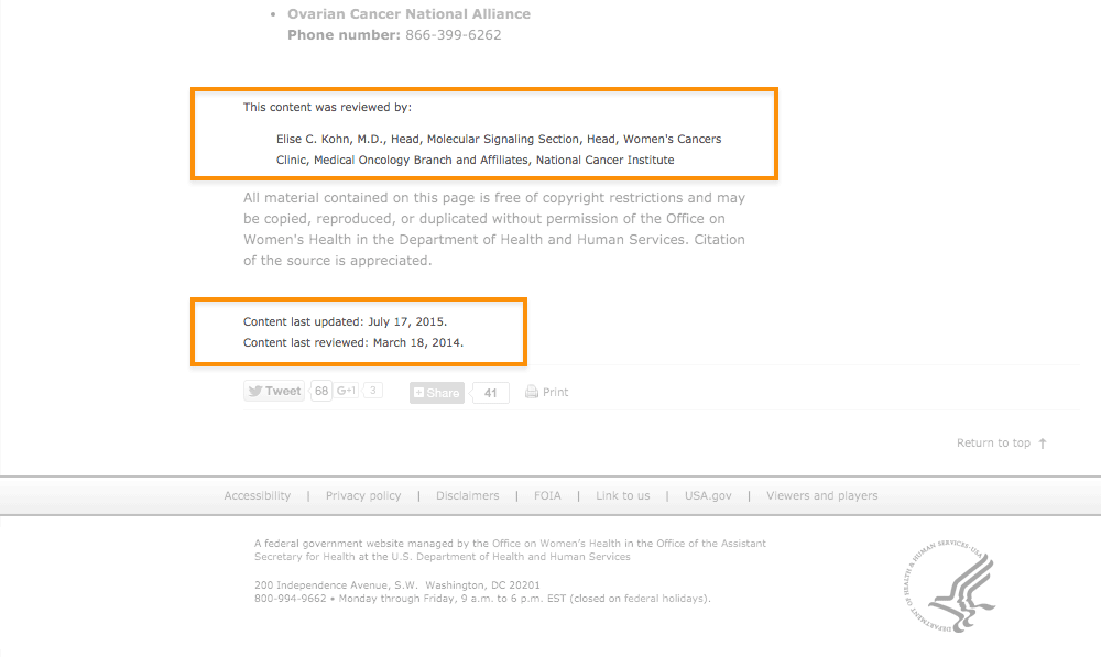
2.7 Check content for accuracy.
Have a subject matter expert or panel periodically review your health
content for accuracy. Post the date the content was last reviewed and
the reviewer’s name and contact information. This gives your content
more credibility with users.
Figure 2.5
The date the content was last reviewed and the name and contact
information of the reviewer are both clearly displayed at the bottom of
this page from the Office on Women’s Health.
Develop a style guide.
Use a style guide to keep your content consistent. Style guides are
especially helpful when writing about something like health—a subject
that includes many topic-specific words and phrases. A content style
guide will help you establish a streamlined set of health-related terms
that users will come to recognize in your content.
A style guide also lays out the rules for writing content for a specific
website. A style guide can help you keep track of grammar, spelling, and
writing preferences. (For example, is it “website” or “Web site”?) You
also can use a style guide to keep track of heading and font size.
A style guide is an evolving document. Writers and editors will likely
add to it over time. Be sure to keep it easily accessible.24 Many
organizations use a wiki for their online style guide because it’s easy
to update and share. (A wiki is a website that allows for the easy
creation and editing of web documents.)
For tips on creating a content style guide, check out this resource
from
digitalgov.gov.
Summary
On the web, and especially on mobile devices, users want to find the
information they need as quickly as possible. Regardless of your
audience’s literacy level, keep your content short and to the point, and
write in plain language.
But plain language isn’t enough—if you want your users to change their
behavior, write health content that’s actionable and engaging. When you
give your users clear action steps—and motivate them with engaging
content like interactive tools and checklists—they’re more likely to
follow through.
In the next section, we discuss best practices for design and layout to
make your content easier to read and give it an approachable, inviting
look.
3. Display Content Clearly on the Page
Introduction
Writing easy-to-read web content is only the first step. If you want
people to understand the content, it needs to look easy to read—both
on desktop and on mobile.
Even health content written in plain language can look overwhelming if
there’s too much text in a paragraph or not enough space on the
page.7,24,35,49
And if your site doesn’t display or function well on mobile, users on
mobile devices may give up before they even get to your content.
Web design and content go hand in hand. Use white space, layout, font,
and color to help users understand the content on your website.
Try this
When developing your health content, imagine you’re
writing for a mobile screen. This will naturally force you to take into
account many of the best practices outlined in this section. By writing
for a mobile display, your content will be simpler and easier to
understand across all screen sizes.
3.1 Limit paragraph size. Use bullets and short lists.
It’s very important not to overwhelm your users with content regardless
of screen size. These principles apply not only to mobile devices, but
to desktops and laptops as well. All of the following can trigger web
users with limited literacy skills to skip over content:
- Dense “walls” of text
- Long sentences
- Paragraphs with multiple numbers in the text
- Long words
- Paragraphs with more than 3 lines7,24,28
The takeaway here is that users will skip information that looks
difficult to read regardless of how simply it’s written or how important
it is.
Additionally, write for users’ limited working memory. Breaking up
content into manageable “chunks” or bulleted or numbered lists can help.
For example:
- Use clear, stand-alone sections or “chunks” of text with
headings.24,30,53
- Make sure each chunk of text has only 1 theme or
idea.54
- Turn sentences into lists when possible.24,30
- If your list has more than 7 items, break it up into several
sub-lists.54
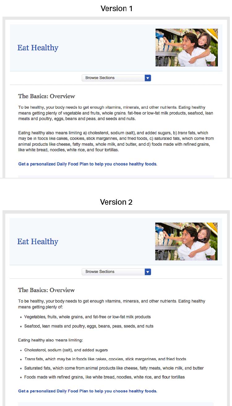
Figure 3.1
Compare these webpages from healthfinder.gov. Users are less
likely to read content presented in long paragraphs of text, as in
version 1. Version 2 is easier to read because it uses bulleted lists
and smaller “chunks” of text.
3.2 Use meaningful headings.
When users scan webpages, they often only read the headings to figure
out if the content is relevant to them. It’s important to make your
headings as specific as possible24,30—try to include keywords to help
users find the information they need.
Including keywords in headings also makes it more likely that search
engines will show your content in search results. Search engines show
sites where keywords appear in the web address, title, page headings,
and links before they show websites with keywords that only appear in
content.
Try this
Start headings with verbs when you can. This helps set you
up to write actionable content.
Use subheadings.
Adding a subheading, or “teaser” text, underneath each heading can give
the user additional clues about what to expect from your content.
Suggestion
Main heading: Get Active
Subheading: Aim for 2 hours and 30 minutes of activity a week.
Consider question headings.
When appropriate, try using questions as headings.24 Use “I” and “me”
to reflect the voice of the user.
For example, when discussing mammograms, common questions include:
- How will this benefit me?
- How much does it cost?
- What happens if the doctor finds something wrong?
- How often do I need to get tested?
- Does it hurt?
- Are there any risks associated with the test?
- What if I don’t have time?
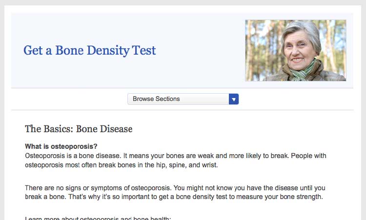
Place headings properly.
Make sure your headings don’t “float” on the page (floating happens when
there’s too much white space above and below the heading). Make it clear
which chunk of text the heading corresponds to—leave more space above a
heading than between the heading and the text that comes after it.24
Figure 3.2
On this healthfinder.gov webpage, information about
osteoporosis is organized using questions as headings. There’s more
space before the heading than after, creating clear “chunks” of text.
3.3 Use a readable font that’s at least 16 pixels.
The font you choose is important because it affects your site’s
readability. Below, we list the most important elements that contribute
to making a font readable.
Size
Choose a font that’s at least 16 pixels, or 12 points. If many of your
users are older adults, consider using an even larger font size—19
pixels or 14 points.6,24 A small font size is more
difficult to read, especially for users with limited literacy skills and
older adults.
 Quote
Quote
“I like when I can read the words without my
reading glasses.”
Set up your site so that users can adjust the size of the text on the
page.24 Web designers can make this possible by using what’s called
relative type size. However, it’s still important to test out your
website with different font sizes to make sure it’s still easy to read
and navigate. Always check how your content looks on a mobile device, as
well—newer, high-resolution screens that render more pixels per inch can
make text look smaller.
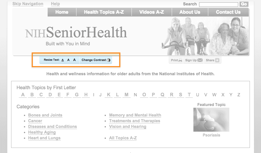
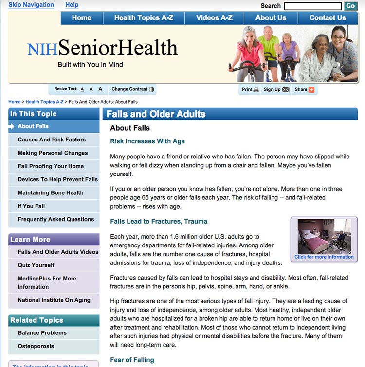
Figure 3.3
NIH SeniorHealth includes a toolbar on every page that allows
users to change text size and adjust color contrast (colored text on a
black background).
Simplicity
Unusual fonts with unnecessary flourishes can be hard to read. Choose a
mainstream font that will feel familiar to your users.30
It’s easier to read text printed in simple, familiar fonts like
Verdana.
Example
Lucida Handwriting
“Regular physical activity is good for your health. Get tips to help you
get more active.”
Verdana
“Regular physical activity is good for your health. Get tips to help you
get more active.”
Also, while you can use a different font for headings and body content, don’t use more than 3 fonts on a page. Use fewer, simpler fonts to make your page look more cohesive.55
Serif or sans serif?
There’s been a lot of debate about which type of font is easier to read
online—and overall, the research is inconclusive.30,56
However, some evidence suggests that serif fonts may make reading on the
web more difficult for users with reading
disorders.56,57
The bottom line: Choosing sans serif fonts is best practice when writing
for the web.24,57,58 Use a familiar sans serif font like
Verdana, Lato, Open Sans, Proxima Nova, or Source Sans.
Line height
Line height (also called leading) is the vertical distance between lines
of text. Common line heights in word processing include:
- “Single spaced” (line height of 100%, equal to the font size)
- 1.5 lines (line height of 150%, equal to 1.5 times the font size)
- “Double spaced” (line height of 200%, twice the font size)
Some word processors—and many web design programs—will give you even
more options.
To maximize readability, use a line height that is 130% to 150% larger
than the font size.56 This helps keep users with limited literacy
skills from losing their place in the text as they start reading a new
line—and makes it easier for them to use their fingers to help keep
their place.
Example
It’s best to specify leading of about 140% (the middle option
below).59
100% Leading
“Making small changes to your eating habits can make a big difference
for your health. Here are some tips and tools you can use to get
started.”
140% Leading
“Making small changes to your eating habits can make a big difference
for your health. Here are some tips and tools you can use to get
started.”
200% Leading
“Making small changes to your eating habits can make a big difference
for your health. Here are some tips and tools you can use to get
started.”
Line height is also an important consideration for mobile users. When
paragraphs or bulleted lists include multiple links, extra height
between lines helps ensure that users have enough room to tap the item
they want.60
3.4 Use white space and avoid clutter.
Clean, uncluttered webpages are easier to read24,30—they’re less
distracting and less overwhelming for everyone, especially people with
limited literacy skills and very busy users.
Use white space in your content to break information into chunks. Leave
space between sections of text and around images and buttons.
Figure 3.4
The CDC.gov homepage includes space around the logo and search
box, and under the banner image, which helps the site look clean and
uncluttered.
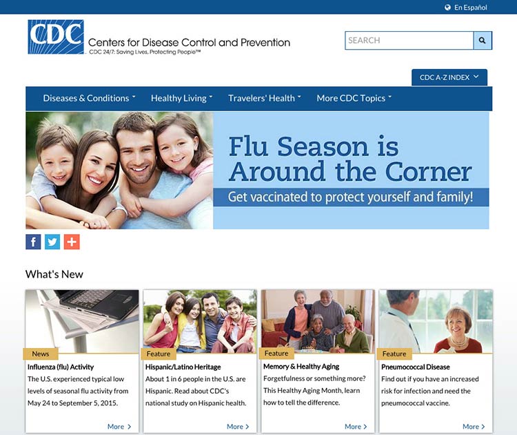
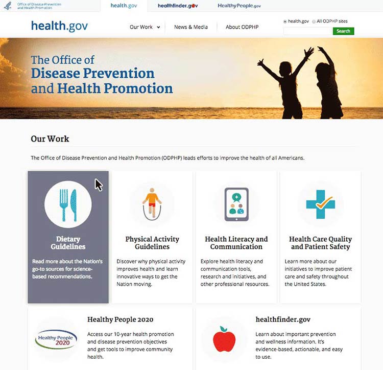
Figure 3.5
The health.gov homepage also has a very clean look with lots of
white space.
White space around site features also helps mobile users interact with
buttons and links without accidentally tapping the wrong place.
3.5 Keep the most important content above the fold—even on mobile.24,30,61
Users spend the most time looking at content they see
first,62 so make sure the most important and compelling
content appears above the fold. Users also judge the content they can
see to decide whether it’s worth scrolling down to see more.62
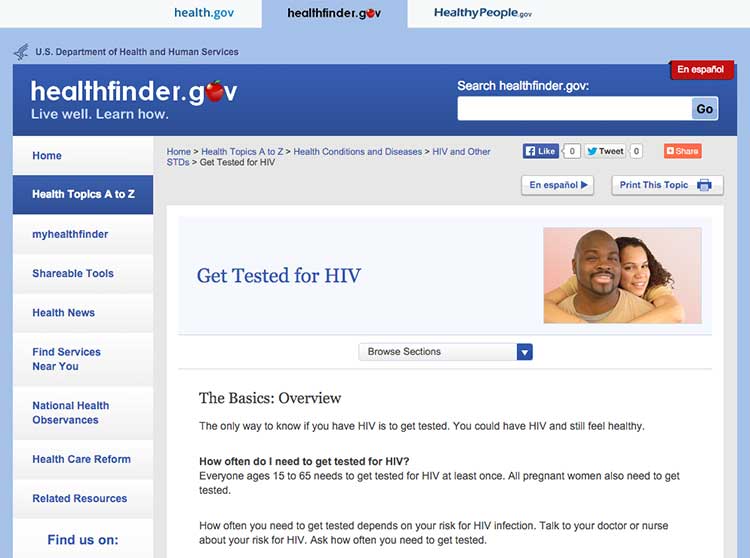
Figure 3.6
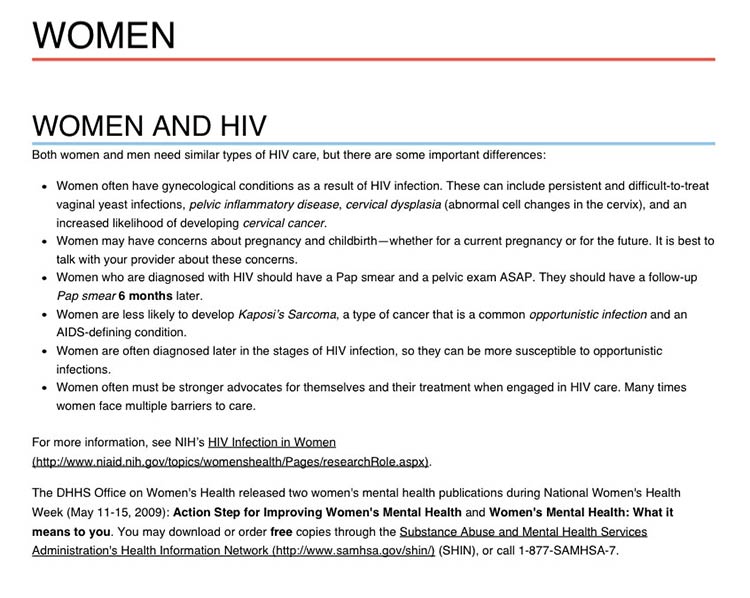
The most important content in this topic about getting tested
for HIV is visible above the fold.
Keep in mind that low literacy readers may have trouble with
scrolling—eye-tracking data shows that the need to scroll makes it more
likely that they’ll skip content as they try to find their place again
to continue reading. That’s why it’s important to minimize scrolling
when you can.63
If your content continues below the fold, the best cue to let users know
they need to scroll down is a paragraph of text that crosses the scroll
line.64 However, it’s very challenging to ensure that
this will display consistently on different screen sizes—so you may want
to consider using a scroll arrow or scroll bar
instead.65
Try this
View your website using different monitors, browsers, and
devices to see how your content displays on the screen.
Finally, be aware that users may mistake horizontal lines or large
sections of white space at the bottom of their screen for the end of a
webpage. That’s a good reason to look at your site on many devices and
screen sizes. If you find either of these at the bottom of a page,
consider making some changes—“false bottoms” might stop people from
seeing all of your content.24
3.6 Use links effectively.
The ability to link to related content is a major benefit of writing for the web. Below, we list some strategies for using links effectively in your online health content.
Limit the number of links on a page.
Users with limited literacy skills sometimes click on links instead of reading content on a page.7 Limiting how many links you have on a page can help prevent too much “link hopping”.
Think about links as exit points—include them only in places where you really want your users to exit.
Link directly to tools and resources that support your
content.28,40
Include links that allow
users to “drill down” for more detailed
information8,28,40—avoid linking to pages with
redundant content.
Here are 3 rules to follow when writing links on a webpage:30
1. Make links long enough to “grab” easily.24,50 If
your link is too short, it may be hard for users to tap or click on the
right part of the screen to select the link.
2. Use descriptive link labels so there are no surprises.24,30
Descriptive link labels tell your user what to expect from a link. Users
should never be surprised by what they find when they click on your
link. They can also help users find the right content—and improve search
engine rankings.
3. Use action verbs in link labels.8,24 Choose actionable link
labels, like “Check out these tips for getting active,” “Find out how to
eat healthy during pregnancy,” or “Read more about diabetes.” Action
verbs help users engage with your content.
Suggestion
- Before:
- Insurance Plan Locator
- After:
- Find the right insurance plan for you
Figure 3.7
Links on this healthfinder.gov webpage follow all 3 rules for
link labeling. Readers know what to expect when they click on each link.
Never use general link labels—they don’t help people know what to
expect. For example, avoid the following link labels:
- Click here
- Print
- Learn more
3.7 Use color or underline to identify links.
Display links so users will easily recognize them as clickable—and stay
consistent with presentation throughout your site.66
To follow established guidelines for displaying links:
- Use blue for unvisited links and purple for visited links unless you
have a reason to choose different colors.
- Test your color choice to make sure it stands out from the body text—and
that it’s visible to people who are color blind.50
- Underline links in main content areas—users still recognize underlined
content as a hyperlink indicator (especially users with low vision or
other accessibility issues).67
- Don’t underline items like navigation menus if their location makes it
clear that they’re links.50
Figure 3.8
NIH Senior Health uses standard link guidelines—blue and
underlined for unvisited links, and purple for visited links.
3.8 Use images that help people learn.
Including simple visuals to support written text can help users with
limited literacy skills find, understand, communicate, and use health
information.30,38,65,68,69
Choose images that support your text.
Think of graphics as a way to enhance and explain your content, not as
decorations. Also look out for visuals that might actually diminish your
content—busy, bright, or animated graphics are distracting and often
mistaken for advertisements.41
Choose realistic images.
Use realistic pictures to illustrate health behaviors and clarify
medical concepts. Users prefer photographs of “real” people rather than
illustrations or people who look like models.49 It’s also important to
show people of diverse racial and ethnic backgrounds. That way, more
people will be able to find “themselves” on your site—and more easily
relate to your content.
Keep in mind that people react strongly to images, so be sure to test
your site with images included. Pay attention to users’ reactions to the
images—they may surprise you.
Try this
When illustrating an anatomical or medical concept,
consider a simple line drawing—they’re often most effective.67
Figure 3.9
This simple line drawing and labels from CDC.gov explain the
location of the colon and rectum.
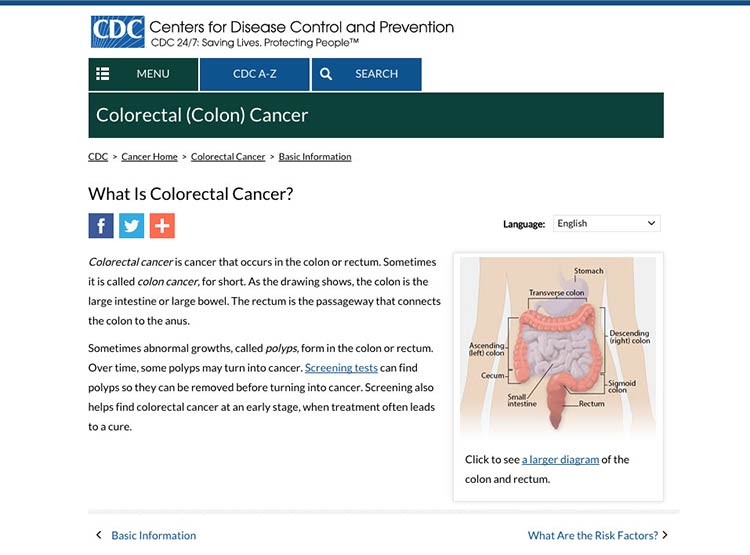
Make sure the meaning of your image is clear to all users.
Always include a descriptive caption that explains the picture.67 Use
alternative text (called an “alt tag” or “alt text”) to describe
graphics for people using screen readers.
3.9 Use appropriate contrast.
Dark text on a white or very light background is the easiest to
read.24,30 Use reversed-out text (dark backgrounds with light text)
sparingly. It’s also important to keep the background clear, so avoid
patterns and images.
Example
- Good contrast:
- Arteries are the tubes that carry blood away from your heart. Every time your heart beats, it pumps blood through your arteries to the rest of your body.
- Bad contrast:
- Arteries are the tubes that carry blood away from your heart. Every time your heart beats, it pumps blood through your arteries to the rest of your body.
3.10 Make web content printer friendly.
Many web users with limited literacy skills prefer to print pages from a
website rather than read text on a computer screen.28,30,60,65 They may
also want to share health information with family members or friends who
don’t have access to a computer or post it on their refrigerator. That’s
why it’s important to make sure your content is ready to print.
Figure 3.10
When a user clicks the “Print” button, a printer-friendly page appears. The printer-friendly version has clear headings and doesn’t include page numbers.
 Quote
Quote
“I would like to print this page and show it to
family members who need this information.”
Use print links for pages designed specifically for printing.
For pages meant to be printed (like a list of questions to bring to the
doctor’s office), prompt users with a print link. Make the print link or
icon clearly visible on each page. If possible, give users the option to
print a single page, a complete section, or just a portion of the text.
Make printed content user-friendly.
Follow these design guidelines:
- Use a lot of white space, good color contrast, and clear headings on
each page.
- Specify a print style sheet that will only be used when the user
clicks to print the page.
- Design your site with fluid, percentage-based widths that allow for
printing from a range of devices.
- If your site has page numbers, make sure that printing will override
them—or give users a “view all pages”
option.71,72
3.11 Make your site accessible to people with disabilities.
All Federal Government websites must be accessible to people with
disabilities. This is often called Section 508 compliance (referring to
Section 508 of the Rehabilitation
Act).73
The guidance in Section 508 helps us design websites that work for
everyone.
Here are a few of the important considerations addressed under Section
508:
- Make sure screen readers and other assistive technologies can read
your site. That way, users with physical impairments will still be
able to access your content. Usually, this involves confirming a
logical reading order of your page, making sure important content is
near the top of what the screen reader will “see” first, and making
sure that images have appropriate alt text. You can find other
criteria in the Web Content Accessibility Guidelines (WCAG)
2.0.
- Mark up page titles and section headings consistently. This will
ensure that users with and without a screen reader can easily
identify the major content sections on the page.
- Check that users can navigate your site using only a keyboard.
That way, your site will still be accessible for users who have
mobility or vision impairments and aren’t comfortable using a mouse
or touch screen.
- Choose strong color contrast, especially for buttons. Many users
with vision impairments are not actually blind, but rather have low
vision or color blindness. For these users, it’s very difficult to
tell the difference between similar colors—low-contrast text
may disappear.
- Test content that requires the use of plug-ins or dedicated
software for accessibility.30 There are additional accessibility
requirements for other plug-ins that take a user out of a
web browser. It’s important to test non-HTML elements in their
application to make sure they are still accessible to all users.
Get more information about web accessibility
from the Web Accessibility Initiative.
3.12 Make websites responsive.
Today’s users expect websites to work well on every screen they
touch—whether it’s a phone, a tablet, a desktop computer, or whatever
else we haven’t thought of yet. More and more, users are accessing the
web from mobile devices. And for some—especially low-literacy
users—mobile devices may be their only means of web
access.17
With this shift in how we’re accessing web content, web designers have a
variety of options for serving content to mobile users, including native
mobile apps, web apps, and mobile
websites.74,75
For most health websites, responsive design is the best choice.
Responsive design websites show users content in a format that’s
tailored to the screen size, platform, and orientation of the user’s
device.72,73
Figure 3.11
AIDS.gov’s responsive design delivers content in different
formats based on the user’s screen width.
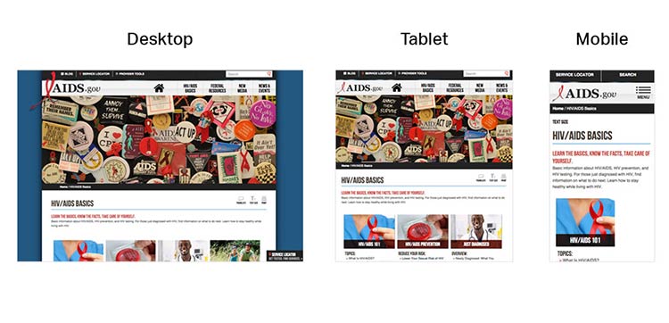
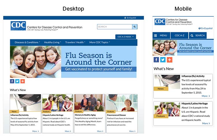
Figure 3.12
CDC’s responsive design template offers a good experience for
users on mobile. The site is reprioritized so that users don’t need to
“pinch” or zoom into content when they land on the page.
A main advantage of responsive design is that a single website can
deliver content optimized to appear on a wide variety of devices and
screen sizes. But keep in mind that responsive design is limited in that
only format—not content—can be tailored based on a user’s device. That’s
why it’s so important to develop content for the smallest screen size.
By doing so, content developers must make tough choices and create a
thoughtful, logical content hierarchy and cut (or link to) superfluous
information.
Most of the time, users won’t think about how your site was built—they
just want a seamless experience across devices.72
3.13 Design mobile content to meet mobile users’ needs.
Many of the core design principles in this guide apply to mobile design
as well as desktop, but there are some additional things to consider
when designing on mobile.
Limit the number of elements on each screen.76
Keeping your design uncluttered is especially important for mobile users
who are viewing content on a small screen. Simple screens enable users
to find what they’re looking for more efficiently.
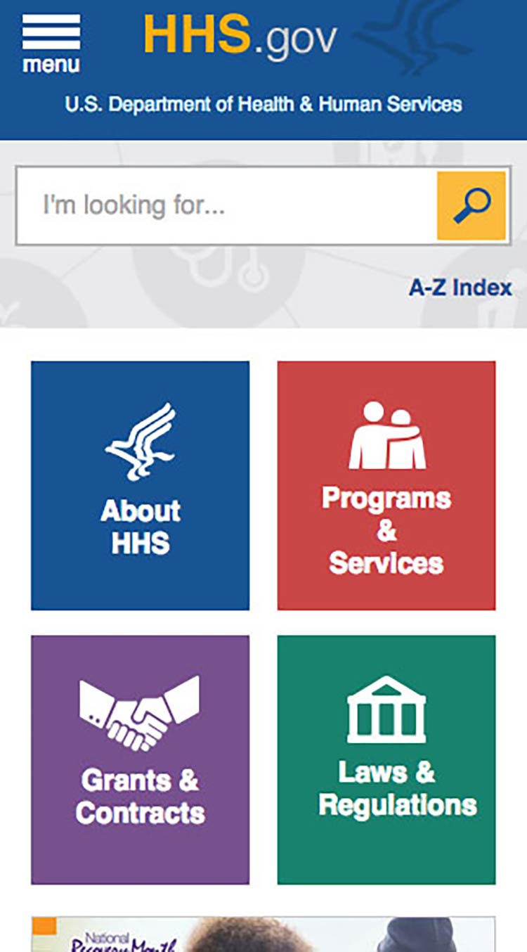
Figure 3.13
On mobile devices, the HHS.gov homepage features a simple
search bar and 4 buttons, each linked to a secondary page.
Prioritize content and features at the top of the page.
Users spend the most time looking at content near the top of the
page.77 Give limited space to elements users interact
with at the top of the page—like buttons, menus, and links—so there’s
room for content.78
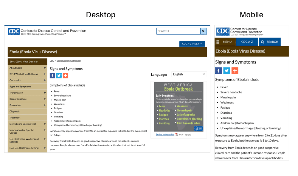
Figure 3.14
On mobile devices, the CDC website prioritizes important
content at the top of the page—images and additional settings (like
language preference) are at the bottom of the page.
Make interaction easy.
Mobile devices have smaller screens, so selecting a button or typing may
be more challenging than on a desktop computer. Additionally, mobile
interfaces can be challenging for users with physical conditions that
affect their fine motor control (how precisely they can click or touch
things).
With this in mind:
- Limit the amount of text your users need to type.20
- Use large buttons and tappable areas so that people using small devices
can easily select them. Also be sure to include enough space around
them.11,17
- Place frequently used buttons where they’re easy to reach. The easiest
places to reach depend on the size of the device and how the user is
holding it. In most cases, the center and bottom of the screen are
easier to reach than the top.17,79
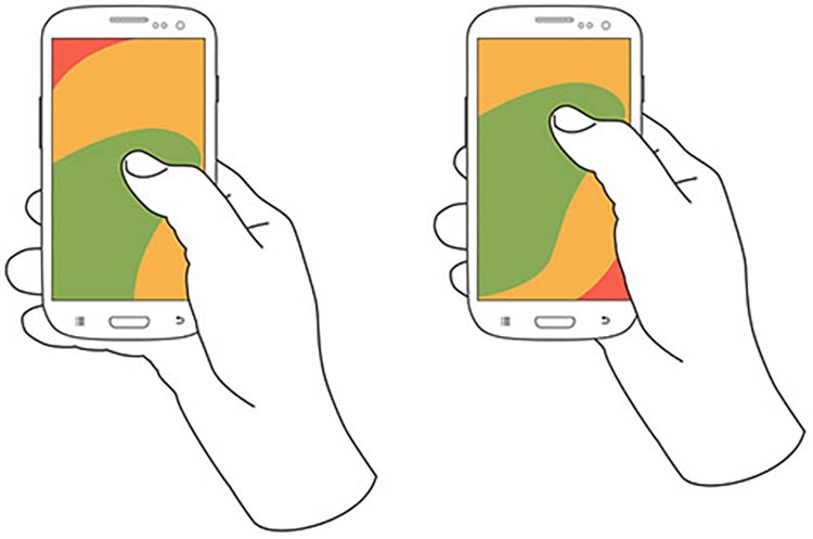
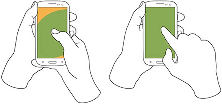
Figure 3.15
Users hold their phones in various ways, but the center and
bottom of the screen are usually easiest to reach.
- Try radio buttons. Limited-literacy users find large radio buttons the
easiest way to make selections on a mobile device. Use them instead of
checkboxes or interactive icons.
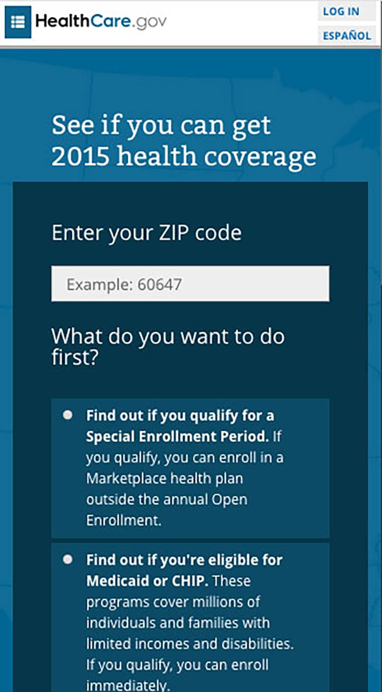
Figure 3.16
HealthCare.gov uses radio buttons for the answers to the
question, “What do you want to do first?”
Try this
To improve “tappability,” be sure the label is associated
with the radio button. That way, the label will be tappable, too—so
users have a bigger area to tap.
Summary
To be successful, web content doesn’t just need to be well written—it
needs
to look
easy to read. Thoughtful design and layout can help your readers focus
on your content without feeling overwhelmed, confused, or distracted by
how the information is presented.
Remember to think about all your users—including those on mobile and
those with accessibility needs—when you’re designing your site. Make
sure your content is accessible and easy to navigate, regardless of how
it’s accessed.
In the next section, we discuss content organization and navigation—that
is, making sure your users can easily get to the right page on your site
to find the information they’re looking
for.
4. Organize Content and Simplify Navigation
Introduction
This section discusses 2 important concepts related to the structure of
a website on devices of every size.
Content Organization (also called Information Architecture) is the
way information is categorized on a website. It typically involves a
category structure (taxonomy) and labels. Think about browsing through a
bookstore—clearly labeled sections (like Mystery, Nonfiction, and so
forth) help you find what you’re looking for. Good content organization
helps users find information quickly.
Navigation refers to how users move through the pages of your
website. Elements of navigation include menus, tabs, headers,
breadcrumbs, sitemaps, and “Back” or “Next” buttons.
It’s important to keep content organization and navigation simple and
consistent. Users are typically topic
focused.24,30 Organize and label your
content according to your users’ needs, and make sure you use terms that
are familiar to them.
4.1 Create a simple and engaging homepage.
Research tells us that web users with limited literacy skills have a
hard time processing more than 1 concept at a
time,7,34,50 so
make sure your homepage is a simple, focused entry point to the content
on your site. This is also valuable when designing for mobile—or even
better, responsive—websites.
Keep your homepage as simple as possible.
Limit the amount of text on the homepage.30
Figure 4.1
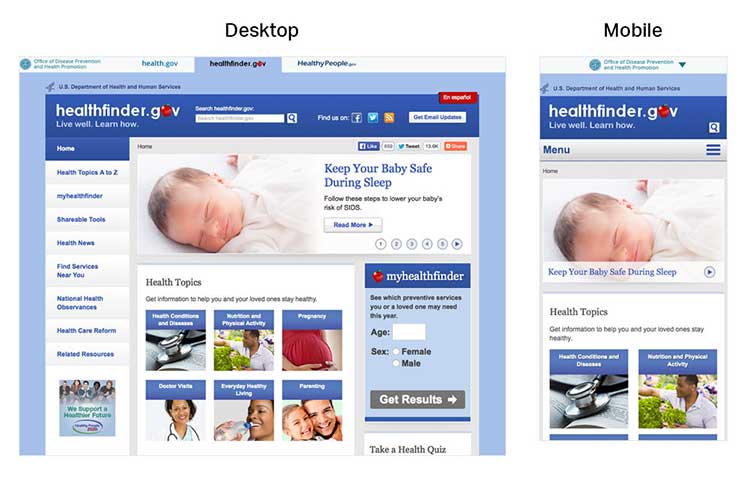
In usability testing, limited-literacy users were more
successful using healthfinder.gov’s mobile-optimized homepage because it
had fewer distractions than the desktop version.
A useful homepage is mostly links and short descriptions.24,30
Well-designed homepages include lots of white space and large buttons.
Figure 4.2
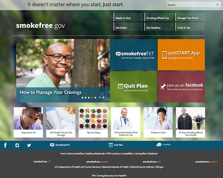
The smokefree.gov website is simple—it doesn’t have too much
text, it’s made up of mostly buttons to get users to more content, and
it has a large search feature.
If you include information in more than 1 language, link to the
non-English sections directly from the homepage. It’s also important to
link to non-English sections from a universal menu bar—that way, if
users find your content using a search engine, they’ll be able to find
additional non-English content.
4.2 Label and organize content with your users in mind.
Use words your users know instead of technical or “catchy” terms.24
Remember, your goal is to help users find what they need as quickly as
possible.
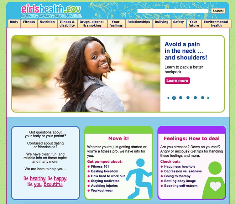
Figure 4.3
This page from the Office on Women’s Health includes a
navigation bar with audience-appropriate category labels (the site is
for girls ages 10 to 16). For example, the mental health section is
labeled “your feelings,” rather than a technical term.
People have different mental models (methods) for grouping health
information.36,40 To help different
users find what they need, repeat topics under multiple categories. For
example, based on card sorting, content on mammograms appears under 3
categories on healthfinder.gov: Cancer, Women, and Doctor Visits.
Try this
Next time you need to prioritize, rank, or organize types
of content on your site, try card sorting with your users.
Card sorting is a user-centered design technique used to organize
content intuitively. Start by creating an index card for each page of
your website. Then ask people to sort the cards into groups. This will
tell you how users expect to see content organized and labeled on your
site.
Alternately, you can have participants rank cards in order of importance
or interest. In card sorting exercises conducted by ODPHP, users with
limited literacy skills prioritized the following types of health
information as most useful:
- Basics I need to know (Understanding)
- I would like to learn more (Assessment)
- I can do this (Overcoming barriers)
- How will this help me? (Motivators)
- Ways I can take action (Strategies)
- Where can I go for help? (Community resources)
Learn more about card sorting on
usability.gov.
4.3 Create linear information paths.
Linear information paths can help web users with limited literacy skills
learn, understand, and move through content on your
website.8,28,38,80
Each topic or section of a site has its own linear path. This path
guides users through the section using a series of pages or screens. On
the first page, give the user a short overview of the content. On each
page in a section, include a button or link that takes users to the next
page. That way, users can move easily along the linear information
path.28,30,35,36,49,50
Figure 4.4
CDC uses links to help users navigate linearly through content.
If you can’t split content into logical chunks, keep it on a single
page.81 It’s better for web users to scroll than to
click through a series of pages without any clear logic.81 Be sure to
put the most important information at the top of the page.
Figure 4.5
healthfinder.gov content is split into short, meaningful chunks
so that users can move through the content without getting overwhelmed.
4.4 Give buttons meaningful labels.
Include buttons or links with labels that tell users where they will go.
Web users will click through if you give them reason to believe the
click will lead them toward their goal.81
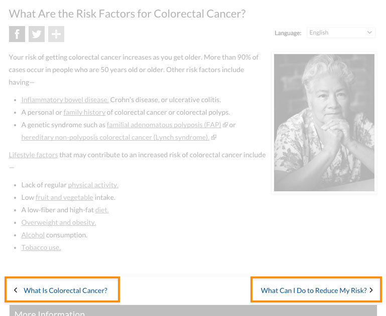
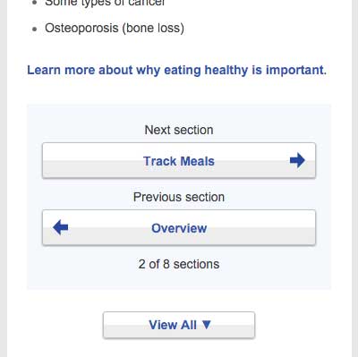
Skip page numbers or generic labels, like “Next” or “Back.”81 Instead,
use specific labels, like “What is cholesterol?” or “Back to the
homepage.”
Figure 4.6
In a study of healthfinder.gov mobile usability, users missed
the clickable page numbers. Instead of page numbers, healthfinder now
uses buttons with more meaningful labels.
4.5 Make clickable elements recognizable.
Users get frustrated when clickable elements—like buttons and links—are
difficult to spot.
Design buttons that are easy to find.
Make them:
- Large
- Bright
- A contrasting color from the surrounding text and background
- Obviously clickable30,35,36,50
Buttons that are obviously clickable have borders and shadows. If you’re
using a site design that doesn’t include borders and shadows, give
buttons a rectangular shape and rounded corners.66
Figure 4.7
The buttons on CDC’s homepage look clickable because of their
shape.
Make button labels easy to understand.
Use a label such as “go” or “get started.” Some users with limited
literacy skills don’t understand the term “submit.”
Make buttons look distinct from other elements.
Users get confused when non-clickable elements look like buttons, so
avoid giving headings a background color or including lots of colorful
boxes on a page.66
Figure 4.8
The myhealthfinder “Get Results” button clearly tells users to
click to start finding the preventive services they need. Clickable
buttons and icons have a unique style that’s distinct from other
elements on the page.

Apply clear visual cues to links.
Make it clear that links are clickable—avoid making users mouse over
text to see if it’s clickable. For example, make links blue or another
color that stands out from the body text.66 (See section 3 for more
information on making links look clickable.)
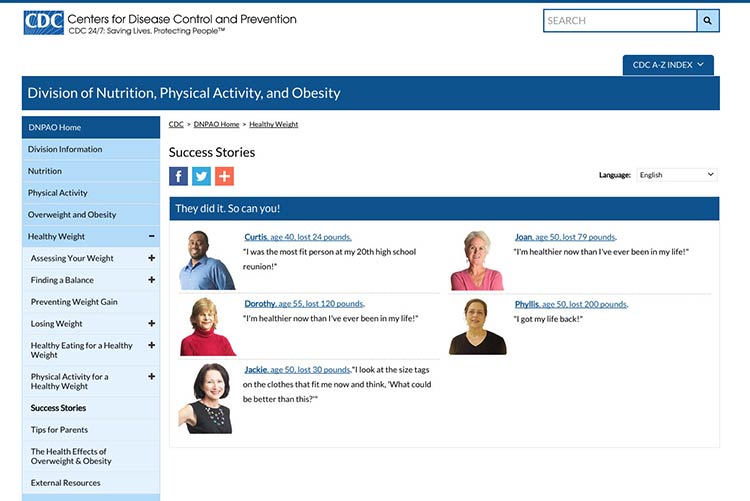
Figure 4.9
Links on CDC’s Healthy Weight Success Stories page are blue and
underlined, which sets them apart from the surrounding text.
Make all link elements clickable.
Make all elements—for example, a picture, icon, and text—that are
related to each other clickable. Users find it easier to click on a
large target area.66 If you’re using an icon for a link, combine it with
another visual cue, like a text label.66
Figure 4.10
Users can click the button, the icon, or anywhere in the box to
get answers to tax questions.
Be consistent.
Whatever button or link style you choose, apply it consistently across
your website.66
4.6 Make sure the browser “Back” button works.
Web users with limited literacy skills often depend on the “Back” button
to navigate a website,41 so it’s very important that
this button works predictably and consistently.
For example, when users enter data into a registration page or form,
make sure that the information isn’t deleted if users click the “Back”
button.
4.7 Provide easy access to home and menu pages.
Web users want the option to start over or jump between pages.11
However, we know that users with limited literacy skills typically don’t
use breadcrumbs.30,35 In ODPHP usability testing, users with limited
literacy skills were also unlikely to click on a logo in the site header
to get to the homepage.
With this in mind, include large buttons that take users back to the
homepage or the main menu pages on the site.30,35,39
Figure 4.11
NIH SeniorHealth uses a strong left-hand navigation menu. The
current section is highlighted with a different color in the navigation
bar so users can easily see where they are in the site.
Use a menu button for mobile.
Mobile devices have limited space. Instead of using a left-hand
navigation menu on mobile, add a menu button that opens a custom,
mobile-optimized menu. That way, users can expand the menu as needed.
Allow mobile users to go back to the homepage by including a home button
or a home option in the menu.
Users appreciate when they don't have to retrace their steps but can instead start fresh on the homepage.
 Quote
Quote
“I like the “Home” button because it lets me correct mistakes
more easily.”11
Don’t rely on the “hamburger button” as a navigation cue—research
suggests that users don’t find it intuitive.81
Instead, try using the word “menu.”
4.8 Give users options to browse.
Many users with limited literacy skills will browse through categories
of content instead of using a search box.8,28,34,39 This may be because
they:
- Don’t see the search box (many users with limited web experience don’t
know where to look for a search box)
- Are worried about spelling mistakes
- Are overwhelmed by search results
- Don’t understand placeholder text in search boxes
Include multiple ways to browse for topics (for example, by topic
categories in an A to Z list).
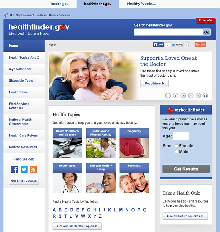
Figure 4.12
The healthfinder website allows users to search for health
information by topic categories, A to Z list, or search box, or by using
the left menu navigation.
4.9 Include a simple search function.
Web users with limited literacy skills are more likely to use a search
function that’s simple and user-friendly.
Make your search function easy to locate and use.
Use a large text box with obvious buttons.15
Use a “get started” or “go” button next to your search box.
During usability testing conducted by ODPHP, some users with limited
literacy skills clicked a “search” button without entering any terms in
the search box.49 A clearly labeled button will signal users that they need to enter a term(s) first.
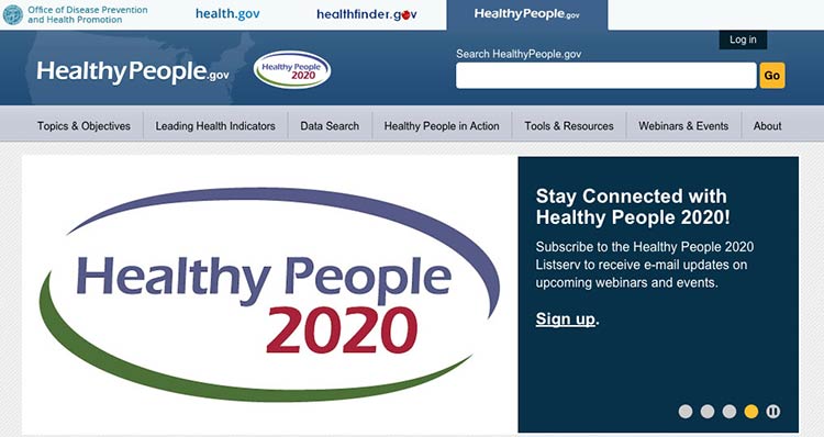
Figure 4.13
The Healthy People website has a large search box and prompts
users to submit their search request with a “go” button.
Allow for common misspellings.8,30
Spelling is difficult for limited-literacy
users,3,10,15 so make sure your
search engine will still work if users make a spelling mistake. Help
users search by providing spelling and autocomplete
assistance.3,10,15
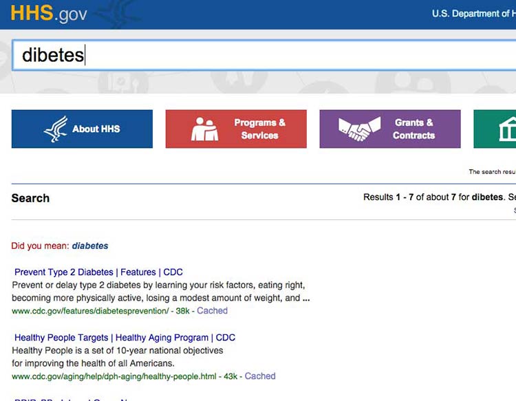
Figure 4.14
HHS.gov uses autocomplete to help users with spelling, and if a
search term is misspelled, the results recommend a word using “Did you
mean...”
4.10 Display search results clearly.
To streamline users’ search experience, display the most relevant
results first.15
Figure 4.15
The health.gov search function lists relevant health
topic results before related news results. Users usually find the most
helpful information in health topics.
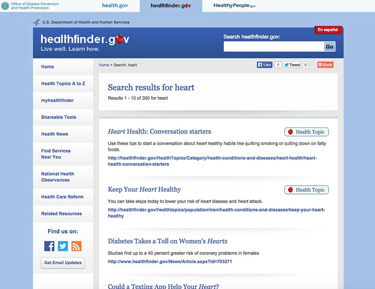
When displaying search results:30
- Limit the number of results displayed on a page (unlike content-heavy
pages, use numbered pages to avoid scrolling)8,30
- Use clear page titles and include a brief plain language description of
each result8,15,30
- Avoid using long URLs if you can
- Use keywords in URLs when possible to help users scan
- Include lots of white space between results
- Use a large, easy-to-read font
- Highlight search terms in the results15
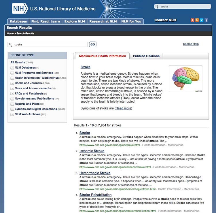
Figure 4.16
This search results webpage from MedlinePlus displays clear
titles and short URLs for the linked results. A brief description
written in plain language appears above the top results. Only 10 results
show per page.
Summary
Before users can read your web content, they need to find it. Construct
simple and consistent navigation that uses familiar terms, and organize
your content in a way that makes sense to your users. Give your users
options, like search- and topic-based browsing, so they can navigate
your site on any device in the way that’s easiest for them.
When your site is organized well, users can quickly and easily find the
information they’re looking for—and they’re less likely to get
frustrated and give up altogether.
In the next section, we discuss strategies for engaging your users with
multimedia and interactive content.
5. Engage Users
Introduction
Section 2 introduced the idea of user engagement. Engagement is the
process of involving users in health content in a way that motivates
them to take action.31
Using multimedia like video, audio, graphics, and
interactivity32,82,83
is an effective way to engage users. For example, you might offer users
the opportunity to:
- Watch video testimonials of people like them
- Customize graphics to reflect variables they care about
- Enter personal data such as age or weight to get tailored
information
Remember, formatting and layout can dramatically improve the user
experience. Make interacting with multimedia content easy for users by
designing user-friendly forms, quizzes, buttons, links, and mobile apps.
It’s also important to make it convenient for users to access and share
web content from anywhere. You can enable users to share content with
their online networks by adding social media buttons to your website.
5.1 Share information through multimedia.
Whenever possible, provide health information in multiple formats—for
example, audio, video, interactive graphics, quizzes, or slideshows.
Multimedia can improve both learning and engagement, particularly for
users with limited literacy skills.82,83
Choose media that support your content.
Before you decide on which formats to use, think about the information
you’re trying to communicate. Each type of media fosters learning in its
own way.
For example, consider:
- Visuals to show spatial information (like maps)
- Text to communicate information you want users to remember in the long
term
- Sound to convey information you want users to remember in the short
term82
Make sure each piece of media you use supports the text—using media only
as decoration will distract your users.83
Make media accessible.
When using audio or video, be sure to include a text alternative or
transcript, so the content is accessible to all
users.84,85,86
Figure 5.1
NIH SeniorHealth offers short video clips on popular health
topics. Each video includes a transcript and a help tool.
If you’re posting videos on a dedicated YouTube channel, use the closed
captioning options available. You can find details in these
instructions from
YouTube.
Consider quizzes.
Use quizzes to encourage active learning. Limited-literacy users like
quizzes and tend to complete them. After each question, give users
helpful feedback.82
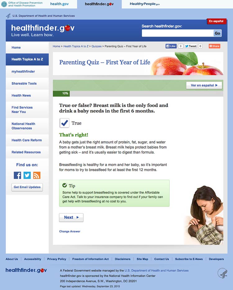
Figure 5.2
In healthfinder.gov usability testing, many participants with
limited literacy skills completed a parenting quiz on the website and
reported liking it. After answering each question, users get information
explaining why their response was right or wrong.
Try this
Look through your website’s content and ask yourself if
any of it can be repurposed as a quiz. Quizzes are especially popular
with limited-literacy users.
5.2 Design intuitive interactive graphics and tools.
Interactive graphics and tools allow users to make choices and see
results that reflect their choices.87 Many types of
graphics and tools—including decision aids, infographics, images,
charts, and maps—can be interactive.
Present choices one at a time.
Avoid asking users to make more than 1 choice at a time. This will help
keep users from getting overwhelmed.87
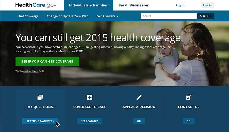
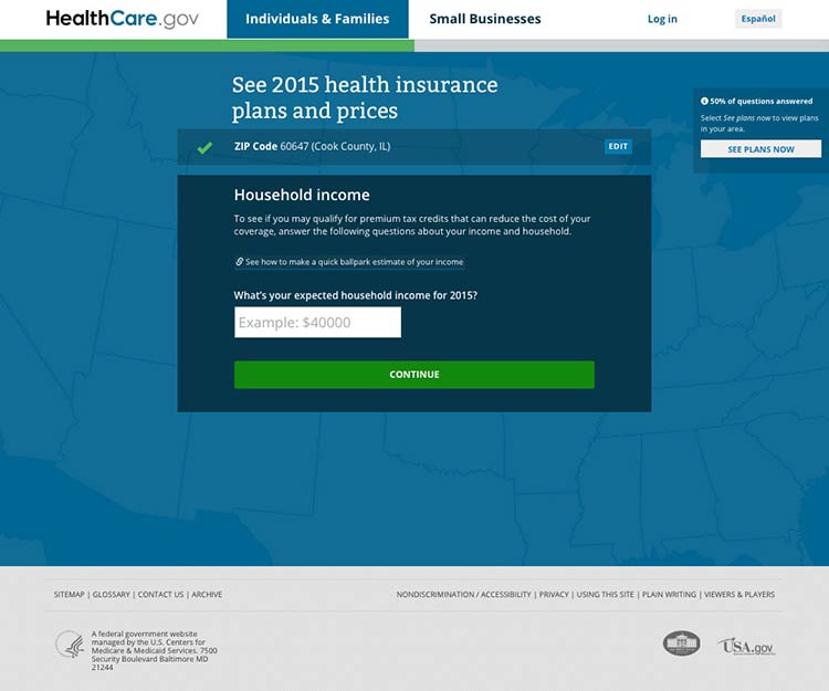
Figure 5.3
Healthcare.gov asks users questions 1 at a time before they can
see information about health care costs in their area.
Show that the graphic or tool has changed with visual
cues.88
If users can’t see changes, they’ll assume the graphic or tool isn’t
working.87 Use visual cues to indicate change—the more obvious, the
better.88
Include intuitive controls.
Users interact with a graphic or tool using controls. Include commonly
used controls that will be familiar to users—for example, radio buttons,
drop-down selections, and autocomplete fields.87
Make it easy to start over.
Allow users to easily clear their choices and start from the beginning.87
You may want to include a “Start Over” button for forms or tools that
have multiple pages.
5.3 Provide tailored information.
Invite your users to customize content to their personal interests or
characteristics. This will help encourage them to interact with your
content.
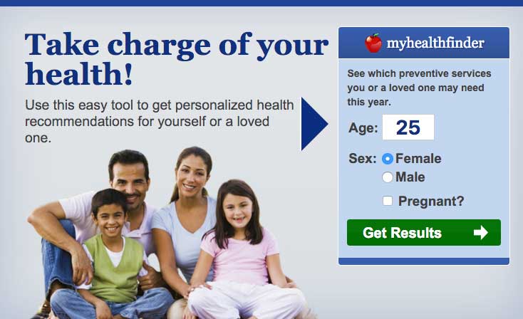
Figure 5.4
The myhealthfinder tool on healthfinder.gov prompts users to
enter their age, sex, and pregnancy status to get personalized
recommendations.
Avoid asking for too much information.
We know that users want personalized health information, but they don’t
want to enter a lot of personal
details.27,39,49
Consider interactive content that only requires users to enter a few
pieces of information about themselves.
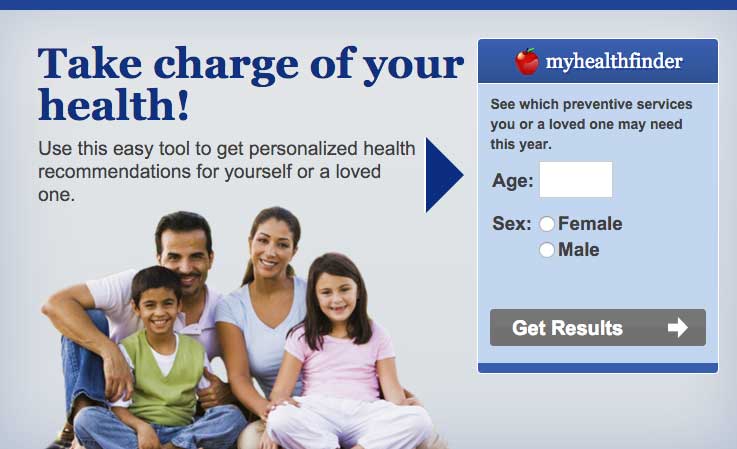
Figure 5.5
To use the myhealthfinder tool, users only need to enter their
sex and age.
Create a link between the information you asked for and users’
personalized results.49
In other words, make sure users understand why you asked them to enter
a particular piece of information. This will help compensate for users’
limited working memory.
 Quote
Quote
“I’m very comfortable [entering my age]. That way, I get exact
information for me, not different age groups.”
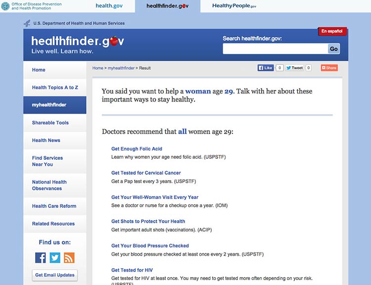
Figure 5.6
The myhealthfinder results page from healthfinder.gov includes
a summary of the user’s personal information entered on the previous
screen.
5.4 Create user-friendly forms and quizzes.
It’s important that forms and quizzes are intuitive and easy to use.
Make instructions clearly visible on the page.
Avoid asking users to click on a button or link to see the instructions
they need to fill in a form or complete a quiz.13
To follow limited-literacy users’ typical reading path, display fields
in a vertical
list23,89,90 and
put instructions above each field. If instructions appear at the
beginning of a section or to the right of a field, users may skip over
them.13
Figure 5.7
Users can easily follow instructions on the myhealthfinder
form.

Suggestion
The best-case scenario is that your quiz or form is so intuitive that it
doesn’t require many instructions in the first place.
Chunk information on forms into meaningful categories.
Grouping information in ways that make sense to users will help them
easily follow along.91
Figure 5.8
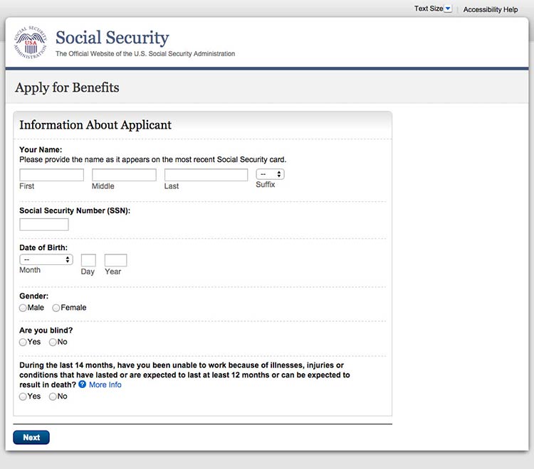
When applying for Medicare benefits, the form is chunked into
manageable pages like “Information About Applicant.”
When designing a long form or quiz, use 1 of 2 layout options:13
- Show users 1 field at a time
- Allow users to scroll down to see all fields
Figure 5.9
This healthfinder.gov parenting quiz displays each question on
a new page.
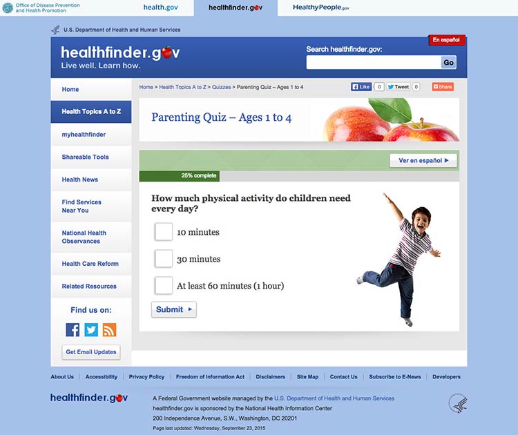
Figure 5.10
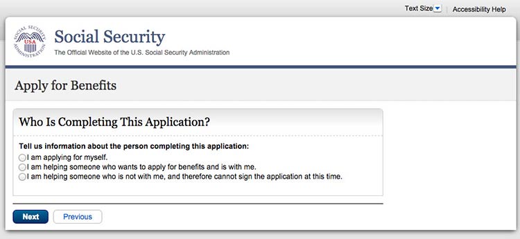
This initial page in the Social Security application asks users
for details about who they’re filling out the form for.
Keep required information on forms to a minimum.
The less information your users have to enter, the better. Also try to
avoid asking users to register. If you need to have a registration page,
ask for as little information as possible. Be sure to:
- Distinguish between logging in and registering
- Make the username an email address
- Keep registration to no more than 3 screens and provide cues (for
example, “Page 1 of 3”)
- Include a final results page with questions and responses
- Display fields that need corrections on a new page and include
instructions for correcting information23,89,90
Figure 5.11
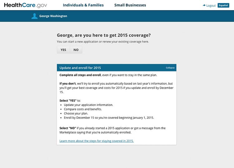
If a user is already logged in to Healthcare.gov, forms
auto-populate with his or her name.
Design forms for mobile.
Online forms can be especially challenging for mobile users when
important information or elements of the form run off-screen. Make sure
users can see the information they need to complete the form and the
related fields in the same view. When they can’t, we rely on users to
remember and interpret content—and low literacy users may already be
struggling to read and understand what they’re supposed to
do.4,10,93
5.5 Consider social media sharing options.
In today’s digital era, people aren’t just online and on mobile—they’re
also on social media. In fact, 3 out of 4 online adults use social
media92 platforms like Facebook, Twitter, Instagram,
Pinterest, and LinkedIn. That’s why it can be important to give users
the opportunity to share your content on social media.
Keep in mind that many people access social media on their phones.92
Make it fast and easy to share.
Embed social media buttons on your website. You can also add fixed
social media buttons to your site header or footer so that users can
easily follow or “like” your social media pages.
Put social media buttons below written content—that way users can read
the information before they decide whether or not to share
it.93 To avoid cluttering your site, beware of
overusing social media buttons—only include them on pages you expect
users will want to share.93
Figure 5.12
healthfinder.gov features fixed social media buttons in the bottom-left hand corner of the site.
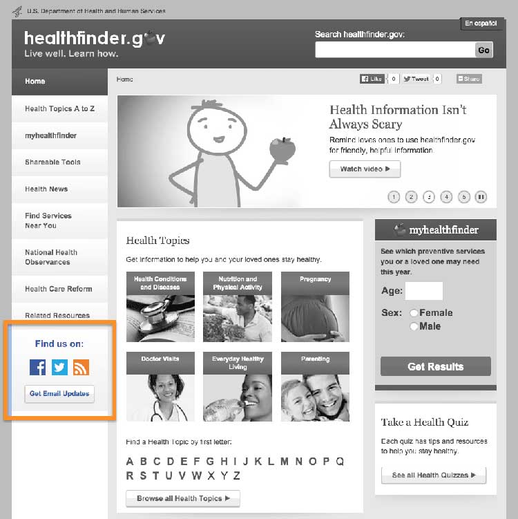
Figure 5.13
Users can click on the video’s sharing icon and choose how
they’ll share it on social media.
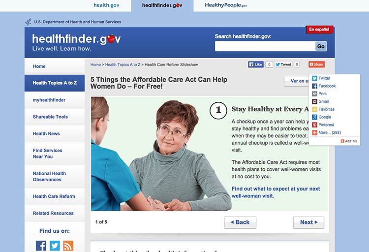
Summary
Interactive and multimedia elements—like video, audio, graphics, and
tailored information based on personal data—can help users actively
engage with your content.
Design an easy and intuitive interface for forms, quizzes, graphics, and
other multimedia content, and make it convenient for users to print your
content or share it on social media. When your users feel connected to
your content, they’re more likely to take action and change their
behavior.
Always test interactive features with users to make sure they’re
intuitive. In the next section, we’ll discuss best practices for
including users with limited literacy skills in research and testing
activities.
6. Test Your Site with Users with Limited Literacy Skills
Introduction
There’s no surefire way to control who comes to your website—and why
would you want to? The web is for everyone.
As mentioned previously in this guide, as many as half of U.S. adults
have limited literacy skills—and nearly 9 in 10 have limited health
literacy skills.94,95 And while the
information in this guide is a good place to start when designing for
users with limited literacy skills, it can’t predict user behavior on a
specific tool or website.
That’s why it’s so important to test your websites and digital products
with individuals with limited literacy skills.
Usability testing can take many forms. In general, it involves “watching
people try to use what you’re creating/designing/building (or something
you have already created/designed/built), with the intention of making
it easier for people to use or proving that it is easy to
use.”96
The goal is to get feedback from users to truly understand their
motivations and behaviors online. Conducting usability testing will help
you answer important questions like:
- Can users find the information they’re looking for?
- Can our users understand and act on this information?
- Are user interface elements intuitive and easy to use?
Suggestion
Have users try out your website as you plan, design, and develop
it—early and often.
The specific approach you choose will depend on the goals of your
research, how much access you have to your users, and the details of
your project, timeline, and budget. Learn more about usability
testing.
Below we outline important strategies for you to consider when
conducting usability testing with limited-literacy users.
6.1 Recruit users with limited literacy skills—and limited health literacy skills.
Most screening tools designed to measure health literacy skills (like
the Test of Functional Health Literacy in
Adults and the Rapid
Estimate of Adult Literacy in
Medicine)
have to be used in person and are meant for patients in a clinical
setting.97
These options may not be practical or very useful for web and health
content developers, especially if you’re using a private company’s
recruitment database. Instead, you can use a proxy for health literacy
based on commonly collected demographic data.97 For example, the
criteria below could be used as a proxy for identifying web users with
limited health literacy skills:
- High school education or below
- Low income—defined as 200% of the federal poverty level or below (or
less than $48,500 for a family of 4 in 2015)98
- Have not searched for health information online in the past year
You can also try a simple 1-question health literacy measure. As part of
screening, ask your participants: “How confident are you filling out
medical forms by yourself?”99
Keep in mind that some kind of personal connection can make a big
difference during recruitment—when you can say that a mutual
acquaintance suggested the connection, people are more likely to
consider participating in your study.100
Use trusted community recruiters to help you recruit from community
contexts—like adult learning centers, federally qualified community
health centers, and senior centers. This can also help you get
participants from your target populations.
6.2 Identify and eliminate logistical barriers to participation.
Choose a testing location that is familiar and accessible to
participants, like a local library, community center, or even a health
clinic. Be mindful of factors that may affect participants’ ability to
get to your testing site—like public transportation options or parking
availability and cost.
Avoid remote and online testing if possible. If you have to do remote
testing, make sure someone is on site with the participant to provide
technical assistance.
It’s also important to consider accommodations that your target
population may need. For example, if you’re testing with older adults,
have reading glasses available for people who might need
them.3 Also make sure your testing location is
accessible to those with limited mobility. If your target audience’s
primary language is not English, you may need to use an interpreter.
Finally, use cash incentives instead of gift cards when possible.
Participants may want to use the incentive for basic living expenses
like rent or utility bills.
6.3 Create plain language testing materials.
Write your screeners, consent forms, and moderator guides in plain
language. Find sample testing documents on
Usability.gov.
Limit the number of tasks and questions when conducting usability
testing with users with limited literacy skills. Be realistic about what
you can accomplish in each session. Make sure the most critical tasks
are early in your protocol—it’s best to keep the session brief.
Users with limited literacy skills can have difficulty understanding
consent forms—you’ll often find that they’ll sign without reading the
form.101 In addition to providing easy-to-read consent
documents, consider using a consent process that doesn’t rely on
participants’ health literacy skills or English proficiency. You can:
- Review consent forms verbally3
- Ask participants to initial each thing they consent to—for example,
written notes, having the screen recorded, or being videotaped
See the Informed Consent and Authorization Toolkit for Minimal Risk
Research [PDF – 300
KB]
from the Agency for Healthcare Research and Quality for more
information.102
6.4 Test whether your content is understandable and actionable.
When designing your study, think about ways to find out if your content
is both understandable and actionable. To evaluate whether participants
understand the content, ask them to:
- Think out loud as they complete tasks
- Describe what they’ve read in their own words
- Describe what action they would take after reading the content
Learning whether users can understand your content is a very important
part of usability testing. But it doesn’t stop there—ultimately, your
goal is that users will act on the health messages you created. That’s
why you also need to find out if your content is actionable.
With this in mind, don’t limit what you test to measures of
comprehension and usability. Include a mix of quantitative and
qualitative measures—for example, you can ask users:
- What they would do after reading your content
- How confident they are that they could do what the content is asking
Qualitative measures like these also offer insight into self-efficacy,
an important predictor of a user’s ability to adopt healthy behaviors.
6.5 Use moderators who have experience with users with limited literacy skills.
Whenever possible, use moderators experienced in conducting usability
testing with people with limited literacy skills or with people who
don’t have a lot of experience using the internet.
Moderators familiar with limited-literacy participants in a usability
testing setting know what to expect—they’re sensitive to participants’
challenges and know how to effectively support participants through
tasks. For example, experienced moderators are more likely to be patient
with participants completing tasks very slowly—or they may immediately
recognize the need to repeat a task prompt when a participant is getting
frustrated.
Ultimately, choosing moderators who have experience working with
limited-literacy users can go a long way toward making your testing
sessions a success.
6.6 Pretest your moderator’s guide.
It’s very important to pretest your moderator’s guide with participants
with limited literacy skills so you can fine-tune tasks and timing.
These pretest—or “dry run”—sessions can help you:
- Clarify tasks that were confusing for users with limited literacy
skills
- Figure out how much time to leave between sessions so you can
accommodate users who may need extra time
If you’re new to testing with limited-literacy users, don’t be surprised
if testing sessions with users with limited literacy skills move more
slowly than testing sessions you’ve facilitated in the past. That’s
normal.
6.7 Use multiple strategies to make sure participants understand what you want them to do.
During introductions, make it clear to users that they can reread the
task at any time if they’re confused or if they’ve forgotten what to
do.
During sessions, have the moderator read tasks out loud and provide
them in writing (only 1 task per sheet). This will remind users of the
task you are asking them to accomplish. Also have the moderator repeat
the task during the session.80
Try this
When testing with limited-literacy users, consider
offering short breaks.3
Keep in mind that participants with limited literacy skills tend to
focus on the specific task—sometimes to a fault. During sessions, remind
users that you’re less interested in the answer and more interested in
where and how they would try to find the answer.
6.8 Test on mobile.
Users with limited literacy skills are more likely to access your
information on mobile, so always test your website on mobile devices.
Testing on mobile will also allow you to collect information about your
site’s responsive design. Remember, you want your website to work well
on a variety of devices.
Testing on mobile is different from testing on a desktop computer. Here
are some things to think about before you test on mobile with
limited-literacy users:
- Record movements using a mobile testing set up if you want to review
your testing session later or share it with other members of your team.
Make sure you think through your technical needs in advance.
Figure 6.1
The moderator sets up a small camera to record participants'
movements during mobile testing.
- Let participants use their own device. Users are accustomed to how
their smartphone or tablet is set up—you’ll get more accurate
information if they test your site on a device they’re familiar with.
- Be mindful of data consumption limits. Since you’re asking
participants to use their own device, you need to consider data use.
Always make sure participants can access free WiFi. And in general,
think through what you’ll be asking them to do in advance—for example,
will they need to download an app or stream multiple videos? Activities
like these may use more data than simpler tasks.
Summary
Conducting usability testing with users with limited literacy skills
requires special preparation. Strategies like working with an
experienced moderator, eliminating logistical barriers for your
participants, and creating plain language testing materials can increase
your likelihood of success.
. Appendices
Reviewers
Marin Allen, PhD
Deputy Associate Director for Communications and Public Liaison and Director of Public Information
National Institutes of Health
Cynthia Baur, PhD
Senior Advisor for Health Literacy and Senior Official for the Plain Writing Act
Centers for Disease Control and Prevention
Janice (Ginny) Redish, PhD
President
Redish & Associates, Inc.
Kathryn Summers, PhD
Associate Professor
University of Baltimore
Kate Walser, MBA, CUA
Sr. User Experience Designer
CX Insights, a registered service mark of Tritus Technologies, Inc.
Lead Editors:
Sandy Hilfiker, MA, Director of User-Centered Design, CommunicateHealth
Stacy Robison, MPH, CHES, President, CommunicateHealth
Mary Ann Brody, MPH, CHES, User Experience Research Manager, CommunicateHealth
Blythe Miller, Senior Health Writer, CommunicateHealth
Contributing Editors:
Linda Harris, PhD, Director, Division of Health Communication and eHealth, Office of Disease Prevention and Health Promotion
Ellen Langhans, MA, Technical Information Specialist, Division of Health Communication and eHealth, Office of Disease Prevention and Health Promotion
Caitlin Blood, MPH, CHES, ORISE Fellow, Division of Health Communication and eHealth, Office of Disease Prevention and Health Promotion
Jaya Mathur, MA, Health Communication Manager, CommunicateHealth
Rebecca Wright, Senior Health Writer, CommunicateHealth
How This Guide Was Developed
The 1st edition of Health Literacy Online (2010) synthesized lessons learned from ODPHP’s original research with more than 700 web users and the small but growing body of literature on the web experiences of users with limited literacy skills. The guide was built on the principles of web usability described in the Research-Based Web Design and Usability Guidelines developed by HHS in partnership with the General Services Administration (GSA).
Although many of the original recommendations in the guide hold true today, much of the technology and related best practices have evolved. That’s why we decided to release a 2nd edition of Health Literacy Online.
The Latest Edition of Health Literacy Online
To update the guide, we reviewed the growing body of literature related to literacy, health literacy, user-centered design, and usability. Using information in articles and resources published after 2008, we’ve updated the recommendations to reflect emerging technologies, a deeper understanding of the cognitive processing of adults with limited literacy skills, and more (see section 1).
Specifically, we’ve included new information about:
- Mobile usability, navigation, search, and responsive design
- Limited-literacy users’ behaviors online
- How to conduct research with users with limited literacy skills
We’ve also incorporated new findings from ODPHP usability testing with more than 70 users with limited literacy skills. Research that informed the 2nd edition of Health Literacy Online includes:
- A tree-testing study of healthfinder.gov to evaluate information architecture
- A baseline mobile usability test of healthfinder.gov’s responsive template
- Additional usability tests to evaluate and iterate small design changes and new tools on healthfinder.gov
Finally, we’ve engaged a team of experts (see appendix A) to contribute additional insights on best practices in the field. Reviewers were selected based on their expertise in literacy and health literacy, health communication, plain language, usability, and conducting user research with users with limited literacy skills. Each reviewer provided feedback on content, organization, and examples throughout the guide.
Read more about ODPHP’s original user research in appendix C.
Original User Research
For the 1st edition of Health Literacy Online in 2010, ODPHP commissioned 15 studies over a period of 4 years to inform the development of an online collection of prevention and wellness content and to redesign healthfinder.gov. More than 750 people aged 18 to 84 participated in these studies. Special care was taken to recruit and test adults with limited literacy skills.
Below is an overview of the iterative research process, followed by a brief description of each study.
Formative Research Phase
- Literature Review
- Website (Content) Analysis
- Expert Interviews
- Structured Interviews
- Mental Models Study
- Card-Sorting Study
Prototyping Phase
- Prototype Test (Paper and Clickable)
- Usability Studies 1–4
Post-Launch Quality Improvement Phase (Ongoing)
- Card-Sorting Study
- Widget Usability Test
- Intermediary Interviews
- Usability Study 5
Formative Research Phase
Literature Review
ODPHP conducted a literature review to answer the following questions:
- Which audience characteristics are the strongest determinants of homogeneity in terms of seeking prevention information?
- In what ways and to what extent is currently available prevention information responsive to these patterns?
- Is prevention information that is targeted in content design and delivery more effective than information that is not targeted?
- How can prevention information be presented effectively online?
The literature generally supported the finding that tailored and targeted materials that respond to individual characteristics, such as readiness to change, can be effective in engaging interest and leading to health behavior change. The review also found that interactive information is more engaging and motivating than information that is not interactive.
Website (Content) Analysis
ODPHP reviewed content on 9 prevention topics available from 4 leading health websites: American Cancer Society, Mayo Clinic, WebMD, and Family Doctor. Based on this review, the authors made several general recommendations for designing health information for websites, including:
- Keep content at a reasonable length.
- Use headings and subheadings.
- Use hyperlinks so users can explore relevant content.
- Provide interactive tools as appropriate.
- Convey information using graphics or visual displays.
Expert Interviews
Subject-matter experts in 9 health content areas identified common questions asked by members of the public. The goal was to identify audience segments based on motivations for seeking information. The audience segments developed from the expert interviews included:
- Segment 1: Those seeking information about a health problem for themselves or someone they know
- Segment 2: Those wanting to find out whether they or someone they know has a health problem or reason to be concerned about a health problem
- Segment 3: Those seeking information to help prevent the onset of health problems
Structured Interviews
ODPHP conducted structured interviews with 200 diverse participants between the ages of 18 and 65 to test the audience segmentation strategy mentioned above. Examples of key findings include:
- The audience segmentation strategy was validated (significant differences were found in motives/preferences between the 3 segments).
- Respondents did not remain in a particular audience segment over time.
- Content should reflect the needs/motives of each segment.
Mental Models Study
In-depth interviews were conducted with 35 English-speaking adults, aged 18 to 65, with limited health literacy. The primary intent of this research was to determine how people naturally group disease prevention topics (i.e., their “mental models”) to inform the development of a prevention prototype. Examples of key findings include:
- Participants grouped the topics of nutrition, obesity, and physical activity together.
- Other topics were commonly stand-alone concepts, such as preventing falls and getting flu shots.
- Participants associated the topics of talking to kids about smoking and talking to kids about substance abuse.
Card-Sorting Study
Eighty-one diverse participants completed the card-sorting study. As a result of the study, ODPHP created a prioritized list of the most useful types of content across the 3 audience segments. These content types emerged as generally “useful” and “important”:
- Basics I need to know (Understanding)
- I would like to learn more (Assessment)
- I can do this (Overcoming Barriers)
- How will this help me? (Motivators)
- Ways I can take action (Strategies)
- Where can I go for help? (Community Resources)
Prototyping Phase
Prototype Test (Paper and Clickable)
ODPHP developed and tested a prevention information prototype with a diverse, nationwide sample of 300 adults. Participants evaluated the prototype and prevention content on measures of engagement, self-efficacy, acceptability, and applicability. Examples of key findings include:
- Participants found the content acceptable (relevant and useful), but did not rate it as highly for inspiring self-efficacy.
- Qualitative data showed participants’ preference for the following content characteristics:
- Informal, clear, and concise writing
- “Tabbed” organization
- Actionable information with a small-steps approach
- Interactive tools
- Graphics that aid understanding
- An interface that allows users to “drill down” through related chunks of information
Usability Study 1
ODPHP performed an initial usability study with 40 adult women with limited health literacy skills recruited from federally qualified community health centers in Baltimore, MD. The study was designed to observe and record any problems encountered by users as they navigated the prototype, to learn whether changes to the content and interface design would positively affect self-efficacy measures, and to gauge levels of understanding and engagement. Examples of key findings include:
- Participants particularly liked checklists, lists of questions to ask a doctor, access to related resources, graphics that aid understanding, and options to print.
- The tabbed approach helped orient participants to where they were in the content.
- Participants found the interactive tools (e.g., calculators, quizzes, menu planners) useful because they were immediate, relevant, and in context.
- Providing small steps for taking action helped improve participants’ self-efficacy.
- Content organization of “What is the behavior?” (Basics), “Why is it important/relevant to me?” (Benefits), and “What do I do about it?” (Take Action) was logical to participants.
Usability Study 2
ODPHP conducted a 2nd usability test with 13 adult women with limited health literacy recruited from federally qualified community health centers in Baltimore, MD. This test was performed to validate changes made from the prior usability test (Usability Study 1) and to continue to test levels of engagement, self-efficacy, and understanding. Examples of key findings include:
- Participants had difficulty using the search function and often clicked on the “Search” button without entering a search term.
- Most users expected to see a list of topics in an A-to-Z format.
- When using the myhealthfinder tool, participants did not easily connect the information they entered into the tool with the search results they received.
- Tab navigation needed to be more clearly delineated.
- Participants preferred photographs of “real” people to icons.
- Participants noticed content at the center of the page more than top, bottom, and side content.
Usability Study 3
ODPHP performed a 3rd usability test with 7 diverse participants recruited in Knoxville, TN. This study provided an overall test of the new healthfinder.gov site and of the changes made based on previous testing. Examples of key findings include:
- Most participants used the A-to-Z section, rather than the search box, to browse.
- When prompted to use the search function, participants had little trouble and were able to scan the results page easily.
- Participants were able to navigate easily back to the home page through strong lefthand navigation.
- Participants particularly liked the photos of “real” people and the Take Action content.
Usability Study 4 (myhealthfinder)
ODPHP conducted a usability test on the 1st iteration of the myhealthfinder tool with 15 diverse participants. Examples of key findings include:
- Participants had difficulty signing in. Many attempted to sign in even though they had never created an account.
- Many participants had difficulty creating an account. For example, they did not distinguish between required and optional fields, had difficulty creating a unique username and password, and did not understand error messages.
- Participants did not want to enter personal information (e.g., height, weight, smoking status).
- Participants often skipped over context and welcome information.
- Participants needed more than just recommendations; they wanted corresponding “how-to” information.
Post-Launch Quality Improvement Phase (Ongoing)
Card-Sorting Study
ODPHP conducted a card-sorting activity with 30 adults with limited health literacy recruited through the WIC program (Special Supplemental Nutrition Program for Women, Infants, and Children) in Alexandria, VA, and from a federally qualified community health center in Baltimore, MD. During each of 4 focus group sessions, participants completed 2 card sorts to refine the organization of the Quick Guide to Healthy Living topic pages and to develop categories and labels for a new Quick Guide landing page. Examples of key findings include:
- Participants had difficulty understanding the Benefits tab and tended to organize all information in the Basics and Take Action categories.
- Participants were very interested in 1-page, printable, action-oriented topics and tools using bullet points instead of paragraphs.
- Participants preferred topics to be placed under multiple categories.
- Participants tended to like categories of information labeled for certain groups (e.g., women, older adults, parents).
Widget Usability Test (Be Active Your Way) (2 Rounds)
ODPHP held 2 usability tests with 18 participants recruited from adult literacy programs in Washington, DC. These studies specifically focused on the usability, usefulness, and understandability of a widget providing targeted physical activity tips. Examples of key findings include:
- Participants did not notice the widgets in the left and right margins.
- Many participants thought the sidebar graphic (widget icon) might be an ad.
- Participants didn’t respond well to the word “barriers.”
- Participants often glossed over difficult words, such as “moderate” and “vigorous.”
- Participants often ignored or skipped over very short words like “is” and “in.”
- Participants wanted to use the “Back” button rather than other navigational elements.
Intermediary Interviews
ODPHP conducted interviews with 10 health intermediaries recruited from WIC programs and federally qualified community health centers. The goal of the interviews was to obtain feedback on how healthfinder.gov content could better serve WIC and community health center clients. Examples of key findings include:
- Participants thought the organizational structure of the content (Basics, Benefits, Take Action) was logical and would help them explain prevention behaviors to their clients.
- Participants cautioned that content should reflect the cultural sensitivities and economic realities of priority audiences.
- Participants liked the use of positive, empowering language.
- Participants suggested an increase in the use of images and symbols to make points “stick.”
Usability Study 5
ODPHP conducted a 5th usability test with 9 participants with limited health literacy recruited through 2 community adult learning centers in Columbia, MD, to provide feedback on a new Quick Guide landing page and topic structure. Examples of key findings include:
- Participants often missed items on the right side.
- Participants struggled with scrolling or didn’t scroll at all.
- Participants had high success rates in finding topics through the Quick Guide organizational structure.
- Participants easily noticed and used the left-hand navigation.
- Participants needed everything that looked “clickable” to be “clickable” and wanted navigational elements to be big and easy to notice.
Additional Resources
Accessible Health Information Technology (Health IT) for Populations With Limited Literacy: A Guide for Developers and Purchasers of Health IT
This evidence-based guide from the Agency for Healthcare Research and Quality includes a checklist for website developers as well as general recommendations for improving the accessibility of all health IT.
Available at https://healthit.ahrq.gov/sites/default/files/docs/page/LiteracyGuide_0.pdf [PDF – 21 pages – 268 KB]
CDC Clear Communication Index
This research-based tool supports the development and assessment of public communication materials.
Available at https://www.cdc.gov/ccindex/
CDC Scientific and Technical Information: Simply Put
This guide will help you translate complicated scientific and technical information into material that captures and keeps the interest of your intended audience.
Available at https://www.cdc.gov/healthliteracy/pdf/Simply_Put.pdf [PDF – 36 pages – 3.06 MB]
Clear & Simple: Developing Effective Print Materials for Low-Literacy Readers
This guide, developed by the National Cancer Institute, outlines a process for developing publications for users with limited literacy skills. The process was derived from communication, health education, and literacy research and practice. The guide includes expertise from writers who have experience creating materials intended for limited-literacy users.
Available at http://www.nih.gov/clearcommunication/clearandsimple.htm
Creating Websites That Work
Kathryn and Michael Summers provide step-by-step information and tools for developing effective websites.
Houghton Mifflin Company, 2005
Letting Go of the Words: Writing Web Content That Works, 2nd Edition
Janice (Ginny) Redish provides a comprehensive and accessible overview of writing web content, with screenshots and examples included throughout.
Morgan Kaufmann Publishers, 2012
National Action Plan to Improve Health Literacy
This action plan from the U.S. Department of Health and Human Services is designed to engage organizations, professionals, policymakers, communities, individuals, and families in a linked, multi-sector effort to improve health literacy.
Available at https://health.gov/our-work/health-literacy/initiatives/national-action-plan-improve-health
NIA: Making Your Website Senior Friendly
This publication summarizes the best practices of the National Institute on Aging website NIH SeniorHealth. Providing practical guidance to web content developers, this publication uses examples to illustrate strategies designed to better reach older adults.
Available at https://nnlm.gov/mar/guides/making-your-website-senior-friendly
PlainLanguage.gov
Designed to improve communication from the Federal Government to the public, this website contains excellent tools and examples of plain language.
Available at http://www.plainlanguage.gov
Research-Based Web Design and Usability Guidelines
These guidelines are based on more than 400 separate sources of research and have been reviewed by experts from across government, industry, and academia. Each guideline includes a “relative importance” rating as well as a “strength of evidence” rating.
Available at https://www.usability.gov/guidelines/index.html
Usability.gov
This website is a great reference for conducting usability testing and user-centered design. The site includes checklists, descriptions of methods, and sample testing documents and research protocols.
Available at https://www.usability.gov
Easy-to-Use Health Information on the Web
Annotated Bibliography
Colter, A., & Summers, K. (2014). Eye Tracking with Unique Populations: Low Literacy Users. In J. Romano Bergstrom & A. J. Schall (Eds.), Eye Tracking in User Experience Design (pp. 331–346). Waltham, MA: Morgan Kaufmann Publishers/Elsevier.
This chapter explores eye tracking and its application to users with limited literacy skills in the field of user experience. It describes the typical online behaviors of users with limited literacy skills using the eye tracking method.
Dailey, S. (2005). NIHSeniorHealth.gov: Empowering older adults with health information. Journal on Active Aging, 4(2), 61–62. Retrieved from http://nihseniorhealth.gov/jactaging.pdf [PDF – 403 KB]
This background piece heralds the award-winning work of the National Institute on Aging and the National Library of Medicine on NIH SeniorHealth. The article describes the purpose of the website and provides an overview of some of the lessons learned.
Echt, K. V. (2002). Designing Web-based health information for older adults: Visual considerations and design directives. In R. W. Morrell (Ed.), Older adults, health information, and the World Wide Web (pp. 61–88). Mahwah, NJ: Lawrence Erlbaum Associates.
Echt summarizes the research behind web-based interface design and explains the special considerations necessary to design web-based health information for older adults. This chapter includes clear guidelines for layout, organization, navigation, and graphics.
Freimuth, V. S., & Mettger, W. (1990). Is there a hard-to-reach audience? Public Health Reports, 105(3), 232–238.
This article deconstructs assumptions about “hard-to-reach” audiences. It offers alternative perspectives to highlight the strengths of different audience segments, encouraging innovative approaches to communication.
Kaphingst, K. A., Zanfini, C. J., & Emmons, K. M. (2006). Accessibility of Web sites containing colorectal cancer information to adults with limited literacy (United States). Cancer Causes and Control, 17(2), 147–151.
Kaphingst and colleagues found that many colorectal cancer websites were too difficult for the average American adult—and much too difficult for adults with limited literacy—to use. Common problems with the sites included insufficient use of illustrations for key messages, crowded layout and long line lengths, and lack of cues to highlight key content.
Kodagoda, N., & Wong, W. (n.d.). Why design for people with reading difficulty and low literacy. Retrieved from http://designtoread.editme.com/files/2008Liverpool/kodagoda_and_wong.pdf [PDF File – 121 KB]
This document summarizes previous research conducted by the authors on users with low literacy and the web. The authors explain the benefits of semantic web technology and offer design guidelines for users with low literacy.
Lefebvre, R. C., Tada, Y., Hilfiker, S., & Baur, C. (2010). The assessment of user engagement with eHealth content: The eHealth Engagement Scale. Journal of Computer-Mediated Communication, 15(4), 666-681. Retrieved from http://onlinelibrary.wiley.com/doi/10.1111/j.1083-6101.2009.01514.x/full
This article describes the psychometric testing and evaluation of the eHealth Engagement Scale, which was adapted from commercial advertising research. The eHealth Engagement Scale may prove to be an important mediator of user retention of information, intentions to change, and ultimately efforts to undertake and achieve behavior change.
Morrell, R. W., Dailey, S. R., & Rousseau, G. K. (2003). Commentary: Applying research: The NIH Senior Health Project. In N. Charness & K. W. Schaie (Eds.), Impact of technology on successful aging (pp. 134–161). New York, NY: Springer Publishing.
This chapter offers a detailed outline of the special considerations, design principles, and methodology implemented in the NIH Senior Health Project. The authors explain the unique needs of aging populations—including their usability testing procedures and results—and clearly lay out detailed guidelines for web content development for aging populations.
Neuhauser, L. (2001). Participatory design for better interactive health communication: A statewide model in the U.S.A. Electronic Journal of Communication/La Revue Electronique de Communication, 11(3,4). Retrieved from www.cios.org/EJCPUBLIC/011/3/01134.html
This article provides an example of how participatory design was used by hundreds of parents and people with disabilities to create a health website for 38 million residents of the State of California.
Nielsen, J. (2005). Low literacy users. Jakob Nielsen’s Alertbox. Retrieved from www.useit.com/alertbox/20050314.html
This website provides an overview of the user population with lower literacy as well as practical tips for improving the usability of websites.
Redish, J. (2012). Letting Go of the Words: Writing Web Content that Works (2nd ed.). Waltham, MA: Morgan Kaufmann Publishers/Elsevier.
Janice (Ginny) Redish provides a comprehensive and accessible overview of writing web content, with screenshots and examples included throughout.
Summers, K., & Summers, M. (2004). Making the Web friendlier for lower-literacy users. Intercom, 51(6), 19–21.
The authors describe some of the online behaviors of limited literacy users. These behaviors, such as avoiding search functions or reading every word, often contradict developers’ most basic assumptions. This resource helps address these issues while developing online prevention content.
Summers, K., & Summers, M. (2005). Reading and navigational strategies of Web users with lower literacy skills. Proc. Am. Soc. Info. Sci. Tech., 42(1). Retrieved from https://doi.org/10.1002/meet.1450420179
This research article summarizes results from a study that sought to understand the differences between the reading and navigational strategies of users with low literacy skills and those with medium to high literacy skills. The authors offer strategies and design principles to make web-based health content usable and accessible for lower literacy adults.
Zarcadoolas, C., Blanco, M., Boyer, J. F., & Pleasant, A. (2002). Unweaving the Web: An exploratory study of low-literate adults’ navigation skills on the World Wide Web. Journal of Health Communication, 7(4), 309–324.
Based on an ethnographic study of a group of low-literate adults, the authors identify specific navigational and content issues that present barriers for this population. They discuss preliminary assumptions that can be used to inform the development of web tools for low-literate adults and directions for future applied research.
Zarcadoolas, C., Pleasant, A. F., & Greer, D. S. (2006). Health literacy and the Internet. In Advancing health literacy (pp. 117–140). San Francisco: Jossey-Bass.
In this book chapter, the authors explain the strengths and weaknesses of using the internet to communicate health information. In addition to reviewing key research findings, they outline specific challenges, opportunities, and ethical issues. This chapter contains applied exercises and an abbreviated glossary of commonly used internet jargon.
References
- 1 Beck, I. L., & Juel, C. (1995). The Role of Decoding
in Learning to Read. American Educator, 19(2), 21–25.
- 2 Gogh, P., & Tunmer, W. (1986). Decoding, Reading, and
Reading Disability. Remedial and Special Education, 7(1), 6–10.
- 3 Colter, A., & Summers, K. (2014). Eye Tracking with
Unique Populations: Low Literacy Users. In J. Romano Bergstrom & A. J.
Schall (Eds.), Eye Tracking in User Experience Design (pp. 331–346).
Waltham, MA: Morgan Kaufmann Publishers/Elsevier.
- 4 Baker, D. W., DeWalt, D. A., Schillinger, D., Hawk,
V., Ruo, B., Bibbins-Domingo, K., … Pignone, M. (2011). “Teach to Goal”:
Theory and Design Principles of an Intervention to Improve Heart Failure
Self-Management Skills of Patients with Low Health Literacy. Journal of
Health Communication, 16, 73–88.
https://doi.org/10.1080/10810730.2011.604379
- 5 Kirsch, I., Jungeblut, A., Jenkins, L., & Kolstad, A.
(2002). Adult Literacy in America: A First Look at the Results of the
National Adult Literacy Survey. Washington, DC: U.S. Department of
Education, National Center for Education Statistics.
- 6 Usability.gov. (n.d.). Washington, DC: U.S.
Department of Health and Human Services.
www.usability.gov
- 7 Summers, K., & Summers, M. (2004). Making the Web
Friendlier for Lower-Literacy Users. Intercom, 51(6), 19–21.
- 8 Summers, K., & Summers, M. (2005). Reading and
navigational strategies of Web users with lower literacy skills.
Proceedings of the American Society for Information Science and
Technology, 42(1). https://doi.org/10.1002/meet.1450420179
- 9 Summers, K., Langford, J., Wu, J., Abela, C., &
Souza, R. (2006). Designing web-based forms for users with lower
literacy skills. Proceedings of the American Society for Information
Science and Technology, 43(1), 1–12.
- 10 Kodagoda, N., Wong, B. L. W., & Khan, N. (2009).
Identifying information seeking behaviours of low and high literacy
users: combined cognitive task analysis. In Proceedings of NDM9, the
9th International Conference on Naturalistic Decision Making (pp.
347–354). London, UK: British Computer Society. Retrieved from
http://eprints.mdx.ac.uk/4751/
- 11 Chaudry, B. M., Connelly, K. H., Siek, K. A., &
Welch, J. L. (2012). Mobile interface design for low-literacy
populations. Proceedings of the 2nd ACM SIGHIT Symposium on
International Health Informatics - IHI ’12, 91.
- 12 Knapp, C., Madden, V., Wang, H., Sloyer, P., &
Shenkman, E. (2011). Internet use and eHealth literacy of low-income
parents whose children have special health care needs. Journal of
Medical Internet Research, 13(3), 1–15.
https://doi.org/10.2196/jmir.1697
- 13 Alton, N. T., Rinn, C., Summers, K., & Straub, K.
(2014). Using Eye-Tracking and Form Completion Data to Optimize Form
Instructions. In Professional Communication Conference (IPCC), 2014
IEEE International (pp. 1–7).
- 14 Birru, M. S., Monaco, V. M., Charles, L., Drew, H.,
Njie, V., Bierria, T., … Steinman, R. A. (2004). Internet usage by
low-literacy adults seeking health information: An observational
analysis. Journal of Medical Internet Research, 6(3), 1–17.
https://doi.org/10.2196/jmir.6.3.e25
- 15 Modesto, D. M., & Ferreira, S. B. L. (2014).
Guidelines for Search Features Development – A Comparison between
General Users and Users with Low Reading Skills. Procedia Computer
Science, 27(Dsai 2013), 334–342.
https://doi.org/10.1016/j.procs.2014.02.037
- 16 Bailey, S. C., O’Conor, R., Bojarski, E. A.,
Mullen, R., Patzer, R. E., Vicencio, D., … Wolf, M. S. (2014). Literacy
disparities in patient access and health-related use of Internet and
mobile technologies. Health Expectations, 1–9.
https://doi.org/10.1111/hex.12294
- 17 Pew Research Center, April, 2015, “The Smartphone
Difference” Available at:
http://www.pewinternet.org/2015/04/01/us-smartphone-use-in-2015/
- 18 Kavanaugh, A., Reese, D., & Pérez-Qui–ones, M.
(2007). Mobile Phone as Scaffolding Technology: How low literacy groups
might learn computing? Presented at the 35th Annual Telecom Policy
Research Conference 2007. Retrieved from
http://www-static.cc.gatech.edu/~mikeb/UCDandIDWorkshop/papers/kavanaugh.pdf [PDF - 102 KB]
- 19 Schneps, M. H., Thomson, J. M., Chen, C., Sonnert,
G., & Pomplun, M. (2013). E-Readers Are More Effective than Paper for
Some with Dyslexia. PLoS ONE, 8(9).
https://doi.org/10.1371/journal.pone.0075634
- 20 Medhi, I., Patnaik, S., Brunskill, E., Gautama, S.
N. N., Thies, W., & Toyama, K. (2011). Designing mobile interfaces for
novice and low-literacy users. ACM Transactions on Computer-Human
Interaction, 18(1), 1–28. https://doi.org/10.1145/1959022.1959024
- 21 Singh, R. I., Sumeeth, M., & Miller, J. (2011).
Evaluating the Readability of Privacy Policies in Mobile
Environments. International Journal of Mobile Human Computer
Interaction, 3(March), 55–78. https://doi.org/10.4018/jmhci.2011010104
- 22 Nielsen, J. (2011). Mobile Content Is Twice as
Difficult. Retrieved from
https://www.nngroup.com/articles/mobile-content-is-twice-as-difficult/
- 23 Jarrett, C., & Gaffney, G. (2009). Forms that
work: Designing Web forms for usability. San Francisco: Morgan
Kaufmann/Elsevier.
- 24 Redish, J. (2012). Letting Go of the Words:
Writing Web Content that Works (2nd ed.). Waltham, MA: Morgan Kaufmann
Publishers/Elsevier.
- 25 Haile, T. (2014, March 9). What You Think You Know
About the Web Is Wrong. Time. Retrieved from
http://time.com/12933/what-you-think-you-know-about-the-web-is-wrong/
- 26 Nielsen, J., & Loranger, H. (2006). Prioritizing
Web usability. Berkeley, CA: New Riders.
- 27 Office of Disease Prevention and Health Promotion.
(2006). My healthfinder usability testing for ODPHP, fall 2006 (final
report, prepared by ACS Healthcare Solutions). Rockville, MD: Author.
- 28 Office of Disease Prevention and Health Promotion.
(2007). healthfinder.gov redesign: Prevention prototype usability study
results report (prepared by Z-Tech Corp.). Rockville, MD: Author.
- 29 Office of Disease Prevention and Health Promotion.
(2006). Prevention content prototype development: ODPHP card sort study
report (prepared by Z-Tech Corp.). Rockville, MD: Author.
- 30 U.S. Department of Health and Human Services & U.S.
General Services Administration. (2006). Research-based Web design and
usability guidelines. Washington, DC: U.S. Government Printing Office.
- 31 Lefebvre, R. C., Tada, Y., Hilfiker, S., & Baur, C.
(2010). The assessment of user engagement with ehealth content: The
eHealth Engagement Scale. Journal of Computer-Mediated Communication,
15(4), 666-681. Retrieved from
http://onlinelibrary.wiley.com/doi/10.1111/j.1083-6101.2009.01514.x/full
- 32 Office of Disease Prevention and Health Promotion.
(2004). Literature review about prevention content
literature (prepared by Abt Associates). Rockville, MD: Author.
- 33 Office of Disease Prevention and Health Promotion.
(2006). Structured interview analyses (report prepared by Health
Communication Research Laboratory & Abt Associates). Rockville, MD:
Author.
- 34 Zarcadoolas, C., Blanco, M., Boyer, J. F., &
Pleasant, A. (2002). Unweaving the Web: An exploratory study of
low-literate adults’ navigation skills on the World Wide Web. Journal
of Health Communication, 7(4), 1, 309–324.
- 35 Office of Disease Prevention and Health Promotion.
(2008). Usability review of healthfinder.gov(beta) (PowerPoint
presentation, prepared by Summers, K.). Rockville, MD: Author.
- 36 Office of Disease Prevention and Health Promotion.
(2009). Usability evaluation of healthfinder.govQuick Guide to Healthy
Living (report prepared by UserWorks). Rockville, MD: Author.
- 37 Zarcadoolas, C., Pleasant, A. F., & Greer, D. S.
(2006). Advancing health literacy: A framework for understanding and
action. San Francisco: Jossey-Bass.
- 38 Office of Disease Prevention and Health Promotion.
(2007). Prevention content prototype development: ODPHP prevention
content prototype evaluation results report (prepared by Z-Tech Corp.).
Rockville, MD: Author.
- 39 Office of Disease Prevention and Health Promotion.
(2008). 2008 healthfinder.gov redesign usability test (final report,
prepared by ACS Healthcare Solutions). Rockville, MD: Author.
- 40 Alexandria Health Department. (2008). Parent and
caregiver discussion groups (discussion group report for ODPHP).
Rockville, MD: Office of Disease Prevention and Health Promotion.
- 41 Office of Disease Prevention and Health Promotion.
(2008). Results of usability testing and design preference interviews
on ODPHP physical activity finder tool (report prepared by Z-Tech
Corp.). Rockville, MD: Author.
- 42 Courage, C., & Baxter, K. (2004). Understanding
your users. San Francisco: Morgan Kaufmann/Elsevier.
- 43 Cooper, A., Reimann, R., & Cronin, D.
(2007). About face: The essentials of interface design (3rd ed.). New
York: Wiley.
- 44 Office of Disease Prevention and Health Promotion.
(2009). Formative research: Report on subject matter expert
interviews (prepared by Z-Tech Corp.). Rockville, MD: Author.
- 45 Janz, N., Champion, V., & Strecher, V. (2002). The
health belief model. In K. Glanz, F. M. Lewis, & B. K. Rimer
(Eds.), Health behavior and health education: Theory, research, and
practice (3rd ed.) (pp. 45–66). San Francisco: Jossey-Bass.
- 46 Bandura, A. (1977). Self-efficacy: Toward a
unifying theory of behavioral change. Psychological Review, 84,
191–215.
- 47 Plain Language Action and Information Network.
(2011). Federal Plain Language Guidelines. Retrieved
from www.plainlanguage.gov
- 48 National Center for Education Statistics.
(2003). National Assessment of Adult Literacy: Key findings.
Washington, DC: U.S. Department of Education. Retrieved from
https://nces.ed.gov/naal/kf_demographics.asp
- 49 Office of Disease Prevention and Health Promotion.
(2007). 2007 healthfinder.gov usability testing (final report,
prepared by ACS Healthcare Solutions). Rockville, MD: Author.
- 50 National Institute on Aging & National Library of
Medicine. (2009). Making your Website senior friendly. Bethesda, MD:
National Institute on Aging.
- 51 Centers for Medicare and Medicaid Services. (2010).
Toolkit for Making Written Material Clear and Effective. Retrieved
from
http://www.cms.gov/Outreach-and-Education/Outreach/WrittenMaterialsToolkit/
- 52 Danielson, W. A., & Larosa, D. L. (1989). A New
Readability Formula Based on the Stylistic Age of Novels. Journal of
Reading, 33(3), pp. 194, 196.
- 53 Broderick, J., Devine, T., Langhans, E., Lemerise,
A. J., Lier, S., & Harris, L. (2014). Designing Health Literate Mobile
Apps. Retrieved from
https://health.gov/sites/default/files/2019-11/BPH-HealthLiterateApps_0.pdf [PDF - 463 KB]
- 54 Centers for Disease Control and Prevention. (2014).
CDC Clear Communication Index: A Tool for Developing and Assessing CDC
Public Communication Products. Retrieved from
https://www.cdc.gov/ccindex/index.html
- 55 Bishop, S. (2014). Adobe Dreamweaver Creative
Cloud Revealed (pp. 3–24). Boston: Cengage Learning.
- 56 Everdell, I. (2014). Web Content. In J. Romano
Bergstrom & A. J. Schall (Eds.), Eye Tracking in User Experience
Design (pp. 163–186). Waltham, MA: Morgan Kaufmann Publishers/Elsevier.
- 57 Rello, L., & Baeza-Yates, R. (2013). Good fonts for
dyslexia. Proceedings of the 15th International ACM SIGACCESS
Conference on Computers and Accessibility - ASSETS ’13, 1–8. Retrieved
from https://doi.org/10.1145/2513383.2513447
- 58 Maceri, K. (n.d.). Document Design for Users with
Reading Disorders. Retrieved from
http://www.angelfire.com/tn3/writing/DesignUsersReadDis.pdf [PDF - 303 KB]
- 59 Roberts, H. (2011). Technical Web Typography:
Guidelines and
Techniques.
Retrieved from
http://www.smashingmagazine.com/2011/03/technical-web-typography-guidelines-and-techniques/
- 60 T, A. (2012). Finger-Friendly Design: Ideal
Mobile Touchscreen Target
Sizes.
Retrieved from
http://www.smashingmagazine.com/2012/02/finger-friendly-design-ideal-mobile-touchscreen-target-sizes/
- 61 Eichner, J., & Dullabh, P. (2007). Accessible
health information technology (IT) for populations with limited
literacy: A guide for developers and purchasers of health IT (AHRQ
Publication No. 08-0010-EF). Rockville, MD: Agency for Healthcare
Research and Quality.
- 62 Schade, A. (2015). The Fold Manifesto: Why the
Page Fold Still Matters. Retrieved from
https://www.nngroup.com/articles/page-fold-manifesto/
- 63 Nielsen, J. (2005). Lower-Literacy Users: Writing
for a Broad Consumer Audience. Retrieved from
https://www.nngroup.com/articles/writing-for-lower-literacy-users/
- 64 Vu, K., & Proctor, R. (2011). Handbook of Human
Factors in Web Design (2nd ed.) (Human Factors and Ergonomics) (p.
158). Boca Raton, FL: CRC Press.
- 65 Gordon, R. (2014). Everybody Scrolls. Retrieved
from http://www.hugeinc.com/ideas/perspective/everybody-scrolls
- 66 Loranger, H. (2015). Beyond Blue Links: Making
Clickable Elements Recognizable. Retrieved from
https://www.nngroup.com/articles/clickable-elements/
- 67 Web Content Accessibility Guidelines 2.0. W3C
World Wide Web Consortium Recommendation 11 Dec 2008. Retrieved
from http://www.w3.org/TR/2008/REC-WCAG20-20081211/, latest version
at http://www.w3.org/TR/WCAG20/
- 68 Houts, P., Doak, C., Doak, L., & Loscalzo, M.
(2006). The role of pictures in improving health communication: A review
of research on attention, comprehension, recall and adherence. Patient
Education and Counseling, 61, 173–190.
- 69 Katz, M. G., Kripalani, S., & Weiss, B. D. (2006).
Use of pictorial aids in medication instructions: A review of the
literature. American Journal of Health-System Pharmacy, 63(23),
2391–2397.
- 70 Kripalani, S., Robertson, R., Love-Ghaffari, M.,
Henderson, L., Praska, J., Strawder, A., … Jacobson, T. A. (2007).
Development of an illustrated medication schedule as a low-literacy
patient education tool. Patient Education and Counseling, 66(3),
368–377.
- 71 Meyer, E. (2002). CSS Design: Going to Print.
Retrieved from http://alistapart.com/article/goingtoprint/
- 72 Krammer, C. (2011). How To Set Up A Print Style
Sheet. Retrieved from
http://www.smashingmagazine.com/2011/11/24/how-to-set-up-a-print-style-sheet/
- 73 Section 508. (n.d.). Washington, DC: U.S. General
Services Administration, Office of Governmentwide Policy.
www.section508.gov
- 74 Hinman, R. (2012). The mobile frontier: A guide
for designing mobile experiences. Brooklyn, NY: Rosenfeld Media.
- 75 McGrane, K. (2012). Content Strategy for Mobile.
New York, NY: A Book Apart.
- 76 Chua, W., Chang, K., Wan, M., & Wu, Y. (2014).
User-Accustomed Interaction: An Usability Approach for Designing Mobile
Application for Novice and Expert Users. SIGHCI 2014 Proceedings,
Paper 17. http://aisel.aisnet.org/sighci2014/17
- 77 He, J., Siu, C., Chaparro, B., & Strohl, J. (2014).
Mobile. In J. Romano Bergstrom & A. J. Schall (Eds.), Eye Tracking in
User Experience Design (pp. 255–290). Waltham, MA: Morgan Kaufmann
Publishers/Elsevier.
- 78 Budiu, R. (2015). The State of Mobile User
Experience. Retrieved from
https://www.nngroup.com/articles/mobile-usability-update/
- 79 Hoober, S. (2013). How Do Users Really Hold Mobile
Devices? Retrieved from
http://www.uxmatters.com/mt/archives/2013/02/how-do-users-really-hold-mobile-devices.php
- 80 Baker, D. W., Gazmararian, J. A., Sudano, J.,
Patterson, M., & Parker, R. M. (2002). Health literacy and performance
on the Mini-Mental State Examination. Aging & Mental Health, 6(1),
22–29. https://doi.org/10.1080/13607860120101121
- 81 Nielsen, J. (2015). Banish the Hamburger Menu,
Adopt Pizza Menus. Retrieved from
https://www.nngroup.com/articles/hamburger-menu-vs-pizza/
- 82 Najjar, L. (2001). Principles of educational
multimedia user interface design. In R. W. Swezey & D. H. Andrews
(Eds.), Readings in training and simulation: A 30-year perspective
(pp. 146–158).
- 83 Lawless, K.A., & Brown, S. W. (1997). Multimedia
learning environments: Issues of learner control and
navigation. Instructional Science, 25(2), 117–131.
- 84 Makoul, G., Cameron, K. A., Baker, D., Francis,
L., Scholtens, D., & Wolf, M. (2009). A multimedia patient education
program on colorectal cancer screening increases knowledge and
willingness to consider screening among Hispanic/Latino
patients. Patient Education and Counseling, 76(2), 220–226.
- 85 Jay, M., Adams, J., Herring, S. J., Gillespie,
C., Ark, T., & Feldman, H. (2009). A randomized trial of a brief
multimedia intervention to improve comprehension of food
labels. Preventive Medicine, 48(1), 25–31.
- 86 Sobel, R. M., Paasche-Orlow, M. K., Waite, K. R.,
Rittner, S. S., Wilson, E. A. H., & Wolf, M. S. (2009). Asthma 1–2–3: A
low literacy multimedia tool to educate African American adults about
asthma. Journal of Community Health, 34(4), 321–327.
- 87 Schlatter, T., & Levinson, D. (2013). Visual
Usability: Principles and Practices for Designing Digital Applications.
Waltham, MA: Morgan Kaufmann Publishers/Elsevier.
- 88 Kodagoda, N., Wong, B. L. W., Rooney, C., & Khan,
N. (2012). Interactive visualization for low literacy users: from
lessons learnt to design. Paper presented at the Proceedings of the
2012 ACM annual conference on Human Factors in Computing Systems.
- 89 Summers, K. (2006). Designing online forms for
users with lower literacy skills. Presented at User Focus Meeting,
Washington, DC.
- 90 Wroblewski, L. (2008). Web form design. New
York: Rosenfeld Media.
- 91 Li, H., Rau, P. L. P., Fujimura, K., Gao, Q., &
Wang, L. (2012). Designing Effective Web Forms for Older Web Users.
Educational Gerontology, 38, 271–281.
https://doi.org/10.1080/03601277.2010.544578
- 92 Pew Internet & American Life Project. (2014).
Social Networking Fact Sheet. Retrieved from
http://www.pewinternet.org/fact-sheets/social-networking-fact-sheet/
- 93 Lang, T. (2012). Content Sharing and Social
Networking Buttons: How do users distribute what they like? UX
Magazine, article no. 912. Retrieved from
https://uxmag.com/articles/content-sharing-and-social-networking-buttons
- 94 Kutner, M., Greenberg, E., Jin, Y., & Paulsen, C.
(2006). The health literacy of America’s adults: Results from the 2003
National Assessment of Adult Literacy (NCES 2006-483). Washington, DC:
U.S. Department of Education, National Center for Education Statistics.
Retrieved from https://nces.ed.gov/pubsearch/pubsinfo.asp?pubid=2006483
- 95 Hogan, J., Montalvan, P., Diaz-Hoffmann, L.,
Dohrmann, S., Krenzke, T., Lemay, M., … Thornton, N. (2013). Program
for the International Assessment of Adult Competencies 2012: U.S. Main
Study Technical Report (NCES 2014-047). Washington, DC: U.S. Department
of Education, National Center for Education Statistics. Retrieved
from https://nces.ed.gov/surveys/piaac/index.asp
- 96 Krug, S. (2010). Rocket Surgery Made Easy (p.
13). Thousand Oaks, CA: New Riders Publishing.
- 97 Amresh, H., Ash, A., Gazmararian, J., Wolf, M., &
Paasche-Orlow, M. (2008). The Demographic Assessment for Health Literacy
(DAHL): A new tool for estimating associations between health literacy
and outcomes in national surveys. Journal of General Internal
Medicine, 23(10), 1561–1566.
- 98 Jiang, Y, Ekono, M., & Skinner, C. (2015). Basic
Facts About Low-income Children: Children Aged 6 through 11 Years,
2013. New York: National Center for Children in Poverty, Columbia
University Mailman School of Public Health. Retrieved from
http://www.nccp.org/publications/pub_1099.html
- 99 Wallace, L. S., Rogers, E. S., Roskos, S. E.,
Holiday, D. B., & Weiss, B. D. (2006). Brief report: Screening items to
identify patients with limited health literacy skills. Journal of
General Internal Medicine, 21(8), 874–877.
https://doi.org/10.1111/j.1525-1497.2006.00532.x
- 100 Chisnell, D., Lee, A., & Redish, J.
(2004). Recruiting and Working with Older Participants in Usability
Studies. Retrieved from
http://www.redish.net/images/stories/PDF/recruiting_and_working_with_older_participants.pdf [PDF - 152 KB]
- 101 Munteanu, C., Molyneaux, H., & O’Donnell, S.
(2014). Fieldwork with vulnerable populations. Interactions, 21(1),
50–53. https://doi.org/10.1145/2543579
- 102 Agency for Healthcare Research and Quality.
(2009). AHRQ informed consent and authorization toolkit for minimal
risk research (AHRQ Publication No. 09-0089-EF). Rockville, MD: Author.
Retrieved from http://www.ahrq.gov/sites/default/files/publications/files/ictoolkit.pdf [PDF – 299 KB]